jQuery Plugin To Replace Native JS Popup Boxes - MessageBox
| File Size: | 71.6 KB |
|---|---|
| Views Total: | 10381 |
| Last Update: | |
| Publish Date: | |
| Official Website: | Go to website |
| License: | MIT |
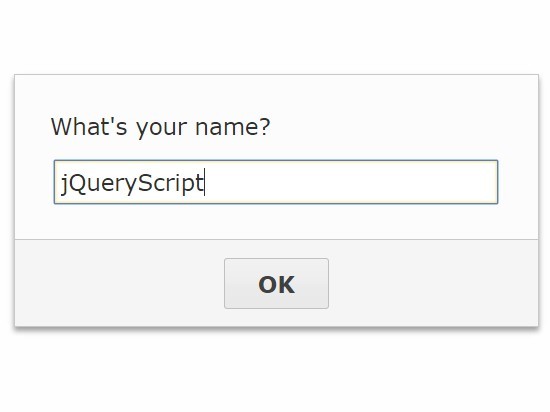
Just another jQuery based JS popup box replacement which enables you to create alert / confirm / prompt dialog boxes with custom styles & animations.
How to use it:
1. Include references to jQuery library and the jQuery Message Box plugin's JavaScript & CSS in your webpage as following:
<link href="src/messagebox.css" rel="stylesheet">
<script src="//code.jquery.com/jquery.min.js"></script>
<script src="src/messagebox.js"></script>
2. Create a dialog box to replace the Javascript's window.alert() function.
$.MessageBox("Alert Message Here");
3. Create a dialog box to replace the Javascript's window.confirm() function.
$.MessageBox({
  buttonDone  : "Yes",
  buttonFail  : "No",
  message     : "Are You Sure?"
  }).done(function(){
    $.MessageBox("You clicked Yes.");
  }).fail(function(){
    $.MessageBox("You clicked No.");
});
4. Create a dialog box to replace the Javascript's window.prompt() function.
$.MessageBox({
  input    : true,
  message  : "What's your name?"
}).done(function(data){
  if ($.trim(data)) {
    $.MessageBox("Hi <b>"+data+"</b>!");
  } else {
    $.MessageBox("You are shy, aren't you?");
  }
});
5. Create custom Done & Fail buttons.
$.MessageBox({
  buttonDone: {
    one: {
      text: "1 - Nice",
      customClass: "your-class",
      keyCode : [49, 97]
    },
    two: {
      text    : "2 - Super",
      keyCode : [50, 98]
    },
    three: {
      text: "3 - Great",
      keyCode : [51, 99]
    }
  },
  buttonFail: {
    zero: {
      text: "0 - Meh",
      keyCode: [48, 96]
    },
  },
  buttonsOrder: "fail done",
  message: "How do you like it?<br>Click a button or press keys 0 to 3 on your keyboard:"
})
6. Trigger functions when the user clicks the Done or Fail buttons.
$.MessageBox({
  // options here
}).done(function(data, button){
  console.log("Handler: .done()");
  console.log("Button: " + button);
}).fail(function(data, button){
  console.log("Handler: .fail()");
  console.log("Button: " + button);
});
7. Full plugin options to create a custom dialog box.
// the specified text that triggers the .done() handler
buttonDone: "OK",

// the specified text that triggers the .fail() handler
buttonFail: undefined,

// buttons order
buttonsOrder: "done fail",

// custom CSS classes
customClass: "",

// custom CSS classes for the overlay
customOverlayClass: "",

/* show input field
e.g.
{
  name : {
    type            : "text"            // String
    label           : undefined         // String
    title           : undefined         // String
    defaultValue    : undefined         // String/Boolean
    customClass     : undefined         // String
    autotrim        : true              // Boolean      - Only applicable to type == "text", "password" and "textarea"
    maxlength       : undefined         // Integer      - Only applicable to type == "text", "password" and "textarea"
    message         : undefined         // String       - Only applicable to type == "caption"
    options         : {"" : " "}   // Object/Array - Only applicable to type == "select"
    resize          : false             // Boolean      - Only applicable to type == "textarea"
    rows            : undefined         // Integer      - Only applicable to type == "textarea"
    htmlAttributes  : {}                // Object       - Only applicable to type == "text", "password", "date", "time", "number", "color" and "email"
  },
  ...
}
*/
input: false,

// plain text or html elements
message: "",

// the MessageBox has to be placed in the queue after the other MessageBoxes already created
queue: true,

// animation speed
speed: 200,

// title
title: "",

// distance from the top of the viewport
top: "25%",

// width of the dialog box
width: "auto",

// Filters functions can be defined using the filterDone and filterFail options.
// The data and button arguments will be provided for them the same way as they are for Handlers.
filterDone: undefined,
filterFail: undefined
Changelog:
v3.2.2 (2020-05-22)
- Added z-index : 9999 to .messagebox_overlay class in default CSS file to improve interaction with external components and plugins.
v3.2.1 (2019-10-17)
- Bugfix
v3.2.0 (2019-10-07)
- Added: Input types "date", "time", "number", "color", "email"
- Added: Input htmlAttributes option
v3.1.0 (2019-04-26)
- Added: Input type "textarea" (alias "memo")
- Added: Input resize option for type "textarea"
- Added: Input rows option for type "textarea"
- Added: Customizable messagebox_content_input_textarea class in the external CSS file
- Added: Enforced strict mode
- Changed: Input autotrim option for types "text, "password" and "textarea" defaults to true
- Changed: CSS that was injected into document head is now included in the external CSS file
- Removed: Direct CSS injection into document head
v3.0.0 (2018-10-08)
- Added more options.
- Bugfixes.
v2.2.3 (2018-04-23)
- Fixed: some more browser compatibility code embellishments
v2.2.2 (2018-04-22)
- Removed a comma in excess causing issues with some browsers
v2.2.1 (2017-02-19)
- A minor bugfix release that addresses some event bubbling issues when keyboard is used instead of the buttons and there have been attached some other event handlers to the document after the MessageBox is displayed.
v2.2 (2017-01-25)
- Added Filters (filterDone and filterFail options)
- Added Error message capabilities
- Added Input autotrim option for type "text and "password"
- Changed Default keycodes for buttonDone
- Minor CSS fix: added margin-bottom for buttons and removed padding-bottom from .messagebox_buttons wrapper
- Minor code fix: don't remove the focus from an existing MessageBox input if another MessageBox is created and queued
2016-11-12
- Version 2.1
2016-10-19
- Version 2.0.1
2016-08-10
- Version 2.0
This awesome jQuery plugin is developed by gasparesganga. For more Advanced Usages, please check the demo page or visit the official website.
