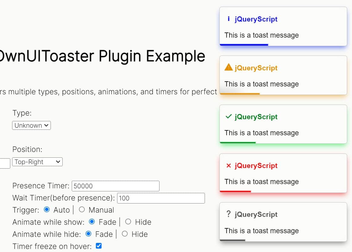
Feature-rich Notification & Popup Box Plugin Based On Bootstrap 4
| File Size: | 8.99 KB |
|---|---|
| Views Total: | 4412 |
| Last Update: | |
| Publish Date: | |
| Official Website: | Go to website |
| License: | MIT |
This is a full-featured jQuery popup plugin that lets you create moveable, mobile-friendly dialog boxes and toast-like notifications using Bootstrap 4 framework.
More features:
- Supports mouse drag, touch swipe, stylus pen, touch gestures, etc.
- Supports dialog, alert, confirm, prompt popup boxes.
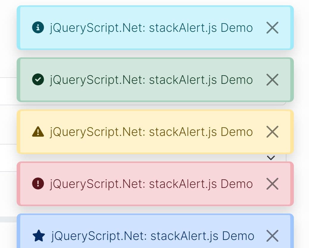
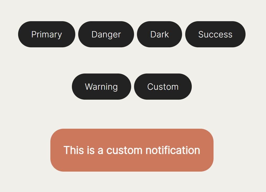
- Supports primary, secondary, success, danger, warning, info, light, dark notifications.
- The notification popup will automatically dismiss after a timeout similar to the Material Design Toasts.
How to use it:
1. Load the bs4pop.css and bs4pop.js in your Bootstrap project.
<link rel="stylesheet" href="bs4pop.css">
<script src="bs4pop.js"></script>
2. Create an alert dialog on the page.
bs4pop.alert('Alert Dialog', function(){
  console.log('You Just Clicked Okay Button');
},{
  // options settings here
  title: 'Alert Dialog',
  hideRemove: true,
  width: 500,
  btns: [
    {
      label: 'Okay',
      onClick(){
        if(cb){
          return cb();
        }
      }
    }
  ]
});
3. Create a confirmation dialog.
bs4pop.confirm('Are You Sure?', function(sure){
  console.log('Are You Sure:', sure);
},{
  title: 'Confirmation Dialog',
  hideRemove: true,
  btns: [
    {
      label: 'Confirm',
      onClick(){
        if(cb){
          return cb(true);
        }
      }
    },
    {
      label: 'Cancel',
      className: 'btn-default',
      onClick(){
        if(cb){
          return cb(false);
        }
      }
    }
  ]
});
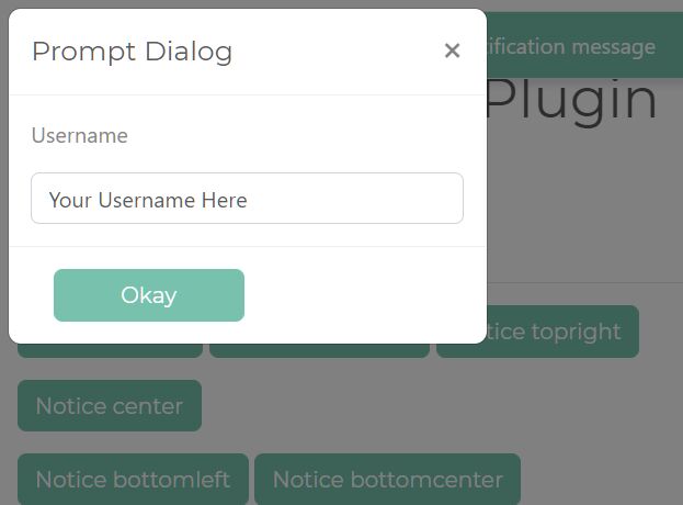
4. Create a prompt dialog.
bs4pop.prompt('Username:', 'Input Placeholder', function(sure, value){
  console.log('I am:', value);
},{
  title: 'Prompt Dialog',
  hideRemove: true,
  width: 500,
  btns: [
    {
      label: 'Okay',
      onClick(){
        if(cb){
          return cb(true, $input.val());
        }
      }
    },
    {
      label: 'Cancel',
      className: 'btn-default',
      onClick(){
        if(cb){
          return cb(false, $input.val());
        }
      }
    }
  ]
});
5. Create a custom dialog box with the following options.
var myDialog = bs4pop.dialog({

    // dialog title
    id: '',

    // dialog title
    title: '',

    // dialog content: string, element, jQuery object
    content: '',

    // custom CSS class
    className: '',

    // width/height
    width: 500,
    height: '',

    // parent container
    target: 'body',

    // shows close button
    closeBtn: true,

    // removes the dialog from the DOM after hidden
    hideRemove: true,

    // closes the dialog by pressing ESC key
    escape: true,

    // sets focus to the dialog on init
    autoFocus: true,

    // shows the dialog on init
    show: true,

    // shows backdrop
    // true, false, static
    backdrop: true,

    // custom action buttons
    // [{label: 'Button', className: 'btn-primary',onClick(cb){}}]
    btns: [],

    // enables draggable
    drag: true,

    // callback functions
    onShowStart: function(){
      // console.log('onShowStart');
    },

    onShowEnd: function(){
      // console.log('onShowEnd');
    },

    onHideStart: function(){
      // console.log('onHideStart');
    },

    onHideEnd: function(){
      // console.log('onHideEnd');
    },

    onDragStart: function(){
      console.log('onDragStart');
    },

    onDragEnd: function(){
      // console.log('onDragEnd');
    },

    onDrag: function(){
      console.log('onDrag');
    }

});
6. Create a notification popup.
var myNofitication = bs4pop.notice('Notification Message', {

    // primary, secondary, success, danger, warning, info, light, dark
    type: 'primary',

    // topleft, topcenter, topright, bottomleft, bottomcenter, bottonright, center
    position: 'topcenter',

    // append, prepend
    appendType: 'append',

    // shows close button
    closeBtn: false,

    // auto dismisses after 2 seconds
    autoClose: 2000,

    // CSS class
    className: ''

})
7. Close the dialog & notification popup manually.
myDialog.hide();
$('#alert').alert('close');
Changelog:
2021-01-01
- Adjusts codes.
- Bugfixes.
This awesome jQuery plugin is developed by aiv367. For more Advanced Usages, please check the demo page or visit the official website.