Slim Custom Range Input Plugin With jQuery - html-input-range
| File Size: | 6.39 KB |
|---|---|
| Views Total: | 14696 |
| Last Update: | |
| Publish Date: | |
| Official Website: | Go to website |
| License: | MIT |
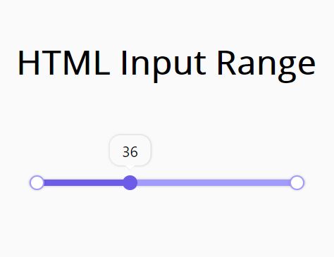
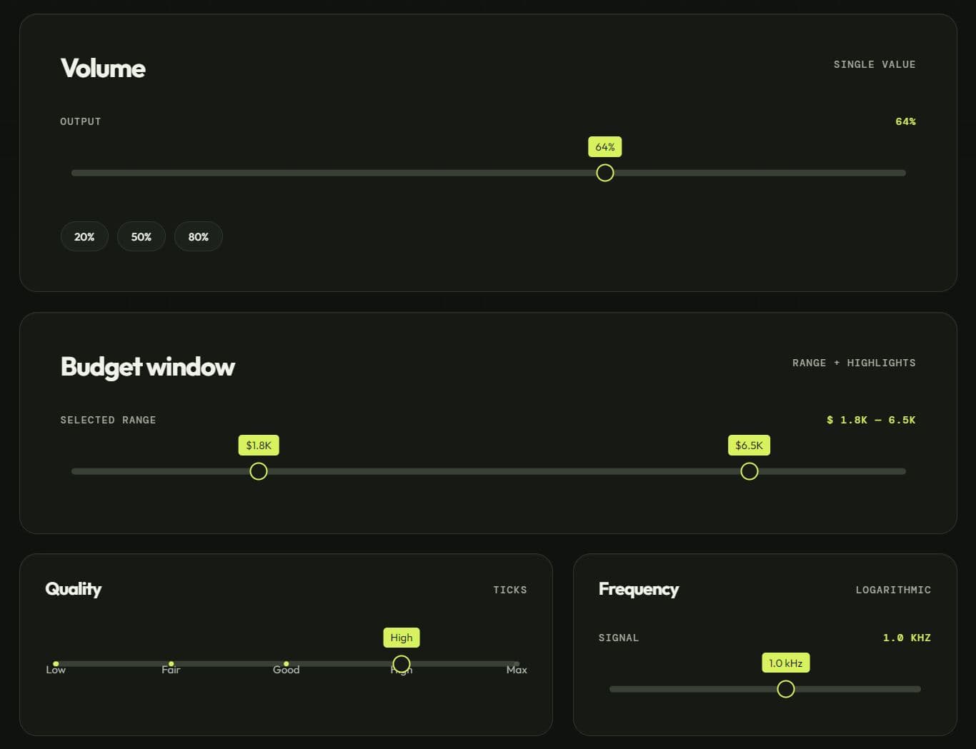
html-input-range is a jQuery plugin that turns a standard HTML <input type="range"> into a custom single-value range slider with a styled track, thumb, optional value tooltip, and optional track markers.
It keeps the native range input as the form control and uses jQuery to update the custom slider UI as the value changes.
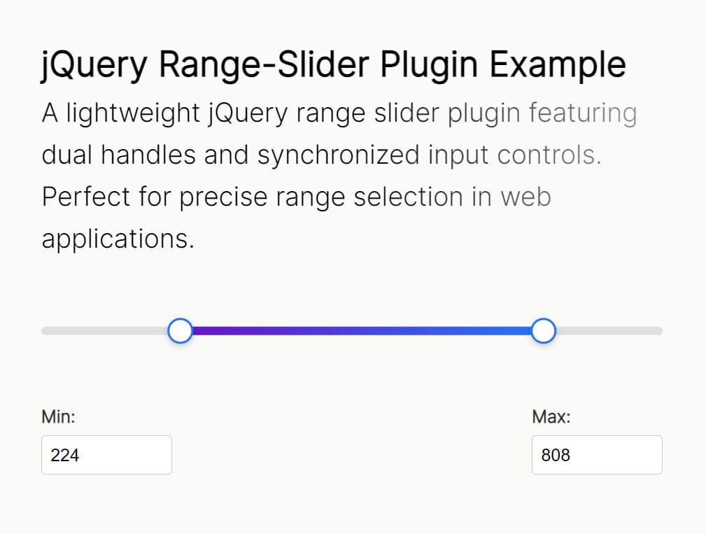
The plugin is ideal for jQuery forms and settings panels that need more controlled styling than the browser's default range input. For newer projects or dual-handle sliders, see the best JavaScript and jQuery range slider plugins.
HTML Range Input Basics
HTML uses <input type="range"> for numeric values selected from a defined interval. Browsers render it as a slider control.
<label for="volume">Volume</label>
<input
  type="range"
  id="volume"
  name="volume"
  min="0"
  max="100"
  step="5"
  value="50">
| Attribute | Purpose |
|---|---|
min |
Sets the lowest selectable value. Native range inputs use 0 when no minimum is specified. |
max |
Sets the highest selectable value. Native range inputs use 100 when no maximum is specified. |
step |
Sets the increment between valid values. The native default is 1. |
value |
Sets the initial numeric value of the control. |
html-input-range changes some of this native behavior during initialization. Its init() method sets min="0", max="100", value="0", and step="1" on the target input. Existing values for those attributes are replaced when the plugin starts.
Features:
- Native HTML range input as the underlying form control.
- Custom slider track and draggable thumb styling.
- Filled track that follows the selected value.
- Optional tooltip that displays the current numeric value.
- Optional marker points across the slider track.
- Configurable maximum value when the tooltip option is active.
- Native
inputandchangeevent updates.
How to Use html-input-range
1. Load jQuery and the Plugin Files
Load the stylesheet first, then jQuery, then html-input-range.js.
<link rel="stylesheet" href="html-input-range.css">
<script src="/path/to/jquery.min.js"></script>
<script src="html-input-range.js"></script>
2. Create the HTML Range Input
The plugin targets the fixed ID html-input-range. Wrap the input in a container. The script applies CSS classes and generated slider elements to its parent.
<div class="range-control">
  <input type="range" id="html-input-range">
</div>
3. Initialize the Default Range Input
Call htmlInputRange.init() after the DOM is ready. This sets the plugin's default range values and adds the html-inupt-range class to the input's parent element.
$(document).ready(function () {
  htmlInputRange.init();
});
4. Add a Current-Value Tooltip
Use htmlInputRange.options() when you need the custom filled track and a tooltip that follows the slider value.
$(document).ready(function () {
  htmlInputRange.options({
    tooltip: true
  });
});
5. Set a Custom Maximum Value
The plugin starts with a maximum value of 100. Its source applies the max option inside the tooltip branch. Pair a custom maximum with tooltip: true.
$(document).ready(function () {
  htmlInputRange.options({
    tooltip: true,
    max: 90
  });
});
6. Add Track Markers
Set labels to true to generate marker elements across the track. The generated markers do not contain text.
$(document).ready(function () {
  htmlInputRange.options({
    tooltip: true,
    max: 100,
    labels: true
  });
});
Full Plugin Options:
| Option | Description |
|---|---|
tooltip |
Boolean. Default: false. Adds a floating tooltip and updates its text and position as the range value changes. |
max |
Number. Default: 100. Changes the input's maximum value. In the plugin code, this option is applied only when tooltip is true. |
labels |
Boolean. Default: false. Adds a hir-labels list that the bundled CSS renders as marker points across the track. |
Public Methods:
| Method | Description |
|---|---|
htmlInputRange.init() |
Initializes #html-input-range, adds the parent class, and sets min=0, max=100, value=0, and step=1. |
htmlInputRange.options(options) |
Runs the default initialization, adds the custom track elements, and applies the supported tooltip, max, and labels settings. |
Events:
html-input-range does not expose custom plugin events. It listens to the native input and change events on #html-input-range. You can listen to the same events when another part of the page needs the selected value.
$('#html-input-range').on('input change', function () {
  $('#range-value').text(this.value);
});
<p>Selected value: <span id="range-value">0</span></p>
How It Works:
The plugin starts from #html-input-range and adds classes to the input's parent container. options() also inserts hir-tracker-bg and hir-tracker-thumb elements for the custom track UI.
When tooltip: true is active, the script appends a tooltip element. The input and change handlers calculate the selected percentage from the current value and maximum value. That percentage controls the filled track width and tooltip position.
The labels option appends a hir-labels list. The bundled stylesheet turns its empty list items into circular marker points.
Customize the Range Slider:
The plugin theme is CSS-based. The main selectors control the native input, generated background track, filled track, thumb, and tooltip. Override these rules after html-input-range.css to match the surrounding form UI.
.html-inupt-range {
  position: relative;
  height: 15px;
}

.html-inupt-range input[type='range'] {
  -webkit-appearance: none;
  height: 6px;
  margin: 0;
  background: #a29bfe;
  box-shadow: 0 0 3px rgba(0, 0, 0, 0.24);
  border-radius: 2px;
  outline: none;
  cursor: pointer;
}

.html-inupt-range input[type="range"]::-webkit-slider-thumb {
  -webkit-appearance: none;
  width: 14px;
  height: 14px;
  box-shadow: 0 0 3px rgba(0, 0, 0, 0.24);
  background-image: linear-gradient(to bottom, #6c5ce7 0, #6c5ce7 100%);
  border-radius: 50%;
}

.html-input-range-custom input[type='range'] {
  position: relative;
  z-index: 99;
  opacity: 0;
}

.html-input-range-custom .hir-tracker-bg,
.html-input-range-custom .hir-tracker-bg::after,
.html-input-range-custom .hir-tracker-bg::before {
  position: absolute;
  box-shadow: 0 0 3px rgba(0, 0, 0, 0.24);
}

.html-input-range-custom .hir-tracker-bg {
  top: 10px;
  left: -7px;
  width: calc(100% + 15px);
  height: 6px;
  background-color: #a29bfe;
  border-radius: 5px;
}

.html-input-range-custom .hir-tracker-bg::after,
.html-input-range-custom .hir-tracker-bg::before {
  content: '';
  z-index: 1;
  top: -4px;
  width: 14px;
  height: 14px;
  border-radius: 50%;
  background-color: #fff;
  border: 1px solid #a29bfe;
  box-shadow: 0 0 3px rgba(0, 0, 0, 0.24);
}

.html-input-range-custom .hir-tracker-bg::before {
  left: 0;
}

.html-input-range-custom .hir-tracker-bg::after {
  right: 0;
}

.html-input-range-custom .hir-tracker-thumb,
.html-input-range-custom .hir-tracker-thumb::after {
  position: absolute;
  background-color: #6c5ce7;
}

.html-input-range-custom .hir-tracker-thumb {
  top: 10px;
  left: 0;
  width: 0;
  height: 6px;
  transition: width 150ms linear;
}

.html-input-range-custom .hir-tracker-thumb::after {
  content: '';
  z-index: 2;
  top: -4px;
  right: -7px;
  width: 14px;
  height: 14px;
  border-radius: 50%;
}

.html-inupt-range .tooltip,
.html-inupt-range .tooltip::after,
.html-inupt-range .tooltip::before {
  position: absolute;
}

.html-inupt-range .tooltip {
  z-index: 0;
  top: -32px;
  left: 0;
  padding: 5px 12px;
  transform: translateX(-50%);
  font-size: 14px;
  box-shadow: 0 0 3px rgba(0, 0, 0, 0.24);
  border-radius: 10px;
  transition: left 100ms linear;
}

.html-inupt-range .tooltip::after,
.html-inupt-range .tooltip::before {
  content: '';
  width: 0;
  height: 0;
}

.html-inupt-range .tooltip::after {
  bottom: -4px;
  left: calc(50% - 4px);
  border-left: 4px solid transparent;
  border-right: 4px solid transparent;
  border-top: 4px solid #fff;
}

.html-inupt-range .tooltip::before {
  bottom: -5px;
  left: calc(50% - 5px);
  border-left: 5px solid transparent;
  border-right: 5px solid transparent;
  border-top: 5px solid #f1f1f1;
}
Native Range Input vs html-input-range:
Native HTML Range Input
- Requires no JavaScript library.
- Supports
min,max,step, andvaluedirectly in HTML. - Uses the browser's own slider rendering. Custom CSS can change its appearance.
- Works better when you need several independent range inputs with different constraints.
html-input-range
- Requires jQuery and the plugin stylesheet.
- Adds a custom filled track, thumb UI, tooltip, and optional markers.
- Targets one input through the fixed
#html-input-rangeselector. - Resets native range attributes during initialization.
Alternatives And Related Resources
- 10 Best Range Slider Plugins In JavaScript
- jQuery Range Slider Plugin with Synchronized Inputs (1.34KB)
- Touch-enabled Range Slider With Stop Points
- Custom Range Slider With Sliding Value
- 10 Best Custom Range Slider JavaScript Libraries
FAQs:
Q: Does html-input-range require jQuery?
A: Yes. The plugin selects the range input, creates the custom slider elements, and handles value changes through jQuery.
Q: Can I set custom min, max, step, and value attributes in the HTML?
A: A native HTML range input supports all four attributes, but htmlInputRange.init() resets them to 0, 100, 1, and 0. The plugin exposes a max option, and its current code applies that option when the tooltip is active.
Q: Why does htmlInputrange.default() fail?
A: The plugin code exposes htmlInputRange.init() and htmlInputRange.options(). Use htmlInputRange.init() for the basic setup.
Q: Can I use html-input-range for multiple sliders on the same page?
A: The code binds its main input reference to the fixed #html-input-range ID and does not implement the commented multiple-input loop. Use one slider per page or modify the source for independent sliders.
This awesome jQuery plugin is developed by vulchivijayakumar. For more Advanced Usages, please check the demo page or visit the official website.