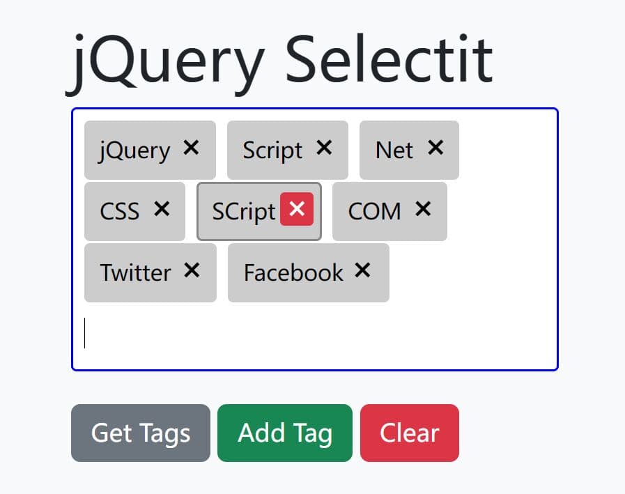
Custom Select Dropdown List Plugin For jQuery & jQuery UI
| File Size: | 45.9 KB |
|---|---|
| Views Total: | 6492 |
| Last Update: | |
| Publish Date: | |
| Official Website: | Go to website |
| License: | MIT |
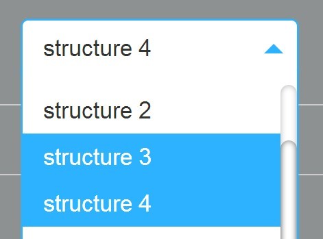
A simple jQuery dropdown plugin that turns the native select element into an animated & fully styleable dropdown list using jQuery UI Selectmenu widget.
How to use it:
1. Load the needed jQuery & jQuery UI libraries in the web page.
<script src="//ajax.googleapis.com/ajax/libs/jquery/1.11.1/jquery.min.js"></script>
<script src="//ajax.googleapis.com/ajax/libs/jqueryui/1.11.2/jquery-ui.min.js"></script>
2. Include the jQuery Dropdown widget's script after jQuery library.
<script src="js/select-widget-min.js"></script>
3. Call the plugin on the existing select elements.
$(document).ready(function(){

$("select").selectWidget({

// onChange callback
change : function (changes) {
  return changes;
},

// slide or fade animations
effect       : "slide",

// enable keyboard controls
keyControl   : true,

// animation speed
speed        : 200,

// height of the select box

scrollHeight : 250
});

});
4. Add custom CSS styles for the dropdown list. Free free to modify or override the following CSS snippets to create your own styles.
div.select-main {
  background-color: #FFFFFF;
  border: 1px solid #2DB2FF;
  box-shadow: 0 0 2px #2DB2FF;
  border-radius: 5px;
  font-size: 1.7em;
  height: 40px;
  position: relative;
  width: 200px;
  -webkit-user-select: none; /* webkit (safari, chrome) browsers */
  -moz-user-select: none; /* mozilla browsers */
  -khtml-user-select: none; /* webkit (konqueror) browsers */
  -ms-user-select: none; /* IE10+ */
}

div.select-main.z-index { z-index: 10; }

div.select-main.disabled {
  cursor: default;
  filter: alpha(opacity=50);
  opacity: 0.5;
  zoom: 1;
}

div.select-main.disabled div.select-set { cursor: default; }

div.select-main.disabled div.select-arrow { cursor: default; }

div.select-set {
  background-color: #FFFFFF;
  border-radius: 5px;
  color: #333333;
  cursor: pointer;
  height: 40px;
  line-height: 40px;
  overflow: hidden;
  position: relative;
  padding: 0 35px 0 15px;
  width: 150px;
  z-index: 5;
}

div.select-arrow {
  border-top: 7px solid #2DB2FF;
  border-left: 7px solid transparent;
  border-right: 7px solid transparent;
  cursor: pointer;
  height: 0px;
  position: absolute;
  top: 18px;
  right: 10px;
  width: 0px;
  z-index: 7;
}

div.select-arrow.reverse {
  border-top: 7px solid transparent;
  border-bottom: 7px solid #2DB2FF;
  top: 10px;
}

div.select-block {
  background-color: #FFFFFF;
  border-left: 1px solid #2DB2FF;
  border-right: 1px solid #2DB2FF;
  border-bottom: 1px solid #2DB2FF;
  border-radius: 5px;
  box-shadow: 0 0 2px #2DB2FF;
  left: -1px;
  line-height: 20px;
  position: absolute;
  top: 32px;
  width: 200px;
}

ul.select-list {
  cursor: pointer;
  margin: 15px 0 7px;
}

/* Scroll view */

ul.select-list::-webkit-scrollbar {
 width: 12px;
}
 ul.select-list::-webkit-scrollbar-track {
 -webkit-box-shadow: inset 0 0 6px rgba(0,0,0,0.3);
 border-radius: 10px;
}
 ul.select-list::-webkit-scrollbar-thumb {
 border-radius: 10px;
 -webkit-box-shadow: inset 0 0 6px rgba(0,0,0,0.5);
}

ul.select-list {
  scrollbar-face-color: #AEB1B1;
  scrollbar-shadow-color: #C7CACA;
  scrollbar-highlight-color: #CED1D1;
  scrollbar-3dlight-color: #CED1D1;
  scrollbar-darkshadow-color: #C7CACA;
  scrollbar-track-color: #CED1D1;
  scrollbar-arrow-color: #FFFFFF;
}

/* End scroll view */


li.select-items {
  color: #333333;
  padding: 7px 15px;
}

li.select-items:hover,
li.select-items.active {
  background-color: #2DB2FF;
  color: #FFFFFF;
}
Change logs:
2015-08-13
- Update select-widget.js
2015-03-11
- Update drop-down.css
This awesome jQuery plugin is developed by karo73. For more Advanced Usages, please check the demo page or visit the official website.