Simple Flexible Autocomplete Plugin - Flexdatalist
| File Size: | 51.4 KB |
|---|---|
| Views Total: | 28706 |
| Last Update: | |
| Publish Date: | |
| Official Website: | Go to website |
| License: | MIT |
Flexdatalist (v3) is a ES6 autocomplete and tag input library that transforms a standard text input into a fully featured suggestion dropdown backed by remote endpoints or static data arrays. Version 3 is a complete rewrite of the library. jQuery version (v2) is available here.
The library supports remote and static data sources, tag-style multi-value input, result grouping, keyboard navigation, accent-insensitive search, localStorage caching, and thin framework adapters for Vue 3, React 18+, and Svelte 4+.
Features:
- Zero dependencies.
- Auto-discovers and initializes any marked input on page load.
- Retrieves suggestions from remote endpoints using GET or POST requests.
- Accepts static data arrays or a JSON file URL as a data source.
- Reads option values from linked native HTML option lists.
- Supports multi-value tag input with add, remove, and toggle per-tag operations.
- Groups result items by any data property with section headers and item counts.
- Keyboard navigation: arrow keys, Enter, Escape, Backspace, and Tab.
- Four search modes: starts-with, contains, exact match, and word-by-word.
- Strips accent characters before comparison for accent-insensitive matching.
- Highlights matched text within each result item.
- Caches remote responses in browser storage with a configurable expiry and automatic garbage collection.
- Links chained inputs and forwards their current values with every data request.
- Fully themeable through CSS custom properties on any ancestor element.
- Positions the suggestion dropdown correctly inside modal dialog elements.
- ARIA attribute support for screen reader accessibility.
- Returns a chainable API instance from the async initializer.
Migrating from v2 (jQuery)
The event names and CSS class names are identical between v2 and v3. Only the initialization syntax and method call style changed. Here is a direct comparison:
// --- v2 (jQuery) ---

// Initialize
$('#product-search').flexdatalist({ url: '/api/products', minLength: 2 });

// Listen for selection
$('#product-search').on('select:flexdatalist', fn);

// Get value
$('#product-search').flexdatalist('value');

// Set value
$('#product-search').flexdatalist('value', 'electronics');

// Destroy
$('#product-search').flexdatalist('destroy');


// --- v3 (Standalone) ---

// Initialize (async)
const [fd] = await Flexdatalist.init('#product-search', { url: '/api/products', minLength: 2 });

// Listen for selection
fd.on('select:flexdatalist', fn);
// or: document.querySelector('#product-search').addEventListener('select:flexdatalist', fn);

// Get value
fd.getValue();

// Set value
fd.setValue('electronics');

// Destroy
fd.destroy();
Swap the stylesheet from jquery.flexdatalist.css to flexdatalist.css. The class names are backwards-compatible.
How to use it (v3):
1. Install and import Flexdatalist into your project.
# NPM
$ npm install flexdatalist

# Vue 3
npm install flexdatalist flexdatalist-vue

# React 18+
npm install flexdatalist flexdatalist-react

# Svelte 4+
npm install flexdatalist flexdatalist-svelte
// Import the core constructor
import Flexdatalist from 'flexdatalist';

// Import the default stylesheet
import 'flexdatalist/css';
2. Or directly load the Flexdatalist's files in the document.
<link rel="stylesheet" href="/dist/flexdatalist.css">
<script src="dist/flexdatalist.js"></script>

<!-- Or from a CDN -->
<script src="
https://cdn.jsdelivr.net/npm/flexdatalist/dist/flexdatalist.umd.min.js
"></script>
<link href="
https://cdn.jsdelivr.net/npm/flexdatalist/dist/flexdatalist.min.css
" rel="stylesheet">
3. Auto-initialize a basic autocomplete input. This setup works well for a server-backed search field. The widget auto-initializes on page load when the input carries the `flexdatalist` class.
<input
  id="country-search"
  type="text"
  class="flexdatalist"
  data-url="/api/countries"
  data-search-in="name,code"
  data-value-property="code"
  data-min-length="2"
  name="country">
4. Initialize it in JavaScript:
<input id="city-picker" type="text" name="city">
const [cityPicker] = await Flexdatalist.init('#city-picker', {
  // Query your endpoint after 2 characters
  url: '/api/locations/cities',
  minLength: 2,

  // Search these properties in each result
  searchIn: ['name', 'region'],

  // Store the city id in the hidden value
  valueProperty: 'id',

  // Show a friendly label in the visible input
  textProperty: '{name} ({region})',

  // Render these fields in each dropdown row
  visibleProperties: ['name', 'region']
});

// Listen for item selection
cityPicker.on('select:flexdatalist', (e) => {
  console.log('Selected city:', e.detail);
});

// Read the stored value later
console.log(cityPicker.getValue());
5. Use local static data:
<input id="language-picker" type="text" name="language">
const [languagePicker] = await Flexdatalist.init('#language-picker', {
  data: [
    { id: 1, label: 'JavaScript', type: 'Language' },
    { id: 2, label: 'TypeScript', type: 'Language' },
    { id: 3, label: 'Rust', type: 'Language' }
  ],
  searchIn: ['label'],
  valueProperty: 'id',
  textProperty: '{label}',
  visibleProperties: ['label', 'type'],
  minLength: 0
});

// Open with an empty input on focus
languagePicker.search('');
6. Read options from a native datalist:
<!-- Keep your existing datalist markup -->
<input id="stack-picker" type="text" class="flexdatalist" list="stack-options" name="stack">

<datalist id="stack-options">
  <option value="Next.js">Next.js</option>
  <option value="Astro">Astro</option>
  <option value="SvelteKit">SvelteKit</option>
</datalist>
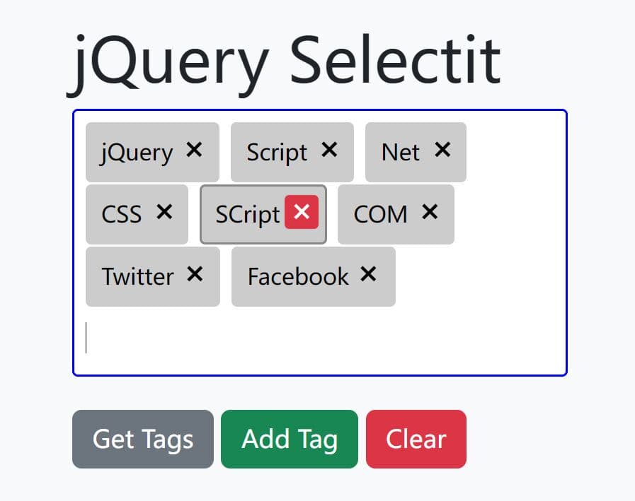
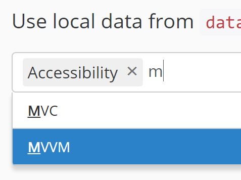
7. Create a multi-select tag input:
<input id="topic-picker" type="text" multiple name="topics">
const [topicPicker] = await Flexdatalist.init('#topic-picker', {
  data: [
    { slug: 'frontend', label: 'Frontend' },
    { slug: 'accessibility', label: 'Accessibility' },
    { slug: 'testing', label: 'Testing' },
    { slug: 'performance', label: 'Performance' }
  ],
  searchIn: ['label'],
  valueProperty: 'slug',
  textProperty: '{label}',
  multiple: true,
  limitOfValues: 5,
  removeOnBackspace: true,
  collapseAfterN: 3
});

// Add values in code
topicPicker.addValue('frontend').addValue('testing');

// Get the display text as a comma-separated string
console.log(topicPicker.getText('string'));
8. Group result rows:
<input id="asset-search" type="text" name="asset">
const [assetSearch] = await Flexdatalist.init('#asset-search', {
  data: [
    { id: 11, name: 'Button Kit', category: 'UI' },
    { id: 12, name: 'Chart Pack', category: 'UI' },
    { id: 21, name: 'Hero Photo', category: 'Media' }
  ],
  searchIn: ['name'],
  valueProperty: 'id',
  textProperty: '{name}',
  visibleProperties: ['name'],
  groupBy: 'category'
});
9. Send extra request parameters:
const [repoSearch] = await Flexdatalist.init('#repo-search', {
  url: '/api/repositories',
  searchIn: ['name'],
  valueProperty: 'id',
  textProperty: '{name}',
  params(keyword) {
    return {
      q: keyword,
      limit: 8,
      team: 'docs'
    };
  }
});
10. Chain related inputs:
<input id="region" type="text" name="region">
<input id="city" type="text" name="city">
const [cityField] = await Flexdatalist.init('#city', {
  url: '/api/city-search',
  searchIn: ['name'],
  valueProperty: 'id',
  textProperty: '{name}',
  relatives: '#region',
  chainedRelatives: true
});

// Update the region field in any way you want
document.querySelector('#region').addEventListener('change', () => {
  cityField.clear();
});
11. Framework Usage:
Vue 3
<script setup>
import { ref } from 'vue';
import { Flexdatalist } from 'flexdatalist-vue';
import 'flexdatalist/css';

const selectedProduct = ref('');
</script>

<template>
  <Flexdatalist
    v-model="selectedProduct"
    url="/api/products"
-min-length="2"
    placeholder="Search products..."
    @select="item => console.log('Selected:', item)"
  />
</template>
React
import { useRef } from 'react';
import { Flexdatalist } from 'flexdatalist-react';
import 'flexdatalist/css';

function ProductPicker() {
    const ref = useRef(null);

    return (
        <Flexdatalist
            ref={ref}
            url="/api/products"
            minLength={2}
            placeholder="Search products..."
            onSelect={item => console.log('Selected:', item)}
        />
    );
}
Svelte
<script>
    import { Flexdatalist } from 'flexdatalist-svelte';
    import 'flexdatalist/css';

    let selectedProduct = '';
</script>

<Flexdatalist
    bind:value={selectedProduct}
    url="/api/products"
    minLength={2}
    placeholder="Search products..."
    on:select={e => console.log('Selected:', e.detail)}
/>
12. Default plugin options. Options can be overwritten when initializing the plugin by passing an object literal, or set via data-attributes on the input element.
url(string|null): Remote URL to fetch results from.data(array|string): Static data array or URL to a JSON file.params(object|function): Extra params sent with every request, or a callback that returns params from the current keyword.relatives(string|NodeList|null): CSS selector or nodes for related inputs whose values are sent with requests.chainedRelatives(boolean): Disables the current input when all relatives are empty.resultsProperty(string): JSON key that contains the results array.minLength(number): Minimum character count before a search starts.searchIn(string[]): Item properties used for matching.searchContain(boolean): Matches the keyword anywhere in the string.searchEqual(boolean): Requires a full exact match.searchByWord(boolean): Splits the keyword into separate words and matches each word.searchDisabled(boolean): Skips local filtering and leaves filtering to the server.searchDelay(number): Debounce delay in milliseconds.normalizeString(function|null): Custom normalizer function for string matching.textProperty(string|null): Property name or placeholder template used for visible text.valueProperty(string|string[]|null): Property stored as the value.'*'stores the full object as JSON.visibleProperties(string[]): Properties rendered in each result row.iconProperty(string): Property name that holds the image URL for an icon.groupBy(string|false): Property used to group results.maxShownResults(number): Maximum number of results rendered.0removes the cap.focusFirstResult(boolean): Activates the first result row automatically.noResultsText(string): Message shown when no item matches the keyword.resultsLoader(string|null): URL of a loader image for pending results.multiple(boolean|null): Enables tag input mode. The widget can infer this from themultipleattribute.limitOfValues(number): Maximum number of selected tags.0means unlimited.valuesSeparator(string): Separator used to serialize multiple values.allowDuplicateValues(boolean): Allows the same value to appear more than once.removeOnBackspace(boolean): Removes the last tag when the input is empty and the user presses Backspace.toggleSelected(boolean): Lets users toggle a selected tag between enabled and disabled.collapseAfterN(number|false): Collapses tags after a set count into one control.collapsedValuesText(string): Label for the collapsed-tag control.selectionRequired(boolean): Forces users to pick from results and blocks free text.disabled(boolean|null): Starts the widget in a disabled state.redoSearchOnFocus(boolean): Runs search again when focus returns to the field.showAddNewItem(boolean): Shows an add-new row when no result matches.addNewItemText(string): Label shown for the add-new row.requestType(string): HTTP method for remote requests. Valid values aregetandpost.requestContentType(string): POST content type. Valid values includex-www-form-urlencodedandjson.requestHeaders(object|null): Extra request headers.keywordParamName(string): Parameter name used for the typed keyword.searchContainParamName(string): Parameter name used for the contains-search flag.cache(boolean): Enables localStorage caching.cacheLifetime(number): Cache lifetime in seconds.
/** @type {string|null} Remote URL to fetch results from. */
url: null,
/** @type {Array|string} Static data array or URL string to pre-load. */
data: [],
/**
* Extra query-string / body params sent with every remote request.
* May also be a function `(keyword) => Object`.
* @type {Object|Function}
*/
params: {},
/**
* CSS selector or NodeList of inputs whose values are sent as
* `relatives[name]` with every request.
* @type {string|NodeList|null}
*/
relatives: null,
/** @type {boolean} Disable this input when all relatives are empty. */
chainedRelatives: false,
/** @type {boolean} Cache remote results in localStorage. */
cache: true,
/** @type {number} Cache lifetime in seconds. */
cacheLifetime: 60,
/** @type {number} Minimum characters before triggering search (0 = show all on focus). */
minLength: 3,
/** @type {string|false} Item property name to group results by. */
groupBy: false,
/**
* Property (or `{placeholder}` pattern) used as the display text in
* the alias input. Defaults to the first entry of `searchIn`.
* @type {string|null}
*/
textProperty: null,
/**
* Property name(s) stored as the actual value.
* Use `'*'` to store the entire matched object as JSON.
* @type {string|string[]|null}
*/
valueProperty: null,
/**
* Properties rendered inside each result `<li>`.
* Supports `{placeholder}` patterns. Defaults to `searchIn`.
* @type {string[]}
*/
visibleProperties: [],
/** @type {string} Property containing an image URL rendered as <img>. */
iconProperty: 'thumb',
/** @type {string[]} Properties searched when filtering results. */
searchIn: ['label'],
/** @type {boolean} Match keyword anywhere in the string (not just at start). */
searchContain: false,
/** @type {boolean} Require exact full-string match. */
searchEqual: false,
/** @type {boolean} Split keyword on spaces and match all words independently. */
searchByWord: false,
/** @type {boolean} Skip local filtering entirely (rely on server-side search). */
searchDisabled: false,
/** @type {number} Debounce delay in ms before running a search. */
searchDelay: 300,
/**
* Custom string normalizer called before comparison.
* Signature: `(string) => string`
* @type {Function|null}
*/
normalizeString: null,
/** @type {boolean|null} Allow multiple values. Inferred from [multiple] attribute when null. */
multiple: null,
/** @type {boolean|null} Start disabled. Inferred from [disabled] attribute when null. */
disabled: null,
/** @type {boolean} Require the user to select a result (disables free-text). */
selectionRequired: false,
/** @type {boolean} Automatically activate the first result item. */
focusFirstResult: false,
/** @type {string} Key in the remote JSON response that holds the results array. */
resultsProperty: 'results',
/** @type {number} Maximum number of results rendered (0 = unlimited). */
maxShownResults: 100,
/**
* Collapse multiple-value tags after this many items.
* Set `false` to disable collapsing.
* @type {number|false}
*/
collapseAfterN: 50,
/** @type {string} Label for the collapse toggle. `{count}` is replaced. */
collapsedValuesText: '{count} More',
/** @type {string} Message shown when no results match. `{keyword}` is replaced. */
noResultsText: 'No results found for "{keyword}"',
/**
* URL of a loading spinner image shown while fetching results.
* Set null to disable.
* @type {string|null}
*/
resultsLoader: null,
/** @type {boolean} Clicking a selected tag toggles its disabled state. */
toggleSelected: false,
/** @type {boolean} Allow the same value to be added more than once. */
allowDuplicateValues: false,
/** @type {boolean} Pressing Backspace on an empty alias marks then removes the last tag. */
removeOnBackspace: true,
/** @type {string} HTTP method for remote requests ('get' or 'post'). */
requestType: 'get',
/** @type {string} Content-type for POST bodies ('x-www-form-urlencoded' or 'json'). */
requestContentType: 'x-www-form-urlencoded',
/** @type {Object|null} Extra HTTP headers merged into every request. */
requestHeaders: null,
/** @type {string} Query-string parameter name that carries the typed keyword. */
keywordParamName: 'keyword',
/** @type {string} Query-string parameter name that carries the searchContain flag. */
searchContainParamName: 'contain',
/** @type {number} Maximum number of tags in multiple mode (0 = unlimited). */
limitOfValues: 0,
/** @type {string} Separator used when serialising multiple values into a string. */
valuesSeparator: ',',
/** @type {boolean} Show an "Add new item" option when no results exist. */
showAddNewItem: false,
/** @type {string} Text of the "Add new item" option. `{keyword}` is replaced. */
addNewItemText: 'No results found for "{keyword}". Click to add it.',
/** @type {boolean} Log warnings to the console. */
debug: true,
13. API methods.
// Get the current stored value
fd.getValue();

// Get the visible text in default array mode, string mode, or a custom separator
fd.getText();
fd.getText('string');
fd.getText(' | ');

// Replace the current value
fd.setValue('london');

// Append one or more values in multiple mode
fd.addValue('frontend');
fd.addValue(['frontend', 'testing']);

// Remove a selected value in multiple mode
fd.removeValue('frontend');

// Toggle a tag state when toggleSelected is active
fd.toggleValue('frontend');

// Clear the current selection
fd.clear();

// Disable the widget
fd.disable();

// Enable the widget
fd.enable();

// Set readonly state or read it back
fd.readonly(true);
fd.readonly();

// Check disabled state
fd.isDisabled();

// Check readonly state
fd.isReadonly();

// Trigger a search from code
fd.search('san');

// Close the dropdown
fd.closeResults();

// Read one option at runtime
fd.getOption('minLength');

// Update one option at runtime
fd.setOption('minLength', 1);

// Subscribe to a custom event
fd.on('select:flexdatalist', (e) => {
  console.log('Item selected:', e.detail);
});

// Remove an event listener
const onChange = (e) => {
  console.log('Changed:', e.detail);
};
fd.on('change:flexdatalist', onChange);
fd.off('change:flexdatalist', onChange);

// Destroy the instance and restore the original input
fd.destroy();
fd.destroy(true);

// Initialize one or more inputs
const instances = await Flexdatalist.init('.js-auto', {
  minLength: 2
});

// Get the instance attached to one element
const existing = Flexdatalist.getInstance('#city-picker');
14. Events.
// Fires when the widget finishes initialization
input.addEventListener('init:flexdatalist', function (e) {
  console.log(e.detail);
});

// Fires when a result is selected
input.addEventListener('select:flexdatalist', function (e) {
  console.log(e.detail);
});

// Fires when the stored value changes
input.addEventListener('change:flexdatalist', function (e) {
  console.log(e.detail);
});

// Fires when values are cleared
input.addEventListener('clear:flexdatalist', function (e) {
  console.log(e.detail);
});

// Fires when the add-new row is clicked
input.addEventListener('addnew:flexdatalist', function (e) {
  console.log(e.detail);
});

// Fires before selection is applied
input.addEventListener('before:flexdatalist.select', function (e) {
  console.log(e.detail);
});

// Fires after selection is applied
input.addEventListener('after:flexdatalist.select', function (e) {
  console.log(e.detail);
});

// Fires before value extraction
input.addEventListener('before:flexdatalist.value', function (e) {
  console.log(e.detail);
});

// Fires after value extraction
input.addEventListener('after:flexdatalist.value', function (e) {
  console.log(e.detail);
});

// Fires before one tag is removed
input.addEventListener('before:flexdatalist.remove', function (e) {
  console.log(e.detail);
});

// Fires after one tag is removed
input.addEventListener('after:flexdatalist.remove', function (e) {
  console.log(e.detail);
});

// Fires before local filtering starts
input.addEventListener('before:flexdatalist.search', function (e) {
  console.log(e.detail);
});

// Fires after local filtering finishes
input.addEventListener('after:flexdatalist.search', function (e) {
  console.log(e.detail);
});

// Fires before result rows render
input.addEventListener('show:flexdatalist.results', function (e) {
  console.log(e.detail);
});

// Fires after result rows render
input.addEventListener('shown:flexdatalist.results', function (e) {
  console.log(e.detail);
});

// Fires when one result row element is created
input.addEventListener('item:flexdatalist.results', function (e) {
  console.log(e.detail);
});

// Fires when no results match
input.addEventListener('empty:flexdatalist.results', function (e) {
  console.log(e.detail);
});

// Fires when the dropdown starts removal
input.addEventListener('remove:flexdatalist.results', function (e) {
  console.log(e.detail);
});

// Fires before data loading starts
input.addEventListener('before:flexdatalist.data', function (e) {
  console.log(e.detail);
});

// Fires after data loading finishes
input.addEventListener('after:flexdatalist.data', function (e) {
  console.log(e.detail);
});
15. Theme the library with CSS custom properties:
:root {
   --fdl-accent:       #3b82f6;   /* Active highlight, focus ring, and selected background */
   --fdl-accent-fg:    #ffffff;   /* Text color rendered on the accent background */
   --fdl-accent-light: #eff6ff;   /* Soft tint applied to keyword-match highlights */
   --fdl-tag-bg:       #eff6ff;   /* Background color for each tag in multiple mode */
   --fdl-tag-border:   #bfdbfe;   /* Border color for each tag */
   --fdl-tag-fg:       #1d4ed8;   /* Text color inside each tag */
   --fdl-radius:       0.375rem;  /* Border radius on the dropdown and tags */
   --fdl-font-size:    0.875rem;  /* Base font size for the widget */
   --fdl-shadow:       0 4px 8px -2px rgba(0,0,0,.1),
                     0 12px 24px -4px rgba(0,0,0,.08);
}

/* Scope overrides to a specific container */
.dark-form {
   --fdl-accent:    #818cf8;
   --fdl-tag-bg:    #1e1b4b;
   --fdl-tag-border:#4338ca;
   --fdl-tag-fg:    #c7d2fe;
}
Alternatives:
Changelog:
v3.1.1 (2026-04-09)
- Improved code structure and readability across the core Flexdatalist module
- Enhanced request handling logic for better clarity
v3.1.0 (2026-04-04)
- New API getText() — retrieve the user-facing display text from the input.
- Added official adapters for React, Vue, and Svelte
v3.0.1 (2026-04-01)
- Rewritten in Vanilla JavaScript.
- Updated doc.
2021-02-16
- prevent form submission when pressing enter to add value on multiple config
v2.3.0 (2021-02-14)
- Added support for taking a string/value from nested objects for valueProperty, textProperty and visibleProperties
- Allow to customize the parameter name 'contain' that goes to the server
- Added 'params' option to also be a callback function that allows the customization of the parameters
- Added event 'empty:flexdatalist.results'
- Added event 'item:flexdatalist.results' to allow for personalization of the item result
- Prevent form submit when adding value from enter key
- Added isArray() polyfill
- Removed deprecated jQuery methods to trigger/listen to events
- Added 'requestHeaders' option
- Fixed value duplication bug for multiple mode
- Fix unescaped string in regex processing, on the highlight function (thks @antunesl)
- Fix when handling the value limit
- Fix for when array values are mixed with JSON object and simple strings
- Fix when toggling values
- Improved accessibility
2021-02-13
- Find results for accented words event when the keyword doesn't have them
- Fix for when array values are mixed with JSON object and simple strings
2020-06-11
- JS Update
2018-03-25
- added tabindex -1 on input to prevent usability issues
2018-01-09
- prevent plugin to autodiscover/load the input
2017-09-26
- added tabindex -1 on input to prevent usability issues
2017-09-10
- placeholder fix
2017-09-09
- dynamic multiple input size
2017-09-06
- minor backspace value removal fix
2017-08-05
- minor fix on toggle
2017-08-03
- valueProperty now accepts array of properties to pick from object item as value
2017-07-29
- added garbage collector for cache to prevent filling all localStorage available storage space
2017-07-28
- don't hide input container when there's no values
2017-07-17
- v2.1.3: minor fixes and improvements
2017-07-16
- now behaviour more like a select control
- minor changes
2017-07-15
- v2.1.2: bugfix
2017-07-10
- v2.1.1
- better alias identification
2017-07-09
- minor fix
2017-07-08
- disabled state handling
- improvements and fixes
2017-07-07
- added options 'url ' to cache key
2017-07-05
- Multiple values fix
2017-07-04
- remove event fix
2017-07-03
- added more option
- added autocomplete off
2017-06-24
- prevent multiple instances of flexdatalist
2017-06-19
- added searchDelay option
2017-05-17
- results position fixed
2017-04-05
- Minor fixes in valueSeparator option
2017-03-21
- default value fix
2017-02-28
- minor fixes and improvements
2017-02-17
- minor fixes
2017-02-14
- on result item click, refocus field (multiple only)
2017-02-13
- added search by word option
2017-01-21
- added 'limitOfValues' option
2017-01-16
- added 'allowDuplicateValues' and 'requestType' to change type of AJAX/HTTP request
2017-01-11
- add value to multiple input with "enter" key press
2017-01-08
- send options with the AJAX request
2017-01-07
- minor fix
2017-01-04
- minor tweak in CSS and disabled multiple selection
- minor fix in the relative field name
2016-12-29
- clear value on multiple values input
- minor fix
2016-12-25
- added possibility of having the current input keyword in noResultsText string with {keyword}
2016-11-05
- minor fix
- not clearing the value correctly
2016-10-28
- console.log removed
2016-09-25
- minor fix
2016-09-24
- fixes and improvements
2016-09-14
- Multiple Values: added option to disable selected value on click/tap
2016-09-10
- minor fix
2016-08-11
- respect input autofocus attribute
2016-08-07
- allowing to add/change option(s) after input instance initialization
2016-07-15
- on reset/destroy remove values
2016-07-12
- v1.4.6
2016-07-09
- fixed result highlight not matching correctly the keyword in field
2016-07-08
- Prevent remove button class conflict
2016-07-02
- Minor fix
2016-07-01
- not processing default input value
2016-06-30
- added 'relatives', 'maxShownResults' and 'chainedRelatives' options
2016-06-29
- minor fix in loading the default value
2016-06-15
- Ignore empty data parameter
2016-05-14
- fixed data option being replaced by default option
2016-04-26
- minor fix
This awesome jQuery plugin is developed by sergiodlopes. For more Advanced Usages, please check the demo page or visit the official website.