Versatile jQuery/Zepto Selection Library - Selectivity
| File Size: | 189 KB |
|---|---|
| Views Total: | 19479 |
| Last Update: | |
| Publish Date: | |
| Official Website: | Go to website |
| License: | MIT |
Selectivity (select3) is a jQuery/Zepto/React/Vanilla JavaScript alternative to Select2 that helps you create versatile & highly configurable select/input elements with the following features:
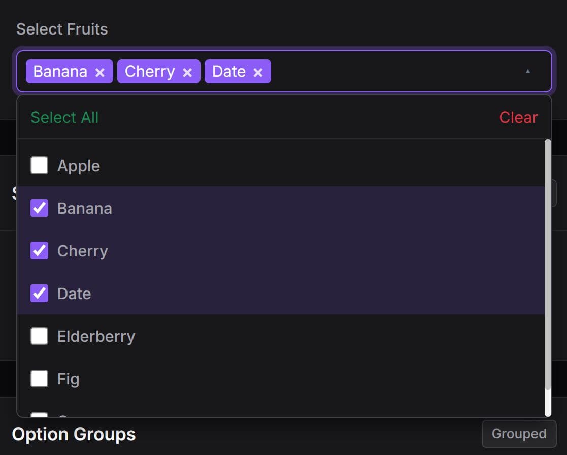
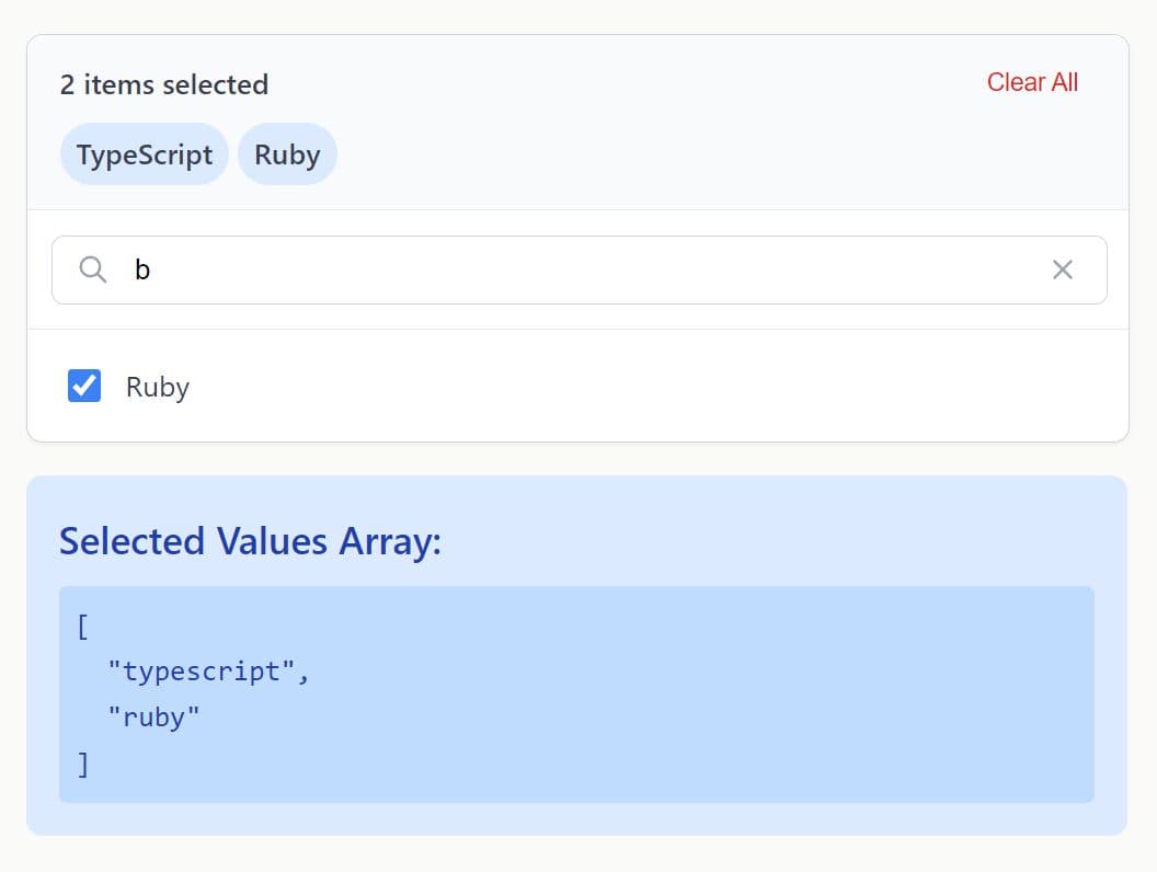
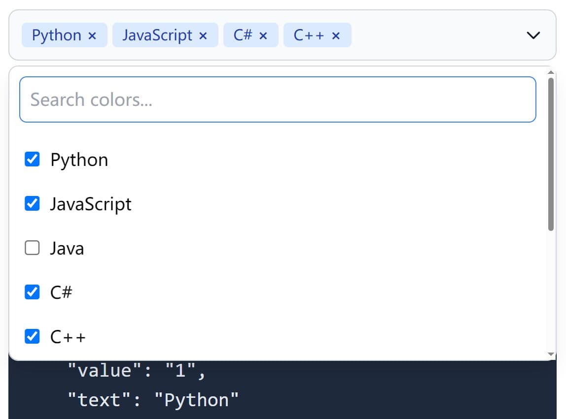
- Searchable dropdown select list.
- Multiple select.
- AJAX enabled.
- Filterable items.
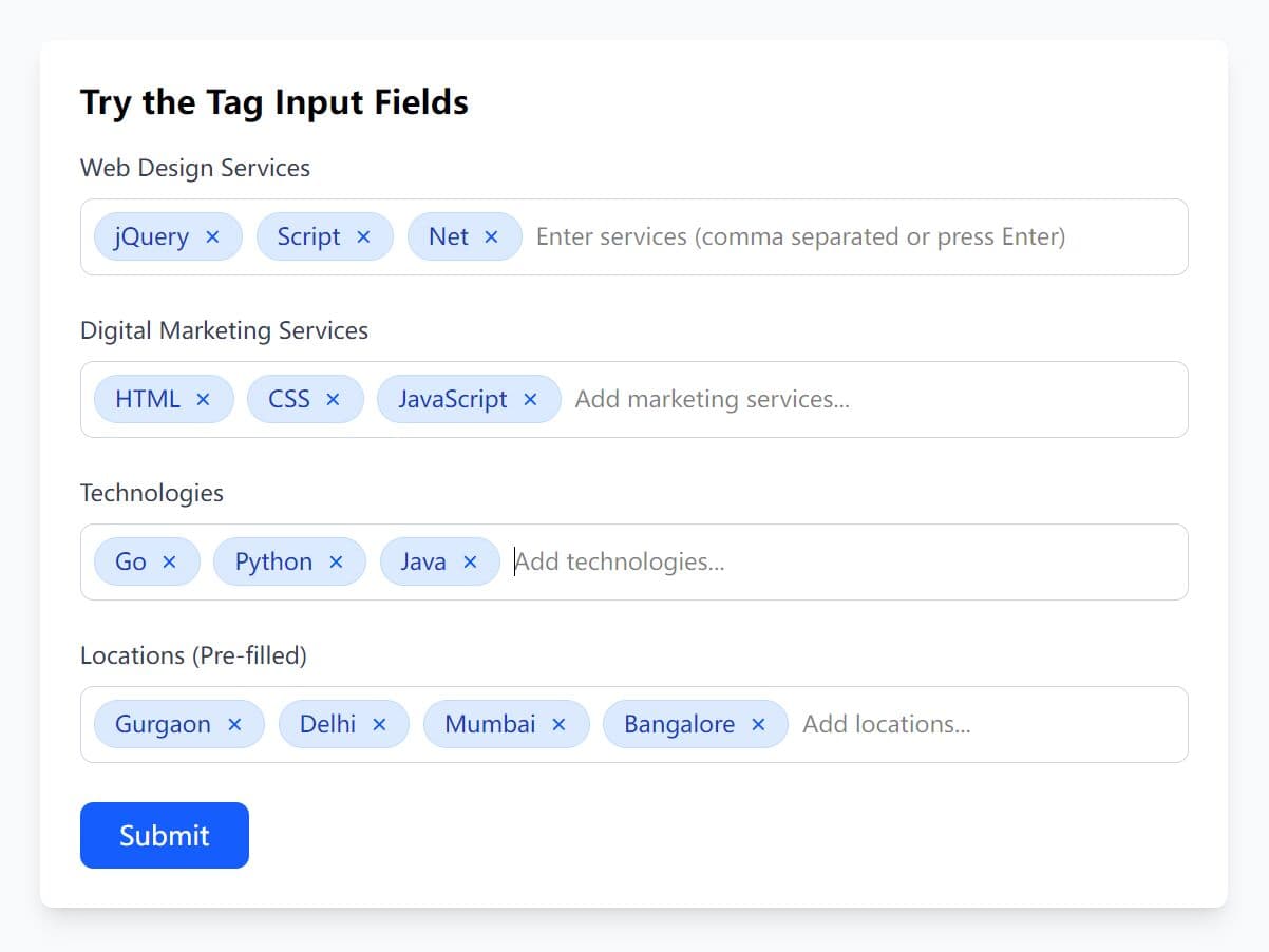
- Tags/tokens input.
- Custom data type.
- Custom templates.
See also:
Installation:
# Yarn
yarn add selectivity

# NPM
$ npm install selectivity
How to use it:
1. Include jQuery JavaScript library and the jQuery Selectivity plugin's CSS & JavaScript in the document.
<!-- As A Vanilla JS Plugin -->
<link href="/path/to/selectivity.min.css" rel="stylesheet">
<script src="/path/to/selectivity.min.js"></script>

<!-- As A jQuery Plugin -->
<link href="/path/to/selectivity-jquery.min.css" rel="stylesheet">
<script src="/path/to/jquery.min.js"></script>
<script src="/path/to/selectivity-jquery.min.js"></script>
2. Include the Font Awesome Iconic Font for essential icons.
<link href="font-awesome.min.css" rel="stylesheet">
3. Create an empty container to place the Selectivity component.
<span id="demo" class="example"></span>
4. Initialize the Selectivity component and define the data as follows:
$('#demo').selectivity({
  items: ['Item 1', 'Item 2', 'Item 3']
});
5. You can also directly initialize the plugin on a select element.
$('select').selectivity({
  // options here
});
6. Option group (nested list) is supported as well.
// option group
$('#demo').selectivity({
  items: [{
      text: 'Item 1',
      children: [ { id: 1, text: 'Item 1.1' } ]
    },{
      text: 'Item 2',
      children: [ { id: 2, text: 'Item 2.1' } ]
    },{
      text: 'Item 3',
      children: [ { id: 3, text: 'Item 3.1' } ]
    }]
});

// context menu
$('#demo').selectivity({
  items: [{
      id: '1',
      text: 'Item 1',
      submenu: {
        items: [{ id: 2, text: 'Submenu 1' }],
        showSearchInput: true
      }
    },{
      id: '3',
      text: 'Item 2',
      submenu: {
        items: [{ id: 4, text: 'Submenu 2' }],
        showSearchInput: true
      }
    }]
});
7. Or load the data from an external data source:
$('#demo').selectivity({
  ajax: {
    url: 'https://api.github.com/search/repositories',
    minimumInputLength: 3,
    quietMillis: 250,
    params: function(term, offset) {
        // GitHub uses 1-based pages with 30 results, by default
        return { q: term, page: 1 + Math.floor(offset / 30) };
    },
    fetch: function(url, init, queryOptions) {
        return $.ajax(url).then(function(data) {
            return {
                results: $.map(data.items, function(item) {
                    return {
                        id: item.id,
                        text: item.name,
                        description: item.description
                    };
                }),
                more: (data.total_count > queryOptions.offset + data.items.length)
            };
        });
    }
  },
  placeholder: 'Search for a repository',
  templates: {
    resultItem: function(item) {
        return (
            '<div class="selectivity-result-item" data-item-id="' + item.id + '">' +
                '<b>' + escape(item.text) + '</b><br>' +
                escape(item.description) +
            '</div>'
        );
    }
  }
});
8. All configuration options.
ajax: Load items through AJAX requests.allowClear: Set to true to allow the selection to be cleared. This option only applies to single-value inputs.backspaceHighlightsBeforeDelete: If set to true, when the user enters a backspace while there is no text in the search field but there are selected items, the last selected item will be highlighted and when a second backspace is entered the item is deleted. If false, the item gets deleted on the first backspace. The default value is true on devices that have touch input and false on devices that don't.closeOnSelect: Set to false to keep the dropdown open after the user has selected an item. This is useful if you want to allow the user to quickly select multiple items. The default value is true.createTokenItem: Function to create a new item from a user's search term. This is used to turn the term into an item when dropdowns are disabled and the user presses Enter. It is also used by the default tokenizer to create items for individual tokens. The function receives a token parameter which is the search term (or part of a search term) to create an item for and must return an item object with id and text properties or null if no token can be created from the term. The default is a function that returns an item where the id and text both match the term for any non-empty string and which returns null otherwise. This option only applies to multiple-value inputs.data: Initial selection data to set. This should be an object with id and text properties in the case of input type 'Single', or an array of such objects otherwise. This option is mutually exclusive with value.dropdown: Custom dropdown implementation to use for this instancedropdownCssClass: Optional CSS class to add to the top-level dropdown element.initSelection: Function to map values by ID to selection data. This function receives two arguments, value and callback. The value is the current value of the selection, which is an ID or an array of IDs depending on the input type. The callback should be invoked with an object or array of objects, respectively, containing id and text properties.inputType: The input type to use. Default input types include 'Multiple', 'Single' and 'Email', but you can add custom input types to the Select3.InputTypes map or just specify one here as a function. The default value is 'Single', unless multiple is true in which case it is 'Multiple'.items: Array of items from which to select. Should be an array of objects with id and text properties. As convenience, you may also pass an array of strings, in which case the same string is used for both the ID and the text. If items are given, all items are expected to be available locally and all selection operations operate on this local array only. If null, items are not available locally, and the query option should be provided to fetch remote data.matcher: Function to determine whether text matches a given search term. Note this function is only used if you have specified an array of items. Receives two arguments: item and term. The item is the item that should match the search term. The term is the search term, which for performance reasons has always been already processed using Select3.transformText(). The method should return the item if it matches, and null otherwise. If the item has a children array, the matcher is expected to filter those itself (be sure to only return the filtered array of children in the returned item and not to modify the children of the item argument).multiple: Enable multiple select.placeholder: Placeholder text to display when the element has no focus and selected items.positionDropdown: Function to position the dropdown. Receives $dropdownEl (the element to be positioned) and $selectEl (the element of the Select3 instance) as arguments. The default implementation positions the dropdown element under the Select3's element and gives it the same width as well.query: Function to use for querying items. Receives a single object as argument with the callback, offset and term properties. The callback should be invoked when the results are available. It should be passed a single object with results and more properties. The first is an array with result items and the latter is an optional boolean that may be set to true indicate more results are available through pagination. Offset is a property is only used for pagination and indicates how many results should be skipped when returning more results. The term is the search term the user is searching for. Unlike with the matcher function, the term has not been processed using Select3.transformText(). This option is ignored if the items option is used.readOnly: Is read only?removeOnly: Is remove only?shouldOpenSubmenu(item, reason): Callback to invoke whenever a result item is highlighted that will decide whether a submenu should be opened.showDropdown: Set to false if you don't want to use any dropdown (you can still open still open it programmatically using open()).showSearchInputInDropdown: Set to false to remove the search input used in dropdowns. This option only applies to single-value inputs, as multiple-value inputs don't have the search input in the dropdown to begin with. The default is true.suppressWheelSelector: The Select3 Dropdown by default suppresses mousewheel events so that any scrolling in the dropdown doesn't affect the scroll position of the page. Through this option you can select which selector should be monited for scroll events to suppress. Set it to null to disable suppressing of mousewheel events altogether. The default value is ".select3-results-container".templates: Object with instance-specific templates to override the global templates assigned to Select3.Templates.tokenizer: Function for tokenizing search terms. Will receive the input (the input string to tokenize), selection (the current selection data), createToken (callback to create a token from the search terms, should be passed an item object with id and text properties) and options (the options set on the Select3 instance) arguments. Any string returned by the tokenizer function is treated as the remainder of untokenized input. This option only applies to multiple-value inputs.tokenSeparators: Array of string separators which are used to separate the search term into tokens. If specified and the tokenizer property is not set, the tokenizer property will be set to a function which splits the search term into tokens separated by any of the given separators. The tokens will be converted into selectable items using the createTokenItem function. The default tokenizer also filters out already selected items. This option only applies to multiple-value inputs.value: Initial value to set. This should be an ID (string or number) in the case of input type 'Single', or array of IDs otherwise. This property is mutually exclusive with data.
9. Events available.
"change": Emitted when the selection has been changed. Additional properties on the event object: added, removed and value."selectivity-close": Emitted when the dropdown is closed."selectivity-highlight": Emitted when an item in the dropdown is highlighted. Additional properties on the event object: item and value."selectivity-open": mitted when the dropdown is opened."selectivity-opening": Emitted when the dropdown is about to be opened. You can call preventDefault() on the event object to cancel the opening of the dropdown."selectivity-selected": Emitted when an item has been selected. Additional properties on the event object: id and item."selectivity-selecting": Emitted when an item is about to be selected. You can call preventDefault() on on the event object to prevent the item from being selected. Additional properties on the event object: id and item.
10. API methods.
// add new items
$(selector).selectivity('add', ID or Object);

// remove item(s)
$(selector).selectivity('add', ID or Object);

// clear the selection
$(selector).selectivity('clear');

// open the dropdown
$(selector).selectivity('open');

// close the dropdown
$(selector).selectivity('close');

// set the focus to the dropdown
$(selector).selectivity('focus');

// destroy the plugin
$(selector).selectivity('destroy');

// Re-render the selection.
$(selector).selectivity('rerenderSelection');

// update options
$(selector).selectivity('setOptions', Options);

// return the current data
$(selector).selectivity('data');

// set new data on a single-value input:
$(selector).selectivity('data', Data);

// set new data on a multiple-value input:
$(selector).selectivity('data', Data array);
Changelog:
2019-08-12
- Update doc.
v4.0.0 (2019-08-07)
- Upgraded dependencies.
- Fixed: Items update should trigger setValue()
v3.1.0 (2018-07-05)
- Add data property to change events.
- Don't crash when some, but not all, result items have children
- Trim template results to avoid runtime errors
- Fix clear button if item text is too long
- React: Don't use componentWillReceiveProps() for forward compatibility with React 17.
v3.0.6 (2017-08-21)
- Add data property to change events.
- Don't crash when some, but not all, result items have children
- Trim template results to avoid runtime errors
- Fix clear button if item text is too long
v3.0.5 (2017-08-21)
- Fix issue where dropdown is hard to close on Firefox
- Filter selected children from results
- Move submenu up if otherwise it would fall below the fold of the page
v3.0.4 (2017-04-27)
- Improved compatibility with React 15.5
- Improved HTML5 validation support
- Fix: Existing selection highlighted by default on multi-value search results
- Fix: Don't close dropdown when clicking scrollbar
v3.0.3 (2017-04-20)
- Fix: Existing selection highlighted by default on multi-value search results.
- Fix: Don't close dropdown when clicking scrollbar.
- Fix issue when a single-value Selectivity input is reset to null throught the React API.
- Fix: React API: Value should be re-set when the items change.
- Fix: Don't crash when unsubscribing from non-subscribed event listener.
- Don't rely on react-dom-server in React templates plugin to avoid issues with React 15.4.
- Fix: Expose Selectivity object as $.Selectivity in jQuery builds.
- Yarn compatibility: Get rid of peerDependencies.
v3.0.0 (2016-08-04)
- Made jQuery dependency fully optional.
- Added optional React dependency.
- Added option: shouldOpenSubmenu() - Callback that determines whether a submenu should be opened.
- Added option: selectable - Allows to make items unselectable without having to disable them. This is mainly useful for items that trigger submenus.
- Fixed: Added NPM package.
- Removed Bower and Component support.
- Removed dist directory from the repository.
- Moved option validation into its own plugin.
- Fixed: Remove the dropdown after timeout to fix "hover" behavior.
- Fixed: Update original <select> element on "change" instead of "selectivity-selected".
v2.1.0 (2016-01-06)
- Implemented disabled property on items. When an item is disabled it cannot be selected and by default is rendered with grey text.
- Fix problem with closeOnSelect behavior.
- Added CSS classes for hover and open states.
- Fix: Respect removeOnly option when set after initialization.
- Fix: Pass queryOptions to url function in AJAX module.
- Fix: Make sure Enter key doesn't submit forms.
- Fix: Make the rerenderSelection() method public and document that triggerChange: false doesn't automatically update the UI.
- Fixed issue where the cursor position was constantly reset when using a tokenizer.
- Miscellaneous smaller fixes and styling tweaks.
v2.0.0 (2016-01-06)
- Fix recursion problems and some issues with submenus.
- Pass correct selectivity reference to query functions.
- Implement disabled items.
2015-05-15
- Fix loading more on scroll.
- Make sure items at the bottom don't get cut off with jQuery.
2015-04-30
- Move close icon to the left.
- Fixed: Incorrect behavior of backspace when deleting last character from search input.
- When query option is specified in options, don't use the value of options to initialize items array.
2015-04-06
- Don't try to maintain focus when the user is tabbing to the next input.
- Use a hidden input field to improve keyboard support (tab navigation and general keyboard support for single-value selectors without search input).
2015-03-17
- rename to selectivity
2015-03-10
- v1.0.0
2015-02-12
- fixed bugs and update.
2015-02-01
- Fix bug with initialization of traditional <select> boxes
2015-01-30
- Fix placeholder support in traditional <select> boxes.
2015-01-29
- Fix opening dropdown when showSearchInputInDropdown is false
This awesome jQuery plugin is developed by arendjr. For more Advanced Usages, please check the demo page or visit the official website.