Basic Responsive Sliding Toggle Menu with jQuery
| File Size: | 1.81 KB |
|---|---|
| Views Total: | 4935 |
| Last Update: | |
| Publish Date: | |
| Official Website: | Go to website |
| License: | MIT |
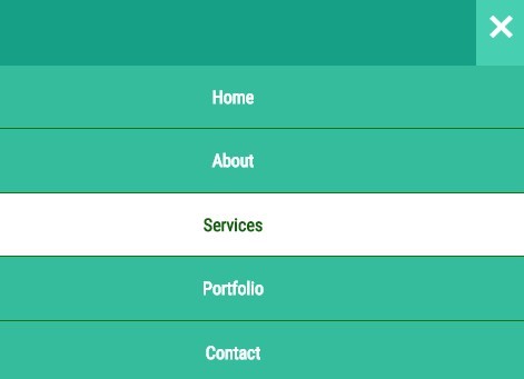
A mobile-friendly responsive menu that slides down from the top of your document, built using HTML, CSS and a little JavaScript (jQuery) magic.
How to use it:
1. Create a hamburger button for the toggle icon.
<header> <button class="hamburger">☰</button> <button class="cross">˟</button> </header>
2. Create a list of links for the menu.
<div class="menu">
  <ul>
    <a href="#"><li>Home</li></a>
    <a href="#"><li>About</li></a>
    <a href="#"><li>Services</li></a>
    <a href="#"><li>Portfolio</li></a>
    <a href="#"><li>Contact</li></a>
  </ul>
</div>
3. The CSS for the hamburger button.
header {
  width: 100%;
  background: #16A085;
  height: 50px;
  line-height: 50px;
}

.hamburger {
  background: none;
  position: absolute;
  top: 0;
  right: 0;
  line-height: 45px;
  padding: 0px 10px 0px 10px;
  color: #fff;
  border: 0;
  font-size: 1.4em;
  font-weight: bold;
  cursor: pointer;
  outline: none;
  z-index: 10000000000000;
}

.cross {
  background: #46CFB0;
  position: absolute;
  top: 0px;
  right: 0;
  padding: 0px 10px 0px 10px;
  color: #fff;
  border: 0;
  height: 50px;
  font-size: 3em;
  line-height: 65px;
  font-weight: bold;
  cursor: pointer;
  outline: none;
  z-index: 10000000000000;
}
4. Style the toggle menu.
.menu {
  z-index: 1000000;
  font-weight: bold;
  font-size: 0.8em;
  width: 100%;
  background: #34BC9D;
  position: absolute;
  text-align: center;
}

.menu ul {
  margin: 0;
  padding: 0;
  list-style-type: none;
  list-style-image: none;
}

.menu li {
  display: block;
  padding: 15px 0 15px 0;
  border-bottom: #1c7317 1px solid;
}

.menu li:hover {
  display: block;
  background: white;
  color: #135e0f;
  padding: 15px 0 15px 0;
}

.menu ul li a {
  text-decoration: none;
  margin: 0px;
  color: #fff;
}

.menu ul li a:hover {
  color: #fff;
  text-decoration: none;
}

.menu a {
  text-decoration: none;
  color: white;
}

.menu a:hover {
  text-decoration: none;
  color: white;
}
5. Load jQuery library at the bottom of the document.
<script src="//ajax.googleapis.com/ajax/libs/jquery/1.11.2/jquery.min.js"></script>
6. Active the responsive toggle menu.
$( ".cross" ).hide();
$( ".menu" ).hide();
$( ".hamburger" ).click(function() {
  $( ".menu" ).slideToggle( "slow", function() {
    $( ".hamburger" ).hide();
    $( ".cross" ).show();
  });
});

$( ".cross" ).click(function() {
  $( ".menu" ).slideToggle( "slow", function() {
    $( ".cross" ).hide();
    $( ".hamburger" ).show();
  });
});
This awesome jQuery plugin is developed by g13nn. For more Advanced Usages, please check the demo page or visit the official website.


