Cool Morphing Sidebar Navigation with jQuery and CSS3
| File Size: | 2.37 KB |
|---|---|
| Views Total: | 14572 |
| Last Update: | |
| Publish Date: | |
| Official Website: | Go to website |
| License: | MIT |
A Material Design inspired navigation pattern that allows you to reveal a sidebar navigation menu by morphing the toggle button. Powered by CSS3 transitions and a little jQuery magic.
See also:
How to use it:
1. Create a full screen overlay to cover the whole page when the navigation is toggled.
<div id="cover"></div>
2. The CSS to style the fullscreen overlay.
#cover {
  opacity: 0;
  visibility: hidden;
  width: 100%;
  height: 100%;
  position: absolute;
  z-index: 1;
  top: 0;
  left: 0;
  -webkit-transition: opacity 0.2s ease-in-out;
  transition: opacity 0.2s ease-in-out;
}

#cover.display {
  background: rgba(0, 0, 0, 0.2);
  opacity: 1;
  visibility: visible;
}
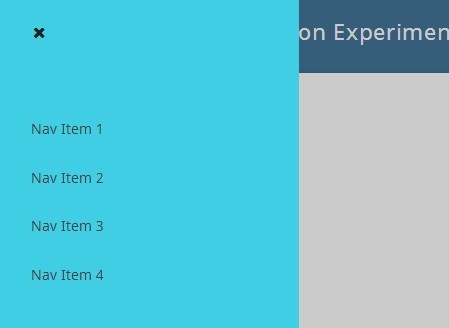
3. Create the Html for the sidebar navigation with a toggle button using Font Awesome icon font.
<nav id="main-nav">
  <div id="nav-button"><span class="fa fa-navicon"></span></div>
  <ul id="nav-list">
    <li><a href="#">Nav Item 1</a></li>
    <li><a href="#">Nav Item 2</a></li>
    <li><a href="#">Nav Item 3</a></li>
    <li><a href="#">Nav Item 4</a></li>
	<li><a href="#">Nav Item 5</a></li>
  </ul>
</nav>
4. The core CSS/CSS3 styles for the morphing navigation & toggle button.
#main-nav {
  z-index: 1;
  width: 300px;
  height: 100%;
  position: fixed;
  overflow: hidden;
  -webkit-transition: background 0.2s ease-in-out;
  transition: background 0.2s ease-in-out;
}

#main-nav.show { background: #3fcee3; }

#nav-button {
  background: #3fcee3;
  height: 3em;
  width: 3em;
  border-radius: 50%;
  box-shadow: 0 2px 5px 0 rgba(0, 0, 0, 0.25);
  top: 1em;
  left: 1em;
  position: relative;
  -webkit-user-select: none;
  -moz-user-select: none;
  -ms-user-select: none;
  user-select: none;
  color: #444;
  -webkit-transition: all 0.3s ease-in-out;
  transition: all 0.3s ease-in-out;
  overflow: hidden;
}

#nav-button .fa {
  position: absolute;
  top: 0;
  left: 0.2em;
  right: 0;
  bottom: 0;
  margin: auto;
  display: block;
  width: 1em;
  height: 1em;
  font-size: 1em;
  opacity: 1;
  -webkit-transition: opacity 0.4s ease-in-out;
  transition: opacity 0.4s ease-in-out;
}

#nav-button:hover {
  cursor: pointer;
  box-shadow: 0 7px 15px 0 rgba(0, 0, 0, 0.3);
  color: #222;
}

#nav-button.width {
  width: 80em;
  height: 80em;
  top: -37.5em;
  left: -37.5em;
  box-shadow: none;
}

#nav-button.width:before {
  content: '';
  display: block;
  width: 0.4em;
  height: 0.4em;
  border-radius: 50%;
  position: absolute;
  top: 0;
  left: 0;
  right: 0;
  bottom: 0;
  margin: auto;
  -webkit-animation: color 0.3s linear;
  animation: color 0.3s linear;
}

@-webkit-keyframes
color {
  0% {
    box-shadow: 0;
  }
 30% {
   box-shadow: 0 0 10px 25px rgba(12, 121, 137, 0.5);
  }
}

@-moz-keyframes
color {
  0% {
    box-shadow: 0;
  }
 30% {
   box-shadow: 0 0 10px 25px rgba(12, 121, 137, 0.5);
  }
}

@keyframes
color {
  0% {
    box-shadow: 0;
  }
  30% {
    box-shadow: 0 0 10px 25px rgba(12, 121, 137, 0.5);
  }
}

#nav-list {
  position: absolute;
  top: 7em;
  padding: 0 0 0 2em;
  opacity: 0;
  -webkit-transition: opacity 0.2s ease-in-out;
  transition: opacity 0.2s ease-in-out;
  width: 100%;
}

#nav-list a {
  color: #444;
  text-decoration: none;
  font-size: 0.9em;
  display: block;
  width: 100%;
  padding: 1.2em 0;
  -webkit-transition: color 0.2s ease-in-out;
  transition: color 0.2s ease-in-out;
}

#nav-list a:hover { color: #111; }

#nav-list.nav-show { opacity: 1; }
5. Include the latest version of jQuery library from a CDN.
<script src="//code.jquery.com/jquery-2.1.1.min.js"></script>
6. The JavaScript to morph the toggle button to a sidebar navigation when clicked.
$('#nav-button').click( function(){
  $(this).toggleClass('width');
  $(this).parent().toggleClass('show');
  $(this).children().toggleClass( 'fa-navicon').toggleClass( 'fa-close');
  $('#nav-list').toggleClass('nav-show'); $('#cover').toggleClass('display');
});
This awesome jQuery plugin is developed by chrisota. For more Advanced Usages, please check the demo page or visit the official website.