Mobile-Aware Responsive Dropdown Menu with jQuery - simpleMobileMenu
| File Size: | 2.94 KB |
|---|---|
| Views Total: | 1681 |
| Last Update: | |
| Publish Date: | |
| Official Website: | Go to website |
| License: | MIT |
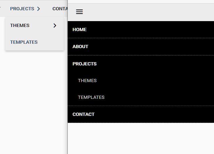
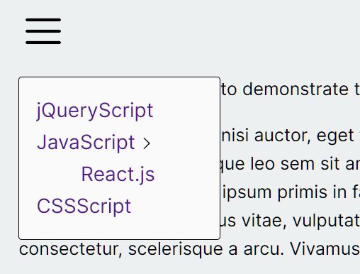
A simple jQuery plugin that turns a horizontal navigation menu into a dropdown toggle menu when the screen size reaches a breakpoint set at 768px.
How to use it:
1. Include the latest version jQuery library at the end of your document.
<script src="//ajax.googleapis.com/ajax/libs/jquery/1.11.1/jquery.min.js"></script>
2. Create a navigation menu using Html unordered list.
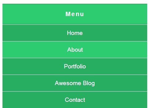
<nav>
  <button id="mobile-nav-trigger">Toggle Menu</button>
  <ul>
    <li><a href="#">Home</a></li>
    <li><a href="#">About</a></li>
    <li><a href="#">Portfolio</a></li>
    <li><a href="#">Awesome Blog</a></li>
    <li><a href="#">Contact</a></li>
  </ul>
</nav>
3. A little CSS to style the navigation menu.
nav {
  font-size: 1.2em;
  background-color: #27ae60;
}

#mobile-nav-trigger {
  display: none;
  width: 100%;
  padding: 20px;
  font-size: inherit;
  font-weight: bold;
  letter-spacing: 2.5px;
  border: 0;
  cursor: pointer;
  color: #fff;
  background-color: inherit;
}

#mobile-nav-trigger.active { background-color: #2ecc71; }

nav ul {
  overflow: hidden;
  margin: 0;
  padding: 0;
  list-style: none;
}

nav li { float: left; }

nav li a {
  display: block;
  padding: 15px;
  text-decoration: none;
  color: #fff;
}

nav li a:hover {
  background-color: #2ecc71;
  -webkit-transition: all 0.4s ease 0s;
  -moz-transition: all 0.4s ease 0s;
  -o-transition: all 0.4s ease 0s;
  transition: all 0.4s ease 0s;
}
 @media screen and (max-width: 768px) {

nav li {
  float: none;
  text-align: center;
  border-top: 1px solid #fff;
}
}
4. The Javascript to enable the mobile-aware menu.
$(document).ready(function() {
var breakpoint  = 768;
var $window     = $(window);
var $navul      = $('nav ul');
var $navtrigger = $('#mobile-nav-trigger');

$navtrigger.on('click', function() {
var $that = $(this);

$that.prop('disabled', true);

$navul.slideToggle(function() {
$that.toggleClass('active').prop('disabled', false);
});
});

if ($window.width() <= breakpoint) {
$navtrigger.show();
$navul.hide();
}

$window.on('resize', function() {
if ($window.width() <= breakpoint) {
if ($navtrigger.is(':hidden')) {
$navtrigger.removeClass('active').show();
$navul.hide();
}
} else {
if ($navtrigger.is(':visible')) {
$navtrigger.hide().removeClass('active');
$navul.show();
}
}
});
});
This awesome jQuery plugin is developed by Bszulc. For more Advanced Usages, please check the demo page or visit the official website.