Multi-Level Drop Down Menu with Pure CSS3 - Minimal Transparent Menu
| File Size: | 834KB |
|---|---|
| Views Total: | 65980 |
| Last Update: | |
| Publish Date: | |
| Official Website: | Go to website |
| License: | MIT |
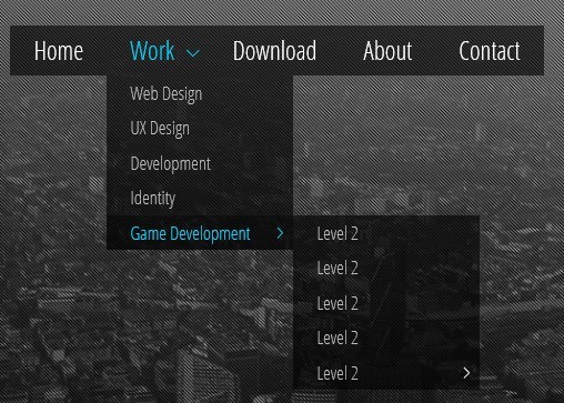
Minimal Transparent Menu is a simple, clean and customizable menu system which supports unlimited menu levels and smooth slide effects. It is compatible with all the modern browsers and currently comes with 4 themes (Blue, Green, Red and yellow). Minimal Transparent Menu is the August's Free File of the Month from Codecanyon. Each register user is entitled to one free regular license.
How to use it:
1. The html
<ul class="nav">
<li><a href="#">Home</a></li>
<li class="dropdown"> <a href="#">Work</a>
<ul>
<li><a href="#">Web Design</a></li>
<li><a href="#">UX Design</a></li>
<li><a href="#">Development</a></li>
<li><a href="#">Identity</a></li>
<li class="dropdown"> <a href="#">Game Development</a>
<ul>
<li><a href="#">Level 2</a></li>
<li><a href="#">Level 2</a></li>
<li><a href="#">Level 2</a></li>
<li><a href="#">Level 2</a></li>
<li class="dropdown"> <a href="#">Level 2</a>
<ul>
<li><a href="#">Level 3</a></li>
<li class="dropdown"> <a href="#">Level 3</a>
<ul>
<li><a href="#">Level 4</a></li>
<li><a href="#">Level 4</a></li>
<li><a href="#">Level 4</a></li>
</ul>
</li>
<li><a href="#">Level 3</a></li>
<li><a href="#">Level 3</a></li>
<li><a href="#">Level 3</a></li>
</ul>
</li>
</ul>
</li>
</ul>
</li>
<li><a href="#">Services</a></li>
<li><a href="#">About</a></li>
<li><a href="#">Contact</a></li>
</ul>
2. The CSS
/* General menu styling */
.nav {
position: relative;
margin: 0;
padding: 0;
line-height: 22px;
}
/* The main navigation link containers */
.nav>li {
display: block;
float: left; /* Displaying them on the same line */
margin: 0;
padding: 0;
}
/* The main navigation links */
.nav>li>a {
/* Layout */
display: block;
position: relative;
padding: 10px 20px;
/* Text */
font-family: "Open Sans Condensed", Arial, Helvetica, sans-serif;
color: #fff;
font-size: 22px;
text-decoration: none;
/* Background */
background: black; /* For older browsers */
background: rgba(0, 0, 0, .6); /* Transparent background for modern browsers */
/* Making the color to change on hover with a transition */
-webkit-transition: color .3s ease-in;
-moz-transition: color .3s ease-in;
-o-transition: color .3s ease-in;
-ms-transition: color .3s ease-in;
}
/* Changing the color on hover */
.nav>li>a:hover, .nav>li:hover>a {
color: #0fd0f9;
}
/* The links which contain dropdowns menu are wider, because they have a little arrow */
.nav>.dropdown>a {
padding: 10px 30px 10px 20px;
}
/* The arrow indicating the dropdown */
.dropdown>a::after {
content: "";
position: absolute;
top: 17px;
right: 10px;
width: 7px;
height: 7px;
-webkit-transform: rotate(45deg);
-ms-transform: rotate(45deg);
-moz-transform: rotate(45deg);
-o-transform: rotate(45deg);
border-bottom: 1px solid #fff;
border-right: 1px solid #fff;
}
/* Changing the color of the arrow on hover */
.dropdown>a:hover::after, .dropdown:hover>a::after {
border-color: #0fd0f9;
}
/* The submenus */
.nav ul {
position: absolute;
margin: 0;
padding: 0;
list-style: none;
display: block;
}
/* General layout settings for the link containers of the submenus */
.nav ul li {
position: absolute;
top: -9999px; /* Hiding them */
height: 0px;
display: block;
margin: 0;
padding: 0;
/* Making them to expand their height with a transition, for a slide effect */
-webkit-transition: height .2s ease-in;
-moz-transition: height .2s ease-in;
-o-transition: height .2s ease-in;
-ms-transition: height .2s ease-in;
}
/* Displays the submenu links, by expading their containers (with a transition, previously defined) and by repositioning them */
.dropdown:hover>ul>li {
height: 30px;
position: relative;
top: auto;
}
/* The submenu links */
.nav ul li a {
/* Layout */
padding: 4px 20px;
width: 120px;
display: block;
position: relative;
/* Text */
font-family: "Open Sans Condensed", Arial, Helvetica, sans-serif;
color: #bbb;
text-decoration: none;
font-size: 16px;
/* Background & effects */
background: black;
background: rgba(0, 0, 0, .6);
-webkit-transition: color .3s ease-in, background .3s ease-in;
-moz-transition: color .3s ease-in, background .3s ease-in;
-o-transition: color .3s ease-in, background .3s ease-in;
-ms-transition: color .3s ease-in, background .3s ease-in;
}
/* Changing the link's color and background on hover */
.nav ul li:hover>a, .nav ul li a:hover {
color: #0fd0f9;
background: rgba(0, 0, 0, .75);
}
/* Making the level 2 (or higher) submenus to appear at the right of their parent */
.nav ul .dropdown:hover ul {
left: 160px;
top: 0px;
}
/* The submenu links have a different arrow which indicates another dropdown submenu */
.nav ul .dropdown a::after {
width: 6px;
height: 6px;
border-bottom: 0;
border-right: 1px solid #fff;
border-top: 1px solid #fff;
top: 12px;
}
/* Changing the color of the arrow on hover */
.nav ul .dropdown:hover>a::after, .nav ul .dropdown>a:hover::after {
border-right: 1px solid #0fd0f9;
border-top: 1px solid #0fd0f9;
}
This awesome jQuery plugin is developed by tiberiualexander. For more Advanced Usages, please check the demo page or visit the official website.