Responsive Multi-purpose Navigation Plugin With jQuery - Pushy
| File Size: | 22 KB |
|---|---|
| Views Total: | 5450 |
| Last Update: | |
| Publish Date: | |
| Official Website: | Go to website |
| License: | MIT |
Pushy is a mobile-friendly jQuery navigation plugin which lets you create responsive push and/or overlay sidebar menus using CSS transforms and transitions.
Basic usage:
1. Add jQuery library and the jQuery Pushy plugin's files to the html page.
<link rel="stylesheet" href="css/pushy.css">
<script src="//code.jquery.com/jquery.min.js"></script>
<script src="js/pushy.js"></script>
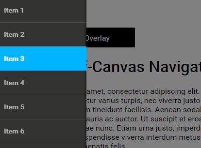
2. Create the Pushy Menu from a navigation list as this:
<nav id="menuSample" class="" >
  <ul>
    <li><a href="#">Item 1</a></li>
    <li><a href="#">Item 2</a></li>
    <li><a href="#">Item 3</a></li>
    <li><a href="#">Item 4</a></li>
    <li><a href="#">Item 5</a></li>
    <li><a href="#">Item 6</a></li>
  </ul>
</nav>
3. Create a menu toggle button which can be placed anywhere on the page.
<div class="menu-pushy-button">Open</div>
4. Call the function on the nav element and done.
$("#menuSample").Pushy({

  // button element
  button: "menuPushyButton",

  // container element
  container: "container",

  // push the container when the menu is active
  containerPush: true,

  // container class when the menu is active
  containerClass: "my-menu",

  // 'left', 'right' or 'top'
  menuPosition: "left",

  // open the menu on page load
  menuOpen: false,

  // shows overlay
  overlayShow: true

});
This awesome jQuery plugin is developed by eduardoestrella. For more Advanced Usages, please check the demo page or visit the official website.