Fixed Bootstrap 4 Vertical Sidebar Navigation
| File Size: | 3.73 KB |
|---|---|
| Views Total: | 15839 |
| Last Update: | |
| Publish Date: | |
| Official Website: | Go to website |
| License: | MIT |
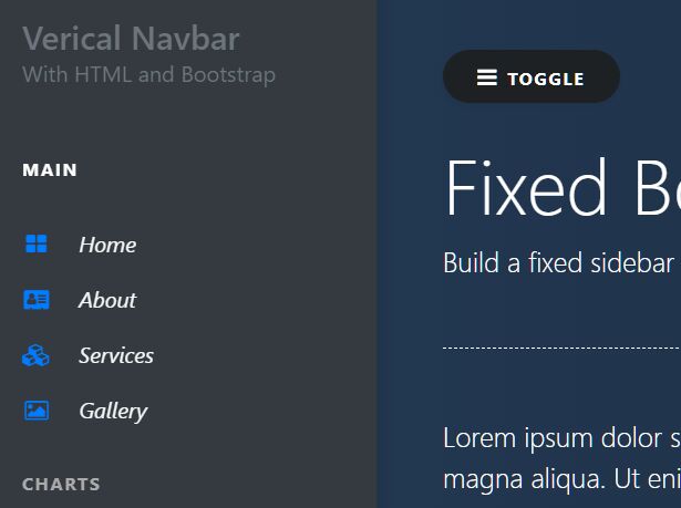
This is a Bootstrap vertical nav script that helps you build a fixed sidebar navigation using Bootstrap 4 navigation and media objects.
Fully responsive and mobile-friendly. The fixed sidebar navigation will automatically hide on mobile devices and only allows the user to toggle it by tapping a trigger element you specify.
How to use it:
1. Import jQuery and Bootstrap 4 framework into the HTML document.
<link rel="stylesheet" href="bootstrap.min.css" />
<script src="jquery.slim.min.js"></script>
<script src="popper.min.js"></script>
<script src="bootstrap.min.js"></script>
2. Code the HTML for the vertical sidebar navigation.
<div class="vertical-nav bg-dark" id="sidebar">
  <div class="py-4 px-3 mb-4 bg-dark">
    <div class="media-body">
      <h4 class="font-weight-white text-muted mb-0">Verical Navbar</h4>
    </div>
  </div>

  <p class="text-white font-weight-bold text-uppercase px-3 small pb-4 mb-0">Main</p>

  <ul class="nav flex-column bg-dark mb-0">
    <li class="nav-item">
      <a href="#" class="nav-link text-light font-italic bg-dark">
        Home
      </a>
    </li>
    <li class="nav-item">
      <a href="#" class="nav-link text-light font-italic">
        About
      </a>
    </li>
    <li class="nav-item">
      <a href="#" class="nav-link text-light font-italic">
        Services
      </a>
    </li>
  </ul>
</div>
3. Create a nav toggle button in your page content.
<div class="page-content p-5" id="content">

  <!-- Toggle button -->
  <button id="sidebarCollapse" type="button" class="btn btn-dark bg-dark rounded-pill shadow-sm px-4 mb-4">
    <small class="text-uppercase font-weight-bold">Toggle</small>
  </button>

  <!-- Page content -->

</div>
4. The necessary CSS styles for the sidebar navigation.
.vertical-nav {
  min-width: 17rem;
  width: 17rem;
  height: 100vh;
  position: fixed;
  top: 0;
  left: 0;
  box-shadow: 3px 3px 10px rgba(0, 0, 0, 0.1);
  transition: all 0.4s;
}

.page-content {
  width: calc(100% - 17rem);
  margin-left: 17rem;
  transition: all 0.4s;
}

/* for toggle behavior */

#sidebar.active {
  margin-left: -17rem;
}

#content.active {
  width: 100%;
  margin: 0;
}

@media (max-width: 768px) {
  #sidebar {
    margin-left: -17rem;
  }
  #sidebar.active {
    margin-left: 0;
  }
  #content {
    width: 100%;
    margin: 0;
  }
  #content.active {
    margin-left: 17rem;
    width: calc(100% - 17rem);
  }
}
5. Enable the toggle button to open/close the sidebar navigation on click/tap.
$(function() {
  $('#sidebarCollapse').on('click', function() {
    $('#sidebar, #content').toggleClass('active');
  });
});
This awesome jQuery plugin is developed by ReverbOD. For more Advanced Usages, please check the demo page or visit the official website.