jQuery Plugin For Nice Dialog Boxes with CSS3 Animations - jConfirm
| File Size: | 805 KB |
|---|---|
| Views Total: | 12005 |
| Last Update: | |
| Publish Date: | |
| Official Website: | Go to website |
| License: | MIT |
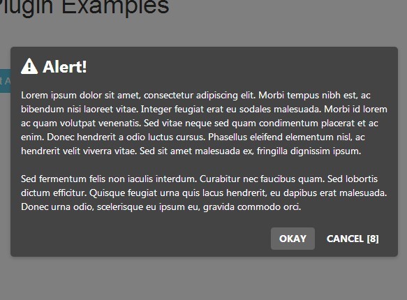
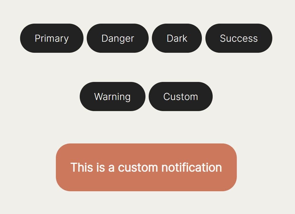
jConfirm is an easy, customizable jQuery dialog box alternative plugin which enables to create nice alert, confirm, and prompt boxes with cool CSS3 powered animations.
Features:
- Gives the default dialog box a nice looking.
- 4 built-in themes.
- 14+ CSS3 based animations.
- Allows to dismiss the dialog via clicking outside the dialog like the Modal.
- Auto closes the dialog within a specified time.
- Works with Bootstrap framework.
Basic Usage:
1. Load the required Bootstrap's stylesheet and the jquery-confirm.css in the head section of the web page.
<link href="//netdna.bootstrapcdn.com/bootstrap/3.3.1/css/bootstrap.min.css" rel="stylesheet" >
<link href="css/jquery-confirm.css" rel="stylesheet">
2. Load the jquery-confirm.js after the jQuery JavaScript library
<script src="//ajax.googleapis.com/ajax/libs/jquery/2.1.3/jquery.min.js"></script>
<script src="js/jquery-confirm.js"></script>
3. Create a basic confirm box with custom title & content.
$.confirm({
  title: 'Confirm Title',
  content: 'Confirm Content'
});
4. Create a basic alert box with custom title & content.
$.alert({
  title: 'Alert Title',
  content: 'Alert Content'
});
5. Create a basic dialog box with custom title & content.
$.dialog({
  title: 'Dialog Title',
  content: 'Dialog Content'
});
6. Customize your dialog boxes with following options & callbacks.
// custom dialog template
template: '' +
'<div class="jconfirm">' +
'<div class="jconfirm-bg jconfirm-bg-h"></div>' +
'<div class="jconfirm-scrollpane">' +
'<div class="container">' +
'<div class="row">' +
'<div class="jconfirm-box-container">' +
'<div class="jconfirm-box" role="dialog" aria-labelledby="labelled" tabindex="-1">' +
'<div class="jconfirm-closeIcon">×</div>' +
'<div class="jconfirm-title-c">' +
'<span class="jconfirm-icon-c"></span>' +
'<span class="jconfirm-title"></span></div>' +
'<div class="jconfirm-content-pane">' +
'<div class="jconfirm-content"></div>' +
'</div>' +
'<div class="jconfirm-buttons">' +
'</div>' +
'<div class="jconfirm-clear">' +
'</div></div></div></div></div></div></div>',
// title of your dialog box
title: 'Hello',
// content of your dialog box
content: 'Are you sure to continue?',
// Custom buttons
buttons: {},
defaultButtons: {
ok: {
action: function () {
}
},
close: {
action: function () {
}
},
},
// callback
contentLoaded: function () {
},
// Icon class prepended before the title.
icon: '',
// if null, the theme's default bg opacity is applied.
bgOpacity: null,
// 'light', 'dark', 'material' & 'bootstrap'
theme: 'light',
// right, left, bottom, top, rotate, none, opacity, scale, zoom, scaleY, scaleX, rotateY, rotateYR (reverse), rotateX, rotateXR (reverse)
animation: 'scale',
closeAnimation: 'scale',
// animation speed
animationSpeed: 400,
// animation bounce
animationBounce: 1.5,
// if false, escapeKey wont work,
// if true, will work, but no callbacks,
// if string, will be assigned to button.
escapeKey: true,
// enable Right To left
rtl: false,
// parent container
container: 'body',
// If true, will use the container-fluid layout, to use the full browser width.
containerFluid: false,
// dismiss the dialog via clicking outside the dialog
backgroundDismiss: true,
// Animation to perform to grab the user's attention when user clicks out of the box.
backgroundDismissAnimation: 'shake',
// Auto-close the dialog within a specified time
// e.g. 'confirm|400'
autoClose: false,
// Close icon comes into picture if both the buttons are disabled, (dialog mode).
// You may remove the close icon by settings this value to false.
closeIcon: true,
// By default jQuery confirm uses × html entity for this close symbol. You can provide icon class here to change it.
closeIconClass: false,
// Provides a better way to set Custom width and is responsive.
// You can also set custom widths for different display sizes using the Bootstraps grid.
columnClass: 'col-md-4 col-md-offset-4 col-sm-6 col-sm-offset-3 col-xs-10 col-xs-offset-1',
// Watch the modal for changes and is centered on screen.
watchInterval: 100,
// Callbacks
onContentReady: function () {
},
onOpenBefore: function () {
},
onOpen: function () {
},
onClose: function () {
},
onDestroy: function () {
},
onAction: function () {
}
Changelogs:
v3.3.4 (2019-01-11)
- Safari height bug fix.
- Fix isClosed bug for firefox.
- Remove scroll to top when content height changes.
- added support for AMD and commonJS
v3.3.3 (2019-01-01)
- Safari height bug fix.
- Fix isClosed bug for firefox.
- Remove scroll to top when content height changes.
- added support for AMD and commonJS
v3.3.2 (2017-08-16)
- Added payload callback to onClose method
v3.3.1 (2017-08-11)
- Pass 'false' in buttons property to remove all buttons in $.confirm and $.alert
v3.3.0 (2017-08-10)
- Moved overflow scroll inside modal
- Improved draggable
- Added 'animateFromElement' method
- Added 'smoothScroll' option
- Added 'hilight' option
- Added 'showLoading','hideLoading' option
- Accept jquery dom element in content
- Updated docs
- 'setDialogCenter' method deprecated, dialog centered with CSS tables
- 'alignMiddle' method deprecated
2017-06-22
- Fixed child margins don't affect parent height
v3.2.3 (2017-05-22)
- bug fixes
v3.2.1 (2017-04-18)
- bug fixes
v3.2.0 (2017-03-20)
- bug fixes
v3.1.1 (2017-03-09)
- bug fixes
v3.1.0 (2017-02-20)
- support for bootstrap v4, justify center
- remove buttons, only auto fill buttons if its initiated using shortcode.
v3.0.3 (2017-01-14)
- Fixes and updates.
v3.0.2 (2017-01-11)
- Fixes and updates.
v3.0.1 (2016-11-08)
- Fixes and updates.
v2.5.1 (2016-03-28)
- Fixes
v2.5.0 (2016-01-22)
- Added closeIconClass
- Added this.$target
- Changed modal template
- Watches modal for new changes auto set to center
- New documentation
- Added new theme 'material' and 'bootstrap'
- Removed themes 'holodark' and 'hololight'
- Improved performance
v2.0.0 (2015-11-21)
- Added closeAnimation
- Added $('a').confirm() to emulate confirm();
- Smoother animations
- Changed backgroundDismiss animation
- Updated documentations
v1.8.0 (2015-11-08)
- Minor bug fixes
v1.7.8 (2015-10-21)
- KeyboardEnabled now doesn't work when input elements are focused in modal.
v1.7.8 (2015-09-13)
- RTL support
- Option to select keyboard keys
v1.7.5 (2015-08-04)
- Callbacks added, onOpen, onClose, onAction
v1.7.3 (2015-07-14)
- Fix show and hide for closeIcon
- Improved animations, more CSS
- setContent method improved.
- setTitle method added.
v1.7.0 (2015-07-06)
- Option for custom width added (using bootstrap grid)
- Text overflow logic changed
- Documentation & improvements to contentLoaded callback.
This awesome jQuery plugin is developed by craftpip. For more Advanced Usages, please check the demo page or visit the official website.