Dynamic Mobile-friendly Responsive Table Plugin - RWD Reflow Table
| File Size: | 131 KB |
|---|---|
| Views Total: | 5396 |
| Last Update: | |
| Publish Date: | |
| Official Website: | Go to website |
| License: | MIT |

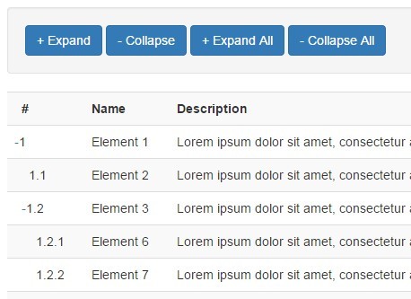
RWD Reflow Table is a dynamic, flexible, responsive table jQuery plugin designed for cross-platform tabular data presentation.
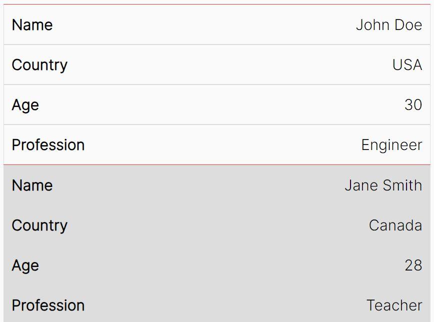
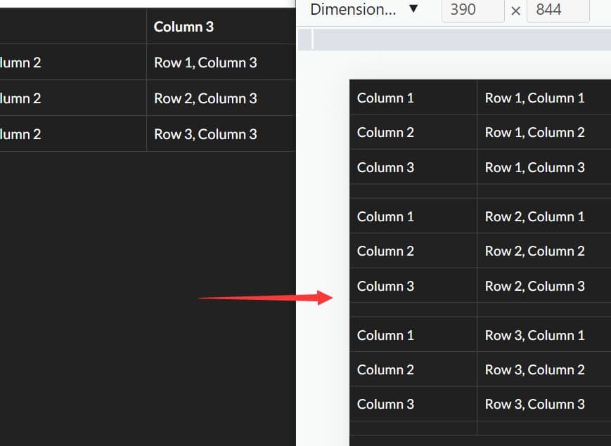
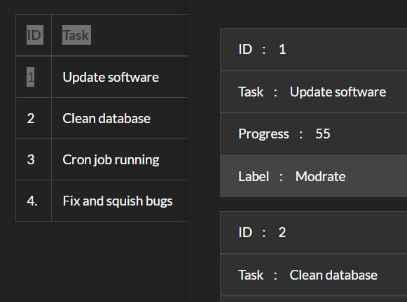
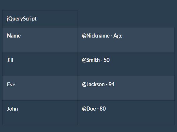
The plugin detects the table content and window resize event and automatically switches between Mobile Mode and Desktop Mode depending on the current screen width.
Works perfectly with the Bootstrap framework and easy to integrate with the jQuery DataTables plugin.
How to use it:
1. Insert the RWD Reflow Table plugin's files after jQuery library is loaded in the document.
<link href="dist/css/reflow-table.css" rel="stylesheet">
<script src="https://code.jquery.com/jquery-3.3.1.slim.min.js"
        integrity="sha384-q8i/X+965DzO0rT7abK41JStQIAqVgRVzpbzo5smXKp4YfRvH+8abtTE1Pi6jizo"
        crossorigin="anonymous">
</script>
<script src="dist/js/reflow-table.js"></script>
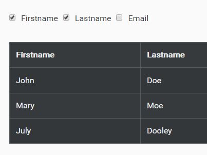
2. Just call the function reflowTable() on the HTML table and done. Note that your HTML table must have thead and tbody elements as follows:
<table class="table">
  <thead>
    <tr>
      <th>Firstname</th>
      <th>Lastname</th>
      <th>Email</th>
    </tr>
  </thead>
  <tbody>
    <tr>
      <td>John</td>
      <td>Doe</td>
      <td>[email protected]</td>
    </tr>
    <tr>
      <td>Mary</td>
      <td>Moe</td>
      <td>[email protected]</td>
    </tr>
    <tr>
      <td>July</td>
      <td>Dooley</td>
      <td>[email protected]</td>
    </tr>
  </tbody>
</table>
$(function(){

  $(".table").reflowTable();

});
3. Possible options.
$(".table").reflowTable({

  // namespace
  namespace: 'reflow-table'  Table namespace for unbind

  // width ratio in mobile mode
  widthRatio: '50',

  // width size in mobile mode. (xs, sm, md, lg)
  widthSize: null,

  // thead element with table titles used to build mobile mode for current tbody
  thead: '.your_thead'

});
4. Callback functions which will be fired when the mobile mode is on or off.
$(".table").reflowTable({
  eventMobileOn: function(){},
  eventMobileOff: function(){}
});
5. API methods.
// update the table after the data changed
$(".table").reflowTable('update');

// toggle mobile mode
reflowTable.mobileMode(true);

// destroy the plugin
reflowTable.destroy();
6. Event handlers.
$(".table").on('reflow-table.mobile.on', function() {
  // Mobile mode is now ON
});

$(".table").on('reflow-table.mobile.off', function() {
  // Mobile mode is now OFF
});
Changelog:
2019-01-19
- Optimize CSS for table
2019-01-12
- Remove td hidden overflow
This awesome jQuery plugin is developed by yidas. For more Advanced Usages, please check the demo page or visit the official website.