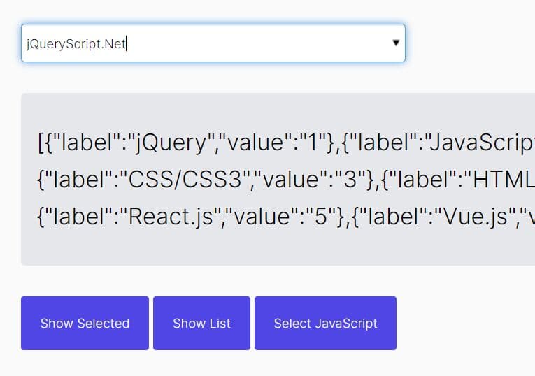
Beautiful Select Element Replacement Solution with jQuery and CSS3
| File Size: | 7.77KB |
|---|---|
| Views Total: | 4632 |
| Last Update: | |
| Publish Date: | |
| Official Website: | Go to website |
| License: | MIT |

In this tutorial, we're going to create a beautiful and touch enabled alternative solution to standard html select elements with well-design and transition effect, built only with CSS3 and jQuery.
You might also like:
- Form Select Element Replacement Plugin - Mighty Form Styler
- Default Checkbox Replacement Plugin - jQuery prettyCheckable
- Standard Select Form Replacement Plugin - Selectik
- Select Boxes Replacement Plugin - Select2
- jQuery Plugin For Custom Select Menus
- jQuery Multiple Select Element Replacement Plugin - selectlist
How to use it:
1. Include necessary javascript files in your head section
<script src="modernizr.js"></script>
<script src="https://ajax.googleapis.com/ajax/libs/jquery/1.9.1/jquery.min.js"></script>
2. Markup Html Structure
<form>
<fieldset class="radio-container">
<div class="radio-options">
<div class="toggle">Choose your beer</div>
<ul>
<li>
<input type="radio" name="my-beer" id="choice1" value="choice1">
<label for="choice1">Cul Dorcha</label>
</li>
<li>
<input type="radio" name="my-beer" id="choice2" value="choice2">
<label  for="choice2">Rowers Red Ale</label>
</li>
<li>
<input type="radio" name="my-beer" id="choice3" value="choice3">
<label for="choice3">Belfast Ale</label>
</li>
<li>
<input type="radio" name="my-beer" id="choice4" value="choice4">
<label for="choice4">O'Hara Irish Stout</label>
</li>
</ul>
</div>
</fieldset>
</form>
3. The CSS
form {
margin: 2em auto 1em;
width: 300px;
position: relative;
}
.radio-container {
position: relative;
height: 4em;
font-size: 1.5em;
line-height: 1;
color: #d6ebe0;
}
.no-touch .radio-container:hover, .radio-container.active {
z-index: 9999;
}
.radio-options {
position: absolute;
max-height: 3em;
width: 100%;
overflow: hidden;
-webkit-transition: 0.7s;
-moz-transition: 0.7s;
-o-transition: 0.7s;
transition: 0.7s;
}
.radio-options ul {
margin-top: 18px;
-webkit-transition: 0.5s;
-moz-transition: 0.5s;
-o-transition: 0.5s;
transition: 0.5s;
}
.radio-options li {
position: absolute;
top: 0;
left: 0;
width: 100%;
height: 100%;
}
.radio-options label {
display: block;
padding: 0.75em;
background: #36c875;
opacity: 0;
-webkit-transition: 0s;
-moz-transition: 0s;
-o-transition: 0s;
transition: 0s;
}
.radio-options input {
position: absolute;
top: 0;
left: 0;
width: 300px;
height: 3em;
opacity: 0;
z-index: 1;
cursor: pointer;
}
.radio-options input:checked ~ label {
position: absolute;
top: 0;
left: 0;
right: 0;
opacity: 1;
z-index: 2;
padding: 0.75em;
background: #1b9e4d;
border-radius: 10px;
}
.no-touch .radio-options li:hover label {
background: #25b45f;
}
.radio-options .checked label {
position: absolute;
top: 0;
left: 0;
right: 0;
padding: 0.75em;
background: #1b9e4d;
visibility: visible;
z-index: 2;
}
.no-touch .radio-options:hover, .active .radio-options {
max-height: 100em;
}
.no-touch .radio-options:hover ul, .active .radio-options ul {
position: relative;
margin-top: 9px;
}
.no-touch .radio-options:hover li, .active .radio-options li {
position: relative;
}
.no-touch .radio-options:hover label, .active .radio-options label {
opacity: 1;
-webkit-transition: 0.5s;
-moz-transition: 0.5s;
-o-transition: 0.5s;
transition: 0.5s;
}
.no-touch .radio-options:hover input:checked ~ label, .active .radio-options input:checked ~ label {
position: static;
border-radius: 0;
}
.no-touch .radio-options:hover .checked label {
position: static;
}
.no-touch .radio-options:hover ul:before, .active .radio-options ul:before {
content: "";
position: absolute;
width: 0px;
height: 0px;
right: 0.75em;
margin-right: -4px;
top: -9px;
border-style: solid;
border-width: 0 9px 9px 9px;
border-color: transparent transparent #36c875 transparent;
-webkit-transform: rotate(360deg);
}
.radio-options .toggle {
position: relative;
cursor: pointer;
padding: 0.75em;
background: #1b9e4d;
border-radius: 10px;
z-index: 1;
}
.radio-options .toggle:before {
content: "";
border-style: solid;
border-width: 5px 0 5px 8.7px;
border-color: transparent transparent transparent #d6ebe0;
height: 0px;
position: absolute;
right: 0.75em;
top: 50%;
margin-top: -5px;
width: 0px;
-webkit-transform: rotate(360deg);
}
.no-touch .radio-options:hover .toggle:before, .active .radio-options .toggle:before {
border-width: 8.7px 5px 0 5px;
border-color: #d6ebe0 transparent transparent transparent;
margin-top: -2px;
}
.radio-options input:checked ~ label:before {
content: "";
border-style: solid;
border-width: 5px 0 5px 8.7px;
border-color: transparent transparent transparent #d6ebe0;
height: 0px;
position: absolute;
right: 0.75em;
top: 50%;
margin-top: -5px;
width: 0px;
-webkit-transform: rotate(360deg);
}
.radio-options li.checked label:before {
content: "";
border-style: solid;
border-width: 5px 0 5px 8.7px;
border-color: transparent transparent transparent #d6ebe0;
height: 0px;
position: absolute;
right: 0.75em;
top: 50%;
margin-top: -5px;
width: 0px;
-webkit-transform: rotate(360deg);
}
.no-touch .radio-options:hover input:checked ~ label:before, .active .radio-options input:checked ~ label:before {
content: none;
}
.no-touch .radio-options:hover li.checked label:before {
content: none;
}
.no-opacity .radio-options label {
visibility: hidden;
}
.no-opacity .radio-options:hover label {
visibility: visible;
}
.no-opacity .radio-options li.checked label {
visibility: visible;
}
.no-opacity input {
-ms-filter: "progid:DXImageTransform.Microsoft.Alpha(Opacity=0)";
}
4. The javascript
<script>
$(document).ready(function(){
	if (Modernizr.touch) {
			$(".radio-options").bind("click", function(event) {
				if (!($(this).parent('.radio-container').hasClass("active")))	{
				$(this).parent('.radio-container').addClass("active");
				event.stopPropagation();
				}
			});
	$(".toggle").bind("click", function(){
		$(this).parents('.radio-container').removeClass("active");
		return false;
		 });
	}
})
</script>

<!--[if (IE 8)]>
<script>
	$(document).ready(function(){
		$(".radio-options li").bind("click", function() {
			$(this).siblings(".checked").removeClass("checked");
			$(this).addClass("checked");
			});
	});
</script>
<![endif]-->
This awesome jQuery plugin is developed by unknown. For more Advanced Usages, please check the demo page or visit the official website.