Beautiful Multi-Select Dropdown List Plugin - jQuery select-beauty
| File Size: | 1.3 MB |
|---|---|
| Views Total: | 10294 |
| Last Update: | |
| Publish Date: | |
| Official Website: | Go to website |
| License: | MIT |
Yet another select box replacement jQuery plugin that transforms the regular select into an HTML list based multi-select dropdown list with icons support.
How to use it:
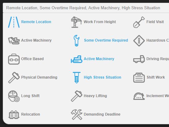
1. Add the icon attribute to your select options as follows:
<select name="example" id="example">
  <option value="1" icon="iw-way">Remote Location</option>
  <option value="2" icon="iw-crane">Work From Height</option>
  <option value="3" icon="iw-scope">Field Visit</option>
  ... more options here ...
</select>
2. Add jQuery library (slim build) and the select-beauty.js script to the webpage.
<script src="https://code.jquery.com/jquery-3.3.1.slim.min.js"
        integrity="sha384-q8i/X+965DzO0rT7abK41JStQIAqVgRVzpbzo5smXKp4YfRvH+8abtTE1Pi6jizo"
        crossorigin="anonymous">
</script>
<script src="select-beauty.js"></script>
3. Initialize the plugin.
var beauty = new SelectBeauty({
    el: '#example' // required
});
4. This will transform the select element into an unordered html list:
<div class="select-beauty" data-instance="#example">
  <button class="button-sb button-sb-block">Select Something</button>
  <ul class="">

    <li>
      <a href="#" data-value="1"><i class="iw iw-way"></i> Remote Location</a>
    </li>

    <li>
      <a href="#" data-value="2"><i class="iw iw-crane"></i> Work From Height</a>
    </li>

    <li>
      <a href="#" data-value="3"><i class="iw iw-scope"></i> Field Visit</a>
    </li>

    ...

  </ul>
</div>
5. Style the generated multi-select dropdown list.
.button-sb {
  padding: 8px 10px;
  background: #f2f2f2;
  border: 1px solid #ccc;
  border-radius: 3px;
  color: #818181;
  font-family: sans-serif;
  outline: none;
  transition: all .3s ease-in-out;
}

.button-sb:hover {
  background: #818181;
  color: #fff;
}

.button-sb-block {
  display: block;
  width: 100%;
}

.hide { display: none; }

.select-beauty {
  position: relative;
  display: block;
}

.select-beauty button {
  background: #f2f2f2;
  border: 1px solid #ccc;
  color: #818181;
  text-align: left;
}

.select-beauty ul {
  position: absolute;
  padding: 0 15px;
  margin: 0;
  list-style: none;
  background: #f2f2f2;
  left: 0;
  right: 0;
  z-index: 2;
  border-bottom-left-radius: 20px;
  border-bottom-right-radius: 20px;
  box-shadow: 0px 10px 10px 2px rgba(0,0,0,.09);
  border: 1px solid #ccc;
  border-top: none;
  top: auto;
}

.select-beauty ul li {
  float: left;
  width: 33.333%;
}

.select-beauty ul li a {
  display: block;
  font-size: 12px;
  padding: 10px 0;
  color: #818181;
  font-weight: 600;
  /* text-align: center; */
  font-family: sans-serif;
  text-decoration: none !important;
  transition: all .2s ease-in-out;
}

.select-beauty ul li a:hover, .select-beauty ul li.active a { color: #2aabe4; }
6. The example CSS for the icons. In this example, the plugin uses a sprite image for the icons.
.iw {
  background-image: url('../img/sprite.png');
  width: 40px;
  height: 40px;
  background-size: 40px;
  background-repeat: no-repeat;
  display: inline-block;
  /* margin: 1px 10px 1px 0px; */
  vertical-align: middle;
}

.iw-dozer { background-position: 0px -40px; }
7. Set the placeholder of the select.
var beauty = new SelectBeauty({
    el: '#example' // required
    placeholder: "Select Something"
});
8. Set the max number of options to be selectable.
var beauty = new SelectBeauty({
    el: '#example' // required
    max: 10 // default: false
});
9. Set the max length of selected options.
var beauty = new SelectBeauty({
    el: '#example' // required
    length: 5 // default: 3
});
10. API methods.
// reloads the plugin
beauty.reload();

// gets temporary data
beauty.getTemporaryData();

// gets temporary data as an object
beauty.tempData();

// returns value of the select option as an array
beauty.selected();
Changelog:
2019-12-10
- Enhancement: add default selected value
This awesome jQuery plugin is developed by satriaajiputra. For more Advanced Usages, please check the demo page or visit the official website.