Simple Input Mask & Validation Plugin With jQuery - maskedinput
| File Size: | 309 KB |
|---|---|
| Views Total: | 24999 |
| Last Update: | |
| Publish Date: | |
| Official Website: | Go to website |
| License: | MIT |
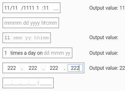
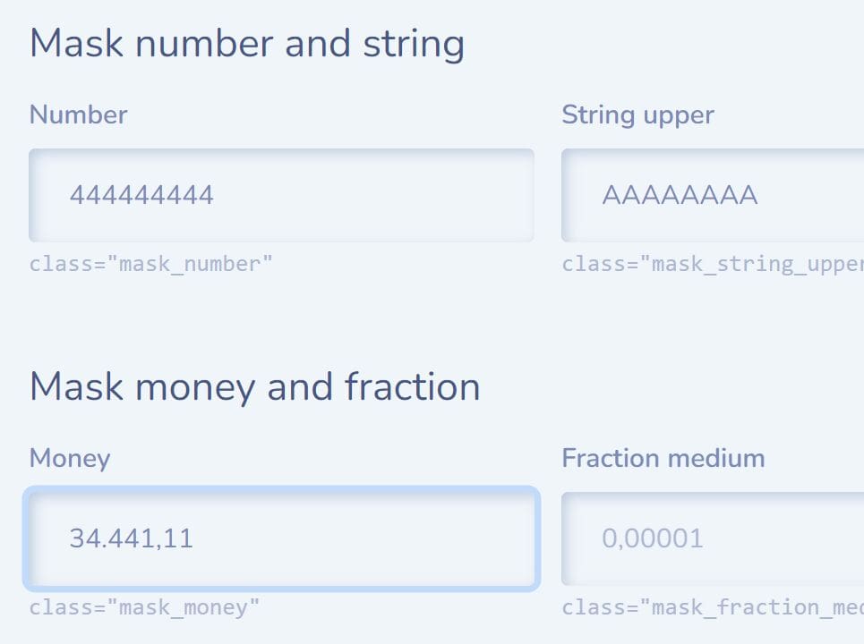
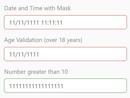
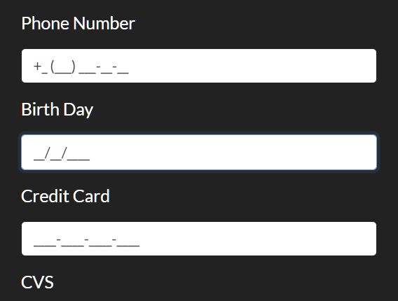
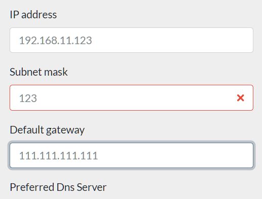
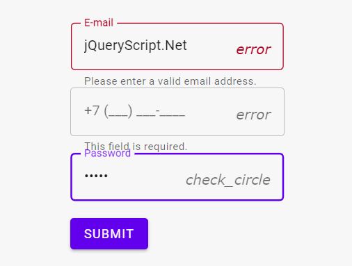
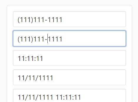
maskedinput is a simple yet fully configurable jQuery input mask plugin that allows the user to type characters in fixed position in a certain format. Great for date / IP address / currency input fields.
More features:
- Live data validation.
- Allows multiple masks in one field.
- Fully accessible via ARIA attributes.
- Custom regex pattern.
- Lots of options and API.
How to use it:
1. Include the necessary JavaScript libraries on the page.
<script src="/path/to/cdn/jquery.slim.min.js"></script>
<script src="/path/to/dist/jquery.maskedinput.umd.min.js"></script>
2. Create a new MaskedInput object and set the data format as follows:
var dateMask = new MaskedInput({
    format: 'dd/MM/yyyy hh:mm tt',
    // additional patterns to recognize the format
    patterns: {}
});
3. Append the date mask to a given input.
dateMask.$el.appendTo('#date-field-cell');
4. Set the options for each field:
dateMask
  .fieldOption('hours_12', 'required', false)
  .fieldOption('minutes', 'required', false)
  .fieldOption('ampm', 'required', false)
  .resize();
5. API methods.
dateMask

// Get an internal field element by index or by name.
.field(index)

// Get/set a field's configuration option
.fieldOption(name, newValue)

// Get/set an internal field's value by index or by name.
.fieldValue(index, newValue)

// Get/set a configuration option
.option(name, newValue)

// Call if something has drastically changed and the control needs to be regenerated.
// Only applicable when you've manually changed a field's type.
.render()

// Update the size of the field's content.
// This can't be called when the control is not on the DOM yet. If you don't want the field to be dynamically sized, you can skip calling this.
.resize()

// A synonym for value
.val(newValue?)

// Get/set the full value
.value(newValue?)
7. PartType parameters:
/**
* @typedef {String} MaskedInput~PartType
* @name MaskedInput~PartType
* @enum {String}
*/
var PartType = {
  /** @const */ NUMBER: 'number',
  /** @const */ TEXT: 'text',
  /** @const */ LABEL: 'label'
};
8. MaskedInput Part parameters:
- type: Type of the field
- name: Name for this field
- ariaLabel: An ARIA accessibility label
- text: Text for this field if it's a LABEL
- placeholder: Placeholder for the field
- length: Length of the field
- maxLength: Maximum length of the field
- numericMin: Minimum numeric value
- numericMax: Maximum numeric value
- wholeNumber: Force the number to be whole? (default `false`)
- validator: Validator regex or function
- options: Options to choose from for textual field
- postProcess: Function for post processing a value before retrieving by user
- padding: Enable padding in value result (default `true`)
- required: Is the field required (default `true`)
- defaultValue: Default value, used if field is not `required`
- forcePlaceholderWidth: Always consider placeholder's width (default `true`)
9. MaskedInput Pattern parameters:
- pattern: Pattern to recognize in the format
- type: Type of the field
- name: Name for this field
- ariaLabel: An ARIA accessibility label
- text: Text for this field if it's a LABEL
- placeholder: Placeholder for the field
- length: Length of the field
- maxLength: Maximum length of the field
- numericMin: Minimum numeric value
- numericMax: Maximum numeric value
- wholeNumber: Force the number to be whole? (default `false`)
- validator: Validator regex or function
- options: Options to choose from for textual field
- postProcess: Function for post processing a value before retrieving by user
- padding: Enable padding in value result (default `true`)
- required: Is the field required (default `true`)
- defaultValue: Default value, used if field is not `required`
- forcePlaceholderWidth: Always consider placeholder's width (default `true`)
10. MaskedInput options:
- format: Format to show
- patterns: Additional patterns to recognize in the format
Changelog:
2022-12-09
- v1.0.15: [feature] fieldCount/fieldKeys getters
2022-01-11
- v1.0.14: [fix] undefined error when passing existing root element
2022-01-10
- v1.0.13: [feature] allow attaching to existing root element
2021-04-26
- v1.0.12: Bugfix
2021-04-21
- v1.0.11: Added defaultPartOptions
2021-01-03
- v1.0.10
2018-12-07
- v1.0.8: Added enable/disable methods
2017-05-09
- v1.0.7: js update
2017-05-04
- v1.0.5: Allow clearing the field using .val('')
2017-01-15
- v1.0.4
This awesome jQuery plugin is developed by danielgindi. For more Advanced Usages, please check the demo page or visit the official website.