iCheck: Custom Checkboxes & Radio Buttons for jQuery
| File Size: | 460 KB |
|---|---|
| Views Total: | 39958 |
| Last Update: | |
| Publish Date: | |
| Official Website: | Go to website |
| License: | MIT |
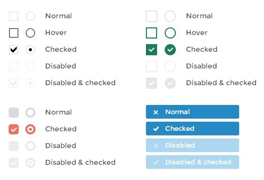
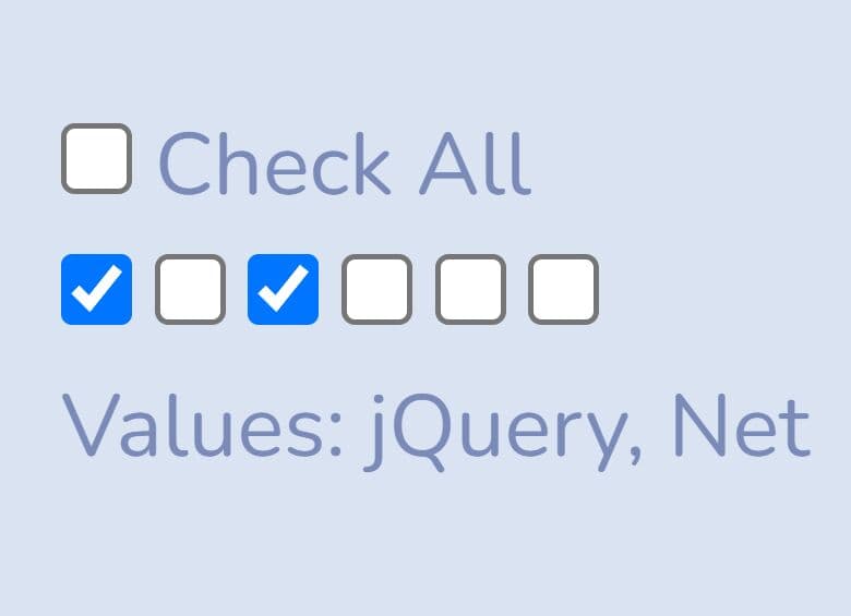
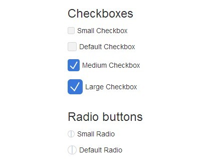
iCheck is a jQuery plugin for styling native checkboxes and radio buttons with custom skins while keeping the original input state available to forms and scripts.
It currently includes 6 skin families, 32 options, nine methods, and 11 callbacks for checked, disabled, indeterminate, and lifecycle state changes.
Features:
- 6 skins: Minimal, Square, Flat, Line, Polaris, and Futurico.
- Color variants for the Minimal, Square, Flat, and Line skins.
- Programmatic check, uncheck, toggle, enable, disable, indeterminate, update, and destroy methods.
- Eleven callbacks for input state changes and plugin lifecycle events.
- Keyboard interaction for customized checkbox and radio inputs.
- Optional ARIA attributes for screen reader support.
- Custom wrapper class names, label hover states, clickable-area adjustment, and inserted HTML.
See also:
- 10 Best Custom Checkbox And Radio Input Replacements
- 10 Best Toggle Switch Plugins
- Top 10 Checkbox & Radio Button Replacement Libraries
- jQuery Plugin For Multiple Select With Checkboxes - multi-select.js
Basic Usage:
1. Include jQuery library and iCheck plugin in the head section of your web page
<script src="/path/to/cdn/jquery.min.js"></script>
<script src="/path/to/icheck.min.js"></script>
2. Choose a skin CSS and include it on the web page. The plugin now has 6 skins (and 10 color variants, respectively)
- Black — minimal.css
- Red — red.css
- Green — green.css
- Blue — blue.css
- Aero — aero.css
- Grey — grey.css
- Orange — orange.css
- Yellow — yellow.css
- Pink — pink.css
- Purple — purple.css
<!-- All In One -->
<link href="skins/all.css" rel="stylesheet" />

<!-- Flat Theme -->
<link href="skins/flat/red.css" rel="stylesheet" />

<!-- Futurico Theme -->
<link href="skins/futurico/red.css" rel="stylesheet" />

<!-- Line Theme -->
<link href="skins/line/red.css" rel="stylesheet" />

<!-- Minimal Theme -->
<link href="skins/minimal/red.css" rel="stylesheet" />

<!-- Polaris Theme -->
<link href="skins/polaris/red.css" rel="stylesheet" />

<!-- Square Theme -->
<link href="skins/square/red.css" rel="stylesheet" />
3. Create checkboxes and radio buttons on the page.
<input type="checkbox">
<input type="checkbox" checked>
<input type="radio" name="iCheck">
<input type="radio" name="iCheck" checked>
4. Activate the plugin and done.
$('input').iCheck({
  checkboxClass: 'icheckbox_minimal',
  radioClass: 'iradio_minimal'
});
5. Full plugin options with default values.
$('input').iCheck({

  // 'checkbox' or 'radio' to style only checkboxes or radio buttons, both by default
  handle: '',

  // base class added to customized checkboxes
  checkboxClass: 'icheckbox',

  // base class added to customized radio buttons
  radioClass: 'iradio',

  // class added on checked state (input.checked = true)
  checkedClass: 'checked',

  // if not empty, used instead of 'checkedClass' option (input type specific)
  checkedCheckboxClass: '',
  checkedRadioClass: '',

  // if not empty, added as class name on unchecked state (input.checked = false)
  uncheckedClass: '',

  // if not empty, used instead of 'uncheckedClass' option (input type specific)
  uncheckedCheckboxClass: '',
  uncheckedRadioClass: '',

  // class added on disabled state (input.disabled = true)
  disabledClass: 'disabled',

  // if not empty, used instead of 'disabledClass' option (input type specific)
  disabledCheckboxClass: '',
  disabledRadioClass: '',

  // if not empty, added as class name on enabled state (input.disabled = false)
  enabledClass: '',

  // if not empty, used instead of 'enabledClass' option (input type specific)
  enabledCheckboxClass: '',
  enabledRadioClass: '',

  // class added on indeterminate state (input.indeterminate = true)
  indeterminateClass: 'indeterminate',

  // if not empty, used instead of 'indeterminateClass' option (input type specific)
  indeterminateCheckboxClass: '',
  indeterminateRadioClass: '',

  // if not empty, added as class name on determinate state (input.indeterminate = false)
  determinateClass: '',

  // if not empty, used instead of 'determinateClass' option (input type specific)
  determinateCheckboxClass: '',
  determinateRadioClass: '',

  // class added on hover state (pointer is moved onto input)
  hoverClass: 'hover',

  // class added on focus state (input has gained focus)
  focusClass: 'focus',

  // class added on active state (mouse button is pressed on input)
  activeClass: 'active',

  // adds hoverClass to customized input on label hover and labelHoverClass to label on input hover
  labelHover: true,

  // class added to label if labelHover set to true
  labelHoverClass: 'hover',

  // increase clickable area by given % (negative number to decrease)
  increaseArea: '',

  // true to set 'pointer' CSS cursor over enabled inputs and 'default' over disabled
  cursor: false,

  // set true to inherit original input's class name
  inheritClass: false,

  // if set to true, input's id is prefixed with 'iCheck-' and attached
  inheritID: false,

  // set true to activate ARIA support
  aria: false,

  // add HTML code or text inside customized input
  insert: ''

});
6. API methods.
// check/uncheck
$('input').iCheck('check');
$('input').iCheck('uncheck');

// toggle between states
$('input').iCheck('toggle');

// enable/disable
$('input').iCheck('disable');
$('input').iCheck('enable');

// set state to indeterminate
$('input').iCheck('indeterminate');
$('input').iCheck('determinate');

// apply input changes
$('input').iCheck('update');

// destroy
$('input').iCheck('destroy');
7. Event handlers.
$('input').on('ifClicked', function(event){
  // do something
});

$('input').on('ifChanged', function(event){
  // do something
});

$('input').on('ifChecked', function(event){
  // do something
});

$('input').on('ifUnchecked', function(event){
  // do something
});

$('input').on('ifToggled', function(event){
  // do something
});

$('input').on('ifDisabled', function(event){
  // do something
});

$('input').on('ifEnabled', function(event){
  // do something
});

$('input').on('ifIndeterminate', function(event){
  // do something
});

$('input').on('ifDeterminate', function(event){
  // do something
});

$('input').on('ifCreated', function(event){
  // do something
});

$('input').on('ifDestroyed', function(event){
  // do something
});
Changelog:
v1.0.3 (2020-10-09)
- iOS 13 support
- fire change event when toggled
- Doc updated
2015-02-19
- add dppx unit to HiDPI support
2015-02-19
- add dppx unit to HiDPI support
v1.0.2 (2014-03-04)
- Better HiDPI screens support.
v1.0.0 (2013-12-18)
- Added ARIA attributes support (for VoiceOver and others)
- Added Amazon Kindle support
- Fixed clickable links inside labels
- Fixed lines separation between labels and inputs
- Merged two versions of the plugin (jQuery and Zepto) into one
- Fixed demo links
- Fixed callbacks
v0.9.1 (2013-09-22)
- Add support for Kindle Fire HD
This awesome jQuery plugin is developed by dargullin. For more Advanced Usages, please check the demo page or visit the official website.