Searchable Tree Multi-Select for jQuery - jqTreeSelect
| File Size: | 53.7 KB |
|---|---|
| Views Total: | 5 |
| Last Update: | |
| Publish Date: | |
| Official Website: | Go to website |
| License: | MIT |

jqTreeSelect is a jQuery-based, tree-structured multi-select control that turns a native <select multiple> into a collapsible, searchable dropdown with group hierarchy and badges.
It's ideal for permission editors, category filters, reporting controls, and large forms where users need to browse grouped values before they submit several selections.
Features:
- Renders a dropdown with tree-nested options from
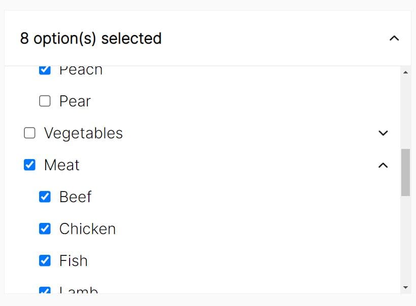
<optgroup>or a nested JSON array. - Supports flat lists, single-level groups, and deep subgroup trees.
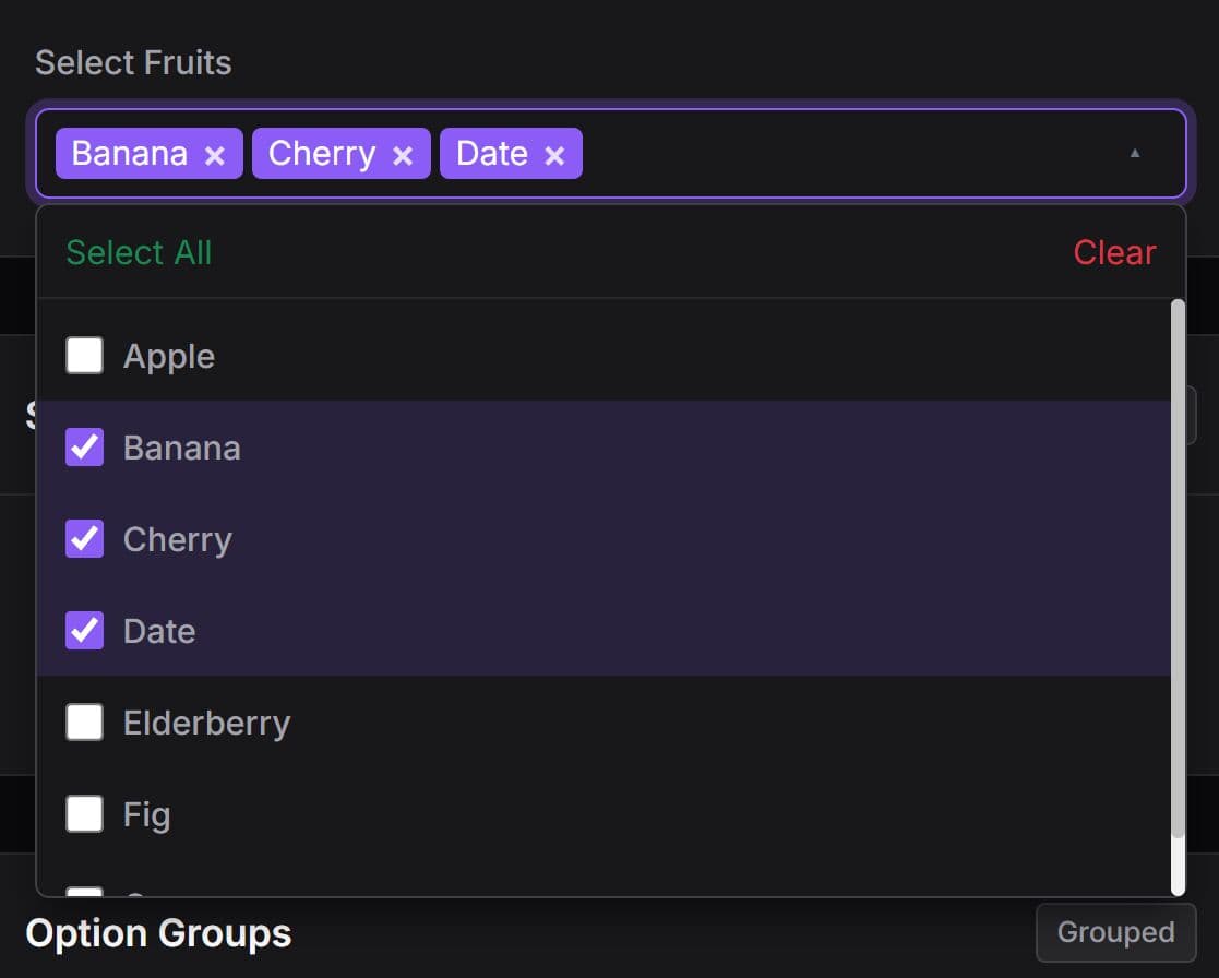
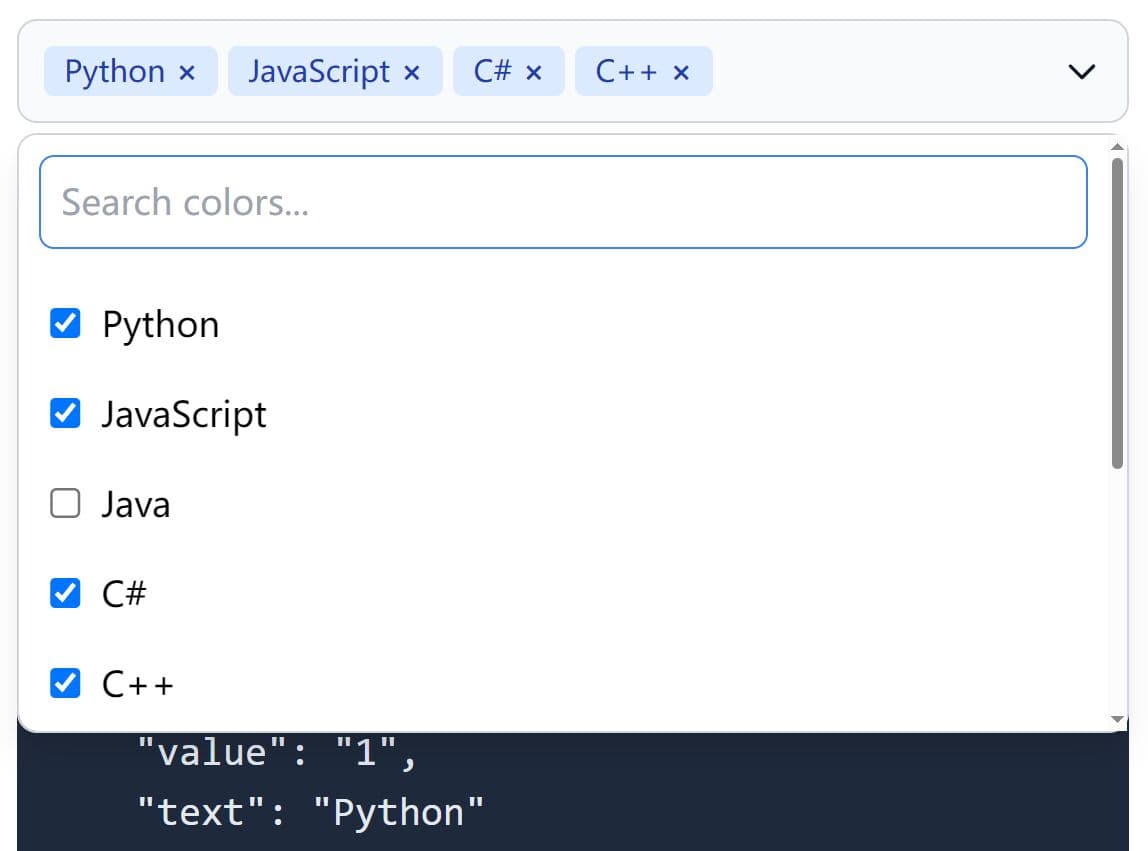
- Displays a selected-count badge and shows tag-like chips when few items are chosen.
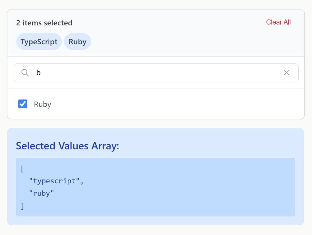
- Real-time search filters visible options and auto-expands matching groups.
- Toolbar action buttons for Select All, Clear All, Reset, Expand All, and Collapse All.
- Accepts most settings directly through
data-*attributes for zero-JS initialization. - Provides a destroy method that restores the original
<select>element. - UMD-compatible and works with AMD, CommonJS, and browser globals.
Use Cases:
- A role editor keeps permissions under Administration, Billing, and Reporting branches.
- Product taxonomy filters keep dozens of categories searchable inside one compact field.
- An analytics screen exposes optional metrics through grouped checkboxes and a selected-value API.
- Content workflows submit selected labels through a standard multi-select field.
Basic Usage:
1. Load the jqTreeSelect stylesheet, jQuery, and the plugin script. jqTreeSelect requires jQuery. Bootstrap 5 and Font Awesome are optional.
<link
  rel="stylesheet"
  href="https://cdn.jsdelivr.net/gh/umairwebdeveloper/jqTreeSelect/dist/jq-tree-select.min.css"
/>

<script src="https://code.jquery.com/jquery-3.7.1.min.js"></script>
<script src="https://cdn.jsdelivr.net/gh/umairwebdeveloper/jqTreeSelect/dist/jq-tree-select.min.js"></script>
2. jqTreeSelect initializes only on a select element with the multiple attribute. Standard optgroup elements create the first level of the tree.
<label for="content-areas">Content areas</label>

<select id="content-areas" name="content_areas[]" multiple>
  <optgroup label="Editorial">
    <option value="articles">Articles</option>
    <option value="tutorials">Tutorials</option>
    <option value="case-studies">Case Studies</option>
  </optgroup>

  <optgroup label="Documentation">
    <option value="api-reference">API Reference</option>
    <option value="release-notes">Release Notes</option>
  </optgroup>
</select>
3. Initialize the Tree Multi-Select:
$("#content-areas").jqTreeSelect({
  layout: {
    placeholder: "Choose content areas...",
    width: "100%",
    dropdownHeight: "320px"
  },

  search: {
    enabled: true,
    placeholder: "Filter content areas..."
  },

  grouping: {
    collapsible: true,
    collapsedByDefault: false,
    showExpandAll: true,
    showCollapseAll: true
  },

  actions: {
    showSelectAll: true,
    showClearAll: true,
    showReset: true,
    showTotalCount: true
  }
});
All plugin options:
Layout Options
layout.width: Sets the width of the widget wrapper. Type: String. Default:"100%".layout.height: Sets the height of the closed select display. Type: String. Default:"36px".layout.dropdownHeight: Sets the maximum height of the dropdown panel before scrolling begins. Type: String. Default:"400px".layout.placeholder: Sets the text shown before the user selects an option. Type: String. Default:"Select...".
Action Options
actions.showSelectAll: Shows a control that checks every available option. Type: Boolean. Default:true.actions.showClearAll: Shows a control that clears every non-disabled option. Type: Boolean. Default:true.actions.showReset: Shows a control that restores the page-load selection. Type: Boolean. Default:false.actions.showTotalCount: Shows the total number of available options in the action area. Type: Boolean. Default:false.
Grouping Options
grouping.nested: Builds grouped tree nodes from option group data. Type: Boolean. Default:false.grouping.collapsible: Adds expand and collapse controls to tree branches. Type: Boolean. Default:false.grouping.collapsedByDefault: Starts collapsible groups in a closed state. Type: Boolean. Default:false.grouping.showExpandAll: Shows an action that opens every tree branch. This option requiresgrouping.collapsible. Type: Boolean. Default:false.grouping.showCollapseAll: Shows an action that closes every tree branch. This option requiresgrouping.collapsible. Type: Boolean. Default:false.
Search Options
search.enabled: Adds a live filter field to the dropdown header. Type: Boolean. Default:false.search.placeholder: Sets the search field placeholder text. Type: String. Default:"Search...".
Data, State, And Callbacks
data: Rebuilds the original select from a JavaScript array before jqTreeSelect renders. Type: Array ornull. Default:null.disabled: Starts the widget in a disabled state. Type: Boolean. Default:false.callbacks.onInit: Runs after jqTreeSelect creates its layout. Type: Function ornull. Default:null.callbacks.onOpen: Runs when the dropdown opens. Type: Function ornull. Default:null.callbacks.onClose: Runs when the dropdown closes. Type: Function ornull. Default:null.callbacks.onChange: Runs after selected values change. The callback receives a detail object withinstance,selectedValues, andchangedElement. Type: Function ornull. Default:null.callbacks.onDestroy: Runs after jqTreeSelect removes its wrapper and restores the native select. Type: Function ornull. Default:null.
Legacy Flat Option Names
nestedGroups: Maps togrouping.nested.collapsibleGroups: Maps togrouping.collapsible.groupsCollapsedByDefault: Maps togrouping.collapsedByDefault.showExpandAll: Maps togrouping.showExpandAll.showCollapseAll: Maps togrouping.showCollapseAll.showSelectAll: Maps toactions.showSelectAll.showClearAll: Maps toactions.showClearAll.showReset: Maps toactions.showReset.showTotalCount: Maps toactions.showTotalCount.showSearch: Maps tosearch.enabled.width: Maps tolayout.width.height: Maps tolayout.height.dropdownHeight: Maps tolayout.dropdownHeight.
Dynamic Tree Data:
Use groupPath on each leaf option when the project needs a true multi-level tree view. Slash-delimited paths keep the data flat and give the plugin the information it needs to render deeper branches.
$("#permission-rules").jqTreeSelect({
  layout: {
    placeholder: "Assign permissions..."
  },

  grouping: {
    nested: true,
    collapsible: true,
    collapsedByDefault: true,
    showExpandAll: true,
    showCollapseAll: true
  },

  search: {
    enabled: true,
    placeholder: "Search permissions..."
  },

  data: [
    {
      value: "users:create",
      text: "Create users",
      groupPath: "Administration/Users"
    },
    {
      value: "users:edit",
      text: "Edit user profiles",
      groupPath: "Administration/Users"
    },
    {
      value: "billing:refund",
      text: "Issue refunds",
      groupPath: "Administration/Billing"
    },
    {
      value: "reports:view",
      text: "View audit reports",
      groupPath: "Reporting/Audit Logs",
      selected: true
    },
    {
      value: "reports:export",
      text: "Export audit reports",
      groupPath: "Reporting/Audit Logs",
      disabled: true
    }
  ]
});
Supported Data Fields
value: Stores the value submitted by the original multi-select.text: Sets the visible option label.selected: Starts the option in a checked state.disabled: Prevents user selection for that option.groupPath: Creates a slash-delimited tree path for the option.groupIdPath: Sets stable IDs for group path segments.groupCollapsed: Sets the initial collapsed state for the option's branch.groupName: Sets a one-level group label.groupId: Sets an ID for a one-level group.subgroupName: Sets a second-level group label.subgroupId: Sets an ID for a second-level group.
API Methods:
// Read the current selected values.
var selectedAreas = $("#content-areas").jqTreeSelect("val");

// Replace the current selection.
$("#content-areas").jqTreeSelect("val", [
  "articles",
  "api-reference"
]);

// Check every non-disabled option.
$("#content-areas").jqTreeSelect("selectAll");

// Clear every non-disabled option.
$("#content-areas").jqTreeSelect("clear");

// Restore the initial selected values.
$("#content-areas").jqTreeSelect("reset");

// Open or close every tree branch.
$("#content-areas").jqTreeSelect("expandAll");
$("#content-areas").jqTreeSelect("collapseAll");

// Toggle the disabled state.
$("#content-areas").jqTreeSelect("disable");
$("#content-areas").jqTreeSelect("enable");

// Rebuild the visible widget from the original select.
$("#content-areas").jqTreeSelect("refresh");

// Remove jqTreeSelect and restore the native multi-select.
$("#content-areas").jqTreeSelect("destroy");
val(): Returns the selected values from the original multi-select. Parameters: None. Returns: Array ornull.val(values): Replaces the selected values. Parameters: Array of option values. Returns: jQuery collection.selectAll(): Checks every non-disabled option. Parameters: None. Returns: jQuery collection.clear(): Clears every non-disabled option. Parameters: None. Returns: jQuery collection.reset(): Restores values selected when the page initialized. Parameters: None. Returns: jQuery collection.expandAll(): Opens every branch when collapsible grouping is active. Parameters: None. Returns: jQuery collection.collapseAll(): Closes every branch when collapsible grouping is active. Parameters: None. Returns: jQuery collection.disable(): Disables the widget and closes an open dropdown. Parameters: None. Returns: jQuery collection.enable(): Restores widget interaction. Parameters: None. Returns: jQuery collection.refresh(): Removes and rebuilds the visible control from the original select and current settings. Parameters: None. Returns: jQuery collection.destroy(): Removes jqTreeSelect markup and restores the original select element. Parameters: None. Returns: jQuery collection.
Events And Callbacks:
Bind lifecycle listeners before initialization when the page needs to catch jqtree:init.
var $reportFilters = $("#report-filters");

$reportFilters
  .on("jqtree:init", function (event, instance) {
    console.log("Tree select is ready.", instance);
  })
  .on("jqtree:change", function (event, detail) {
    $("#selected-filter-count").text(detail.selectedValues.length);
  })
  .on("jqtree:open", function () {
    console.log("Filter panel opened.");
  })
  .on("jqtree:close", function () {
    console.log("Filter panel closed.");
  })
  .on("jqtree:destroy", function () {
    console.log("Tree select removed.");
  });

$reportFilters.jqTreeSelect({
  search: {
    enabled: true
  }
});
jqtree:init: Fires after jqTreeSelect creates the widget. Arguments: Plugin instance. Trigger: Initialization completes.jqtree:open: Fires after the dropdown opens. Arguments: Plugin instance. Trigger: User opens the display area.jqtree:close: Fires after the dropdown closes. Arguments: Plugin instance. Trigger: User closes the dropdown or clicks outside it.jqtree:change: Fires after selected values change. Arguments: Detail object withinstance,selectedValues, andchangedElement. Trigger: A checkbox, group action, method call, or reset changes the selection.jqtree:destroy: Fires after jqTreeSelect removes its generated interface. Arguments: Plugin instance. Trigger: Thedestroy()method runs.
The current build does not expose a separate jqtree:reset event. Listen for jqtree:change when the page needs to react to a reset action.
Data Attribute Configuration:
Add data-toggle="jq-tree-select" to a multi-select field for automatic initialization at document ready.
<select
  id="audience-segments"
  name="audience_segments[]"
  multiple
  data-toggle="jq-tree-select"
  data-layout-width="360px"
  data-layout-dropdown-height="280px"
  data-layout-placeholder="Choose audience segments..."
  data-actions-show-select-all="true"
  data-actions-show-clear-all="true"
  data-actions-show-reset="true"
  data-actions-show-total-count="true"
  data-grouping-nested="true"
  data-grouping-collapsible="true"
  data-grouping-collapsed-by-default="true"
  data-grouping-show-expand-all="true"
  data-grouping-show-collapse-all="true"
  data-search-enabled="true"
  data-search-placeholder="Filter segments..."
>
  <option value="newsletter">Newsletter subscribers</option>
  <option value="trial-users">Trial users</option>
  <option value="customers">Customers</option>
</select>
data-layout-width: Maps tolayout.width.data-layout-height: Maps tolayout.height.data-layout-dropdown-height: Maps tolayout.dropdownHeight.data-layout-placeholder: Maps tolayout.placeholder.data-actions-show-select-all: Maps toactions.showSelectAll.data-actions-show-clear-all: Maps toactions.showClearAll.data-actions-show-reset: Maps toactions.showReset.data-actions-show-total-count: Maps toactions.showTotalCount.data-grouping-nested: Maps togrouping.nested.data-grouping-collapsible: Maps togrouping.collapsible.data-grouping-collapsed-by-default: Maps togrouping.collapsedByDefault.data-grouping-show-expand-all: Maps togrouping.showExpandAll.data-grouping-show-collapse-all: Maps togrouping.showCollapseAll.data-search-enabled: Maps tosearch.enabled.data-search-placeholder: Maps tosearch.placeholder.data-disabled: Maps todisabled.data-placeholder: Works as an alias forlayout.placeholder.
Alternatives And Related Resources
- Bootstrap Select: Use this jQuery plugin for Bootstrap-based searchable selects with multiple selection and optgroup support.
- x-tree-select: Review this option for a tree dropdown built around hierarchical data.
- multi-select.js: Pick this route for checkbox multi-select fields without a tree hierarchy.
- Treeselect: Consider this vanilla JavaScript alternative for nested option data and projects that do not use jQuery.
This awesome jQuery plugin is developed by umairwebdeveloper. For more Advanced Usages, please check the demo page or visit the official website.
- Prev: Bootstrap 5 Number Spinner Plugin with Formatters - bsTouchspin
- Next: None