Multi-column Autocomplete Dropdown For jQuery - Inputpicker
| File Size: | 24.7 KB |
|---|---|
| Views Total: | 46346 |
| Last Update: | |
| Publish Date: | |
| Official Website: | Go to website |
| License: | MIT |
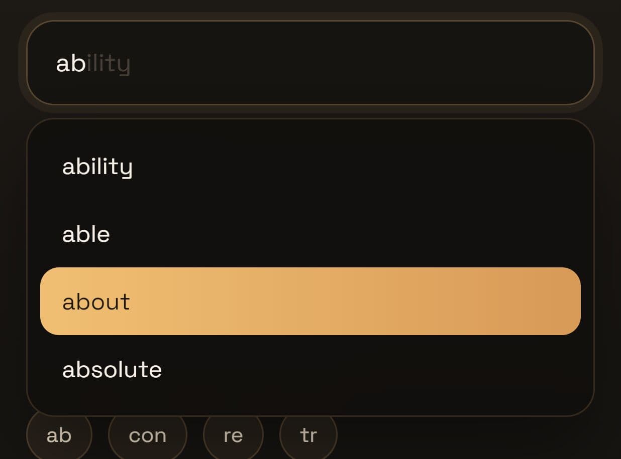
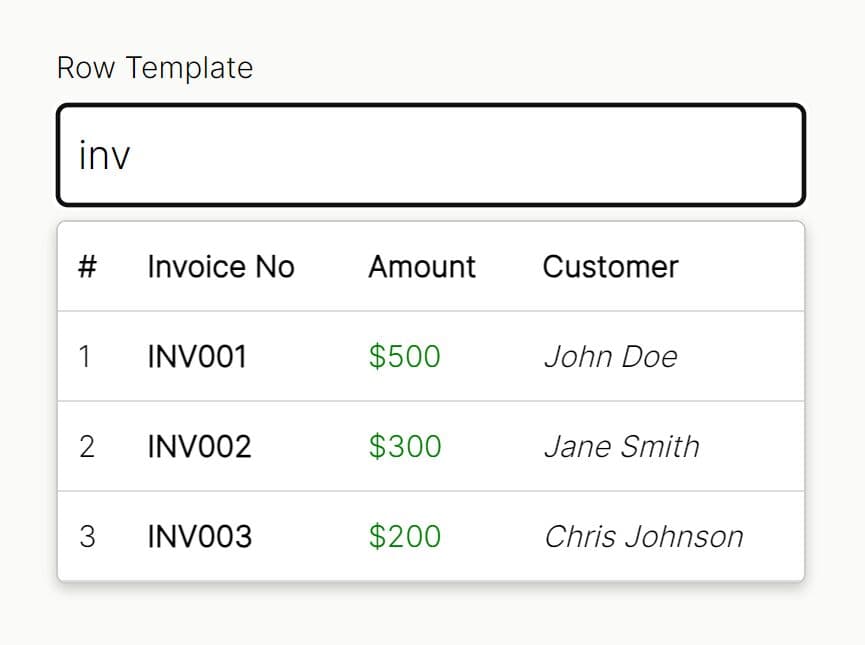
Inputpicker is a lightweight yet robust jQuery dropdown autocomplete plugin that turns a normal text input into a searchable, multi-column selection control.
The plugin can help you build form fields where a single dropdown needs to show structured records such as users, products, countries, SKUs, roles, or customer accounts.
It supports local array data, object-based rows, filtering, remote JSON data, pagination, multiple values, tag-style input, and jQuery-style API methods.
Features:
- Displays multiple fields in a table-style dropdown.
- Reads local array data and object-based JSON records.
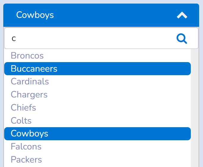
- Filters rows as the user types.
- Loads remote JSON data through Ajax.
- Supports paginated result sets.
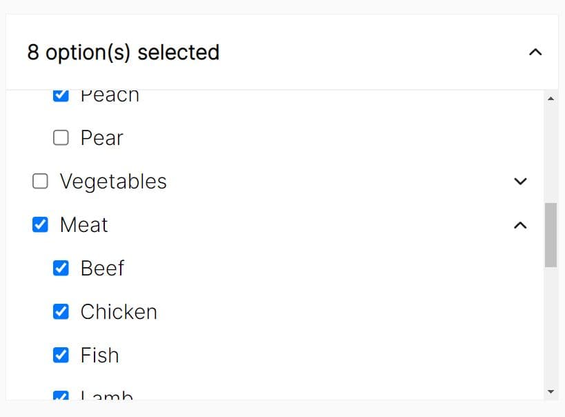
- Handles multiple selected values.
- Adds tag-style value entry.
- Opens dropdowns programmatically.
- Updates data after initialization.
- Uses CSS options for dropdown and active-row styling.
- Keeps the original input value available for form submission.
How to use it:
1. Download and put the jQuery inputpicker plugin's files into the webpage that has the lated jQuery library loaded.
<link href="jquery.inputpicker.css" rel="stylesheet">
<script src="/path/to/cdn/jquery.min.js"></script>
<script src="jquery.inputpicker.js"></script>
2. The plugin code calls Bootstrap .popover() helpers. If you use the unmodified file, keep Bootstrap's popover plugin available or remove that call from your local copy.
<script>
  if (window.jQuery && !jQuery.fn.popover) {
    jQuery.fn.popover = function () {
      return this;
    };
  }
</script>
3. Create a standard input field on the webpage. The original input keeps the selected value. Inputpicker creates a shadow input and dropdown UI next to it.
<label for="country-picker">Country</label>
<input id="country-picker" name="country" type="text">
4. Initialize the plugin to generate a basic dropdown select box.
$(function () {
  $('#country-picker').inputpicker({
    data: [
      { code: 'US', name: 'United States', region: 'North America' },
      { code: 'CA', name: 'Canada', region: 'North America' },
      { code: 'GB', name: 'United Kingdom', region: 'Europe' }
    ],
    fields: [
      { name: 'code', text: 'Code', width: '80px' },
      { name: 'name', text: 'Country' },
      { name: 'region', text: 'Region' }
    ],
    fieldValue: 'code',
    fieldText: 'name',
    headShow: true,
    filterOpen: true,
    filterField: 'name'
  });
});
5. Show readable labels but submit compact database IDs.
<label for="customer-picker">Customer</label>
<input id="customer-picker" name="customer_id" type="text">

<script>
$(function () {
  $('#customer-picker').inputpicker({
    data: [
      { id: 101, company: 'Northwind Supply', city: 'Seattle', tier: 'Gold' },
      { id: 102, company: 'Blue River Foods', city: 'Austin', tier: 'Standard' },
      { id: 103, company: 'Summit Parts', city: 'Denver', tier: 'Gold' }
    ],
    fields: [
      { name: 'id', text: 'ID', width: '60px' },
      { name: 'company', text: 'Company' },
      { name: 'city', text: 'City' },
      { name: 'tier', text: 'Tier', width: '90px' }
    ],
    fieldValue: 'id',
    fieldText: 'company',
    headShow: true,
    filterOpen: true,
    filterField: ['company', 'city'],
    highlightResult: true
  });

  $('#customer-picker').on('change', function () {
    var record = $(this).inputpicker('element', this.value, 'id');
    $('#selected-customer').text(record ? record.company + ' from ' + record.city : '');
  });
});
</script>

<p id="selected-customer"></p>
6. Select several options from the same dropdown.
<label for="role-picker">Assigned roles</label>
<input id="role-picker" name="roles" type="text">

<script>
$(function () {
  $('#role-picker').inputpicker({
    data: [
      { value: 'admin', label: 'Administrator', scope: 'Full access' },
      { value: 'editor', label: 'Editor', scope: 'Content access' },
      { value: 'viewer', label: 'Viewer', scope: 'Read only' }
    ],
    fields: [
      { name: 'label', text: 'Role' },
      { name: 'scope', text: 'Scope' }
    ],
    fieldValue: 'value',
    fieldText: 'label',
    multiple: true,
    delimiter: '|',
    headShow: true,
    filterOpen: true,
    autoOpen: true
  });

  $('#role-picker').on('change', function () {
    console.log('Stored role list:', this.value);
  });
});
</script>
7. Query a backend endpoint and paginate records.
<label for="employee-picker">Employee</label>
<input id="employee-picker" name="employee_id" type="text">

<script>
$(function () {
  $('#employee-picker').inputpicker({
    url: '/api/employees/search',
    urlParam: {
      department: 'sales'
    },
    urlCache: true,
    pagination: true,
    pageField: 'page',
    pageLimitField: 'per_page',
    pageCountField: 'total',
    limit: 10,
    fields: [
      { name: 'id', text: 'ID', width: '70px' },
      { name: 'name', text: 'Name' },
      { name: 'email', text: 'Email' }
    ],
    fieldValue: 'id',
    fieldText: 'name',
    headShow: true,
    autoOpen: true
  });

  // Expected response shape:
  // {
  //   "total": 42,
  //   "data": [
  //     { "id": 1, "name": "Maya Lee", "email": "[email protected]" }
  //   ]
  // }

  $('#employee-picker').on('change_highlight.inputpicker', function () {
    var row = $(this).inputpicker('data_highlighted');
    $('#employee-preview').text(row ? row.email : '');
  });
});
</script>

<p id="employee-preview"></p>
8. All default configuration options:
width(String): Sets the dropdown width. The default value is100%.height(String): Sets the dropdown maximum height. The default value is200px.openAfterLoad(Boolean): Opens the dropdown after local or remote data finishes loading.nextPicker(String or null): Opens another Inputpicker selector when the current picker has no data andopenAfterLoadis active.autoOpen(Boolean): Opens the dropdown when the input receives focus.tabToSelect(Boolean): Selects the active row when the user presses Tab.creatable(Boolean): Lets the user enter a new value outside the supplied data.selectMode(String): Controls value handling after Tab or blur. Supported modes includerestore,active,creatable, andempty.headShow(Boolean): Shows or hides the table header row.multiple(Boolean): Stores multiple selected values in the original input.tag(Boolean): Uses tag-style value entry.delimiter(String): Separates multiple values in the original input. The default value is,.data(Array): Supplies local records. The plugin accepts strings or objects.fields(Array): Defines visible dropdown columns. Each item can be a field name or an object withname,text,width, andcol_custom.fieldValue(String): Defines the record field saved to the original input.fieldText(String): Defines the record field shown in the visible input.filterOpen(Boolean): Filters local rows as the user types.filterType(String): Usesstartfor prefix matching. Any other value uses contains matching.filterField(String or Array): Limits local filtering to one field or a set of fields.limit(Number): Limits records in remote requests and pagination.url(String): Loads JSON data from a remote endpoint.urlCache(Boolean): Caches remote responses by serialized request parameters.urlParam(Object): Adds custom parameters to remote JSON requests.urlDelay(Number): Sets a request delay for remote searching.pagination(Boolean): Enables paginated remote data.pageMode(String): Sets pagination mode. Use an empty string for standard pagination orscrollfor scroll mode.pageField(String): Sets the request parameter name for the current page.pageLimitField(String): Sets the request parameter name for the page size.pageCurrent(Number): Stores the current page number.pageCountField(String): Sets the response field name that stores total result count.pageCount(Number): Stores the total count used by the pagination UI.listBackgroundColor(String): Sets the dropdown background color.listBorderColor(String): Sets the dropdown border color.rowSelectedBackgroundColor(String): Sets the active row background color.rowSelectedFontColor(String): Sets the active row text color.highlightResult(Boolean): Adds a highlight class to rows that match the typed keyword.responsive(Boolean): Recalculates dropdown size and position on window resize._bottom(String): Stores internal bottom-position data.popover(String): Adds popover markup to result rows when popover behavior exists on the page.
/**
* Width , default is 100%
*/
width: '100%',

/**
* Default Height
*/
height: '200px',

/**
* Open the dropdown automatically after data is initialized and loaded
*/
openAfterLoad: false,

/**
* CSS selector of the next inputpicker to open when current has no data.
* Only used when openAfterLoad is true.
* Example: '#myOtherInput'
*/
nextPicker: null,

/**
* Selected automatically when focus
*/
autoOpen: false,

/**
* Press tab to select automatically
*/
tabToSelect: false,

creatable: false,    // Allow user creates new value when true,

/**
* The action after pressing 'tab'
* restore: Use the previous value, the change event is not raised.
* active: Use the active option
* new: Use the current keyword,
* null : Set the word is null
*/
selectMode: 'restore',


/**
* True - show head
* False
*/
headShow: false,   // true : show head, false: hide


/**
* Support multiple values
*/
multiple: false,

/**
* Tag
*/
tag: false,

/**
* Delimiter for multiple values
*/
delimiter: ',',

/**
* Data
*/
data: [],

/**
* Fields
* Store fields need to been shown in the list
* (Sting) - 'value'
* (Object) - {name:'value', text:'Value'}
*/
fields: [],

/**
* The field posting to the field
*/
fieldValue: 'value',

/**
* The field shown in the input
* Will use fieldValue if empty
*/
fieldText: '',


// filter Setting

/**
* True - filter rows when changing the input content
* False - do not do any spliation
*/
filterOpen: false,

/**
* Choose the method of filtering
* 'start' - start filtering from the beginning
* others - all content matches
*/
filterType: '',  // 'start' - start from beginning or ''

/**
* Choose the fields need to be filtered
* (String)'name' - one field
* (Array)['name', 'value'] - multiple fields
*/
filterField: '',

/**
* Limit number
*/
limit: 0,

// --- URL settings --------------------------------------------
url: '',    // set url

urlCache: false,

/**
* Set url params for the remote data
*/
urlParam: {},

/**
* If search interval is too short, will execute
*/
urlDelay: 0,

/**
* pagination
*/
pagination: false,   // false: no

pageMode: '',  // The Pagination mode: '' is the default style; 'scroll' is the scroll dragging style

pageField: 'p', // Page File Name for request

pageLimitField: 'limit', // Page Limit Field name for request

// pageLimit: 10,  // Page limit for request -- deprecated due to replication with the 'limit' field

pageCurrent: 1, // Current page

pageCountField: 'count',
pageCount: 0,    // System uses

listBackgroundColor: '',
listBorderColor: '',
rowSelectedBackgroundColor: '',
rowSelectedFontColor: '',

// Un-necessary - Use Pagination
// pagination: false,

// All the result match keywords will highlight, only
highlightResult: false,

responsive: true,

_bottom: '',
popover: ''
9. API methods.
// Initialize Inputpicker on a text input.
$('#country-picker').inputpicker({
  data: [
    { code: 'US', name: 'United States' },
    { code: 'CA', name: 'Canada' }
  ],
  fields: ['code', 'name'],
  fieldValue: 'code',
  fieldText: 'name'
});

// Load new data manually. The callback receives the input and loaded data.
$('#country-picker').inputpicker('loadData', [
  { code: 'AU', name: 'Australia' },
  { code: 'NZ', name: 'New Zealand' }
], function (input, data) {
  console.log(data.length);
});

// Remove the generated UI and restore the original input.
$('#country-picker').inputpicker('destroy');

// Get all settings.
var settings = $('#country-picker').inputpicker('set');

// Get one setting.
var dropdownHeight = $('#country-picker').inputpicker('set', 'height');

// Change one setting after initialization.
$('#country-picker').inputpicker('set', 'height', '260px');

// Get the current data array.
var currentData = $('#country-picker').inputpicker('data');

// Replace the current data array.
$('#country-picker').inputpicker('data', [
  { code: 'DE', name: 'Germany' },
  { code: 'FR', name: 'France' }
]);

// Get the full record for the highlighted row.
var highlightedRow = $('#country-picker').inputpicker('data_highlighted');

// Get the fieldValue for the highlighted row.
var highlightedValue = $('#country-picker').inputpicker('value_highlighted');

// Get the full record that matches a value.
var country = $('#country-picker').inputpicker('element', 'DE', 'code');

// Toggle the dropdown.
$('#country-picker').inputpicker('toggle');

// Show the dropdown.
$('#country-picker').inputpicker('show');

// Hide the dropdown.
$('#country-picker').inputpicker('hide');

// Set the selected value and trigger change when the value changes.
$('#country-picker').inputpicker('val', 'FR');

// Send the current shadow input to the internal debug helper when debug mode is active.
$('#country-picker').inputpicker('is');

// Remove a value from a multiple-value picker.
$('#role-picker').inputpicker('removeValue', 'editor');

// Jump to a remote data page and reload the result list.
$('#country-picker').inputpicker('jumpToPage', 2);
10. Available events.
// Runs when the selected value changes.
$('#country-picker').on('change', function () {
  console.log('Selected value:', this.value);
});

// Runs when keyboard or mouse movement changes the highlighted row.
$('#country-picker').on('change_highlight.inputpicker', function () {
  var row = $(this).inputpicker('data_highlighted');
  console.log('Highlighted row:', row);
});

// Delegated integration hook for rendered dropdown rows.
// This hook reads generated markup. Treat it as integration code, not an official plugin event.
$(document).on('mouseenter', '#inputpicker-wrapped-list .inputpicker-element', function () {
  console.log('Row value:', $(this).data('value'));
});
Alternatives
- Select2: Adds searchable select boxes, remote data, tagging, and richer accessibility behavior for jQuery projects.
- Chosen: Converts select boxes into searchable dropdown controls with single and multiple selection.
- Selectize.js: Adds tagging, autocomplete, and remote option loading for text inputs and select controls.
- 10 Best Autocomplete & Typeahead JavaScript Plugins
- 10 Best Tags Input Plugins In JavaScript
- 10 Best Dual List Box Plugins In JavaScript
- 10 Best Dropdown Plugins To Replace The Native Select Box
FAQs:
Q: Does it replace the original input?
A: The plugin hides the original input and creates a visible shadow input. The original input still stores the selected value for form submission.
Q: How should remote JSON data be formatted?
A: Return a plain array or an object with a data array. For pagination, include a total count field that matches the pageCountField option.
Q: Can it handle multiple selected values?
A: Yes. Set multiple: true and choose a delimiter value. The plugin stores all selected values in the original input as one delimiter-separated string.
Q: Can I style the dropdown to match Bootstrap or my own theme?
A: The plugin uses its own CSS classes. You can override them in your stylesheet or set colors via options such as listBackgroundColor, listBorderColor, rowSelectedBackgroundColor, and rowSelectedFontColor. There is no built‑in Bootstrap theme.
Q: How do I get the full selected object, not just the value?
A: After selection, call the element() method. For example:
$('#myInput').inputpicker('element', $('#myInput').val());
This returns the full data object. You can also listen to the change event and then fetch the object.
Changelog:
2026-06-04
- Updated plugin
2021-02-05
- Added change_highlight.inputpicker event
2020-09-01
- Turn off debug mode in normal use
2019-10-28
- Add custom style on fields paramater with object, it is used for create custom style of table column will added
2018-05-27
- Add disable/enable status
2018-05-07
- Fix Right Arrow wrong position
2018-04-24
- Add Headers for json request
2018-01-01
- Fix the bug that empty the selected option in the empty selectMode
2017-12-16
- Add the 'selectMode' option, remove the 'creatable' option
2017-12-12
- Add 'creatable' parameter
2017-12-11
- Add auto responsive
2017-12-08
- Add Highlight option
2017-12-05
- Trigger change when the content is empty and press tab
2017-11-28
- Add the pagination feature
2017-11-27
- Change the element() function to support selecting element by specific field
2017-10-27
- Add 'destroy' method
2017-09-15
- Add 'getting element object'
2017-07-28
- Fixed bugs.
2017-06-06
- Remove tabindex for 'x' in multiple options
- Add multiple values support
2017-05-23
- Add cache for loading remote url
2017-05-22
- Fix some bugs in events
- Add events
This awesome jQuery plugin is developed by ukalpa. For more Advanced Usages, please check the demo page or visit the official website.