Range Slider Plugin With Dual Handles and Ticks - CuiSlider
| File Size: | 54.1 KB |
|---|---|
| Views Total: | 287 |
| Last Update: | |
| Publish Date: | |
| Official Website: | Go to website |
| License: | MIT |
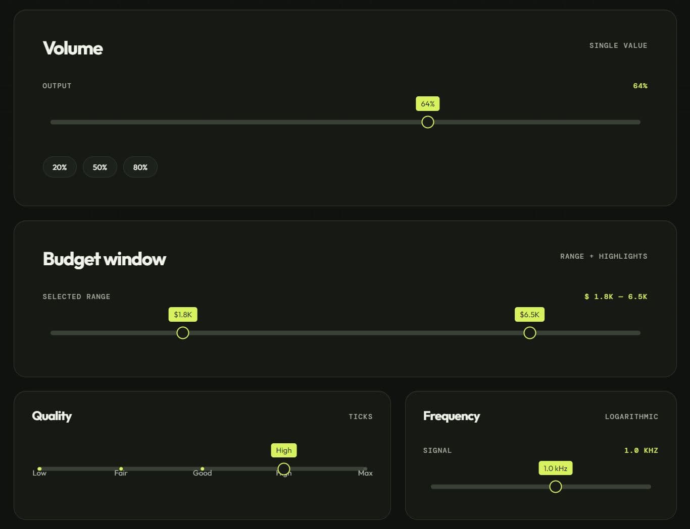
CuiSlider is a JavaScript range slider plugin that turns a regular text input into a draggable range control or single-value slider.
You can use it to create a price filter for an e-commerce sidebar, a volume control for a media player, or a rating input for a feedback form, all from a single <input> element.
The library works as a standalone vanilla JS component, and it also includes an optional jQuery plugin bridge for projects that still use the jQuery library.
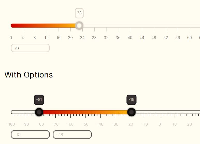
CuiSlider is a rewrite of the well-known bootstrap-slider jQuery plugin, and it keeps the same feature set: dual-handle range selection, vertical orientation, tick marks, tooltips, a logarithmic scale mode, RTL layout, and keyboard and touch support.
Features:
- Single-value and dual-handle range selection.
- Horizontal and vertical slider layouts.
- Mouse, touch, and keyboard controls.
- Linear and logarithmic value scales.
- Ticks, custom tick positions, labels, and snapping.
- Combined or split value tooltips.
- Light, dark, and system-aware themes.
- Left-to-right and right-to-left track directions.
- Native form value synchronization.
- CSS variable based visual customization.
- Standalone JavaScript and optional jQuery APIs.
- ARIA value attributes and label references.
How To Use It:
CDN Setup With jQuery
Load the slider stylesheet first. Load jQuery before the UMD bundle when the page uses the jQuery bridge. The UMD bundle registers $.fn.cuiSlider when it finds jQuery on window. The examples below use version 0.1.0.
<link
  rel="stylesheet"
  href="https://unpkg.com/@cliqthemes/[email protected]/dist/cui-slider.css"
/>

<script src="https://code.jquery.com/jquery-3.7.1.min.js"></script>
<script src="https://unpkg.com/@cliqthemes/[email protected]/dist/cui-slider.umd.cjs"></script>
The core library does not require jQuery. Remove the jQuery script when the page only uses new CuiSlider().
NPM Setup
Install the package for an ESM or bundler project.
npm install @cliqthemes/cliq-slider-control
Use the core constructor:
import { CuiSlider } from '@cliqthemes/cliq-slider-control';
import '@cliqthemes/cliq-slider-control/style.css';

var volumeSlider = new CuiSlider('#volume-control', {
  min: 0,
  max: 100,
  step: 5,
  value: 40
});
Register the optional jQuery bridge in a project that already imports jQuery:
import $ from 'jquery';
import { registerJQueryPlugin } from '@cliqthemes/cliq-slider-control/jquery';
import '@cliqthemes/cliq-slider-control/style.css';

registerJQueryPlugin($);

$('#volume-control').cuiSlider({
  min: 0,
  max: 100,
  step: 5,
  value: 40
});
Basic Usage
Add a text input. The library hides this input, inserts the visual slider after it, and keeps the input value synchronized.
<label for="order-quantity">Order quantity</label>
<input id="order-quantity" name="quantity" type="text" />
Initialize the jQuery plugin after the target element exists:
<script>
  $(function () {
    $('#order-quantity').cuiSlider({
      min: 10,
      max: 200,
      step: 10,
      value: 50,
      tooltip: 'always'
    });
  });
</script>
The slider starts at 50 and moves in increments of 10. The input remains part of the form. A form submission sends the current slider value through the quantity field.
Use the constructor when the page needs slider events:
var quantitySlider = new CuiSlider('#order-quantity', {
  min: 10,
  max: 200,
  step: 10,
  value: 50,
  tooltip: 'always'
});

quantitySlider.on('change', function (eventData) {
  console.log(eventData.newValue);
});
Configuration Options
id(String): Sets the rendered slider wrapper ID. The default value is an empty string.className(String): Adds custom classes to the rendered wrapper. The runtime supports this option, but version0.1.0omits it from the TypeScript interface.theme('light' | 'dark' | 'auto'): Selects the color theme. The default value is'light'. The'auto'value followsprefers-color-scheme.min(Number): Sets the lowest selectable value. The default value is0.max(Number): Sets the highest selectable value. The default value is10.step(Number): Sets the increment between selectable values. The default value is1.precision(Number | null): Sets the decimal places used for stored and displayed values. The library derives the precision fromstepwhen the value isnull.orientation('horizontal' | 'vertical'): Sets the slider direction. The default value is'horizontal'.value(Number | [Number, Number]): Sets the initial value. A two-number array activates dual-handle range mode. The default value is5.range(Boolean): Forces dual-handle mode. The default value isfalse.selection('before' | 'after' | 'none'): Selects the filled side of a single-handle slider. The default value is'before'.tooltip('show' | 'hide' | 'always'): Controls tooltip visibility. The default value is'show'.tooltipSplit(Boolean): Shows one tooltip for each handle in range mode. The default value isfalse.tooltipPosition('top' | 'bottom' | 'left' | 'right' | null): Sets the tooltip side. Anullvalue selects a position from the slider orientation.handle('round' | 'triangle' | 'custom'): Selects the handle shape. The default value is'round'. The'custom'value adds.cui-slider-handle-customfor project CSS.reversed(Boolean): Reverses the track direction. The default value isfalse.rtl('auto' | Boolean): Controls RTL behavior. The default value is'auto', which reads the computed CSS direction.enabled(Boolean): Sets the initial interaction state. The default value istrue.formatter(Function): Formats tooltip text. The default formatter converts a single value to text and joins a range aslow : high.naturalArrowKeys(Boolean): Adjusts arrow-key direction for vertical or reversed sliders. The default value isfalse.ticks(Number Array): Defines tick values. The default value is an empty array.ticksPositions(Number Array): Defines custom tick positions as percentages along the track. The default value is an empty array.ticksLabels(String Array): Defines visible labels for ticks. The default value is an empty array.ticksSnapBounds(Number): Sets the value distance used to snap a dragged handle to a tick. The default value is0.ticksTooltip(Boolean): Shows tooltip text for tick marks. The default value isfalse.scale('linear' | 'logarithmic'): Selects the value scale. The default value is'linear'.focus(Boolean): Moves keyboard focus to the active handle after pointer interaction. The default value isfalse.labelledby(String | [String, String] | null): Setsaria-labelledbyon one handle or both range handles. The default value isnull.rangeHighlights(Object Array): Adds highlighted track bands. Each object acceptsstart,end, and an optionalclassvalue. The default value is an empty array.
Data Attributes
Most options accept data-slider-* attributes. JSON values work for arrays, objects, numbers, and booleans.
<label id="budget-label" for="project-budget">Project budget</label>
<input
  id="project-budget"
  name="budget"
  type="text"
  data-slider-min="500"
  data-slider-max="10000"
  data-slider-step="250"
  data-slider-value="[1500,6000]"
  data-slider-tooltip="always"
  data-slider-tooltip-split="true"
  data-slider-ticks="[500,2500,5000,7500,10000]"
  data-slider-ticks-labels='["$500","$2.5k","$5k","$7.5k","$10k"]'
  data-slider-labelledby='["budget-label","budget-label"]'
/>
var budgetSlider = new CuiSlider('#project-budget');
The attribute names use hyphens for multiword options:
data-slider-id
data-slider-theme
data-slider-min
data-slider-max
data-slider-step
data-slider-precision
data-slider-orientation
data-slider-value
data-slider-range
data-slider-selection
data-slider-tooltip
data-slider-tooltip-split
data-slider-handle
data-slider-reversed
data-slider-rtl
data-slider-enabled
data-slider-natural-arrow-keys
data-slider-ticks
data-slider-ticks-positions
data-slider-ticks-labels
data-slider-ticks-snap-bounds
data-slider-ticks-tooltip
data-slider-scale
data-slider-focus
data-slider-tooltip-position
data-slider-labelledby
data-slider-range-highlights
formatter requires JavaScript. An HTML attribute cannot store a function. className has no matching data attribute in version 0.1.0.
Custom Tooltip Formatting
The formatter changes tooltip text only. It does not change the stored value or step precision.
var currency = new Intl.NumberFormat('en-US', {
  style: 'currency',
  currency: 'USD',
  maximumFractionDigits: 0
});

var priceSlider = new CuiSlider('#price-window', {
  min: 0,
  max: 5000,
  step: 100,
  value: [800, 2600],
  tooltip: 'always',
  formatter: function (value) {
    if (Array.isArray(value)) {
      return currency.format(value[0]) + ' to ' + currency.format(value[1]);
    }

    return currency.format(value);
  }
});
A split range tooltip calls the formatter with a number for each handle. The combined tooltip calls it with the full [low, high] array. A formatter used with tooltipSplit: true must handle both shapes.
API Methods:
// Return the current number or [low, high] range.
slider.getValue();

// Set a value. The optional flags trigger slide and change events.
slider.setValue(value, triggerSlide, triggerChange);

// Return a copy of all current options.
slider.getOption();

// Return one option value.
slider.getOption('min');

// Store one option value on the instance.
slider.setOption('max', 200);

// Return true when the slider accepts interaction.
slider.isEnabled();

// Enable the slider and fire slideEnabled.
slider.enable();

// Disable the slider and fire slideDisabled.
slider.disable();

// Switch between the enabled and disabled states.
slider.toggle();

// Apply the light, dark, or auto theme.
slider.setTheme('dark');

// Recalculate the track size and page offset.
slider.relayout();

// Return the rendered slider wrapper.
slider.getElement();

// Remove the slider, restore the source input, and clear listeners.
slider.destroy();

// Subscribe to an internal slider event.
slider.on('change', changeHandler);

// Remove a previously registered event handler.
slider.off('change', changeHandler);
setOption() updates the stored option in version 0.1.0. It does not rebuild the DOM or recalculate every dependent value. Recreate the instance after structural changes such as orientation, handle mode, ticks, or range layout.
The jQuery bridge dispatches method names through cuiSlider():
// Read the current value.
var currentValue = $('#order-quantity').cuiSlider('getValue');

// Set a new value.
$('#order-quantity').cuiSlider('setValue', 80);

// Disable and enable the control.
$('#order-quantity').cuiSlider('disable');
$('#order-quantity').cuiSlider('enable');

// Remove the generated control.
$('#order-quantity').cuiSlider('destroy');
Events:
var slider = new CuiSlider('#shipping-weight', {
  min: 0,
  max: 50,
  step: 0.5,
  value: 4.5
});

// Fires during pointer dragging and keyboard stepping.
slider.on('slide', function (value) {
  console.log('Current value:', value);
});

// Fires when a drag interaction starts.
slider.on('slideStart', function (value) {
  console.log('Started at:', value);
});

// Fires when a drag interaction ends.
slider.on('slideStop', function (value) {
  console.log('Stopped at:', value);
});

// Fires after the settled value changes.
slider.on('change', function (eventData) {
  console.log('Previous value:', eventData.oldValue);
  console.log('New value:', eventData.newValue);
});

// Fires after enable() changes the state.
slider.on('slideEnabled', function () {
  console.log('Slider enabled');
});

// Fires after disable() changes the state.
slider.on('slideDisabled', function () {
  console.log('Slider disabled');
});
Programmatic updates trigger events only when the related flags are true:
// Set the value and fire slide plus change.
slider.setValue(12, true, true);
Advanced Examples:
Price Filter With Two Handles
This example stores a selected price range in a normal form input and updates a visible summary after each settled change.
<form id="catalog-filter" action="/products" method="get">
  <label id="price-filter-label" for="price-filter">Price range</label>
  <input id="price-filter" name="price" type="text" />
  <output id="price-filter-output" for="price-filter"></output>
  <button type="submit">Apply filter</button>
</form>
var money = new Intl.NumberFormat('en-US', {
  style: 'currency',
  currency: 'USD',
  maximumFractionDigits: 0
});

function formatPriceRange(value) {
  if (Array.isArray(value)) {
    return money.format(value[0]) + ' to ' + money.format(value[1]);
  }

  return money.format(value);
}

var catalogPriceSlider = new CuiSlider('#price-filter', {
  min: 0,
  max: 3000,
  step: 50,
  value: [350, 1800],
  tooltip: 'always',
  labelledby: ['price-filter-label', 'price-filter-label'],
  formatter: formatPriceRange
});

var priceOutput = document.getElementById('price-filter-output');
priceOutput.textContent = formatPriceRange(catalogPriceSlider.getValue());

catalogPriceSlider.on('change', function (eventData) {
  priceOutput.textContent = formatPriceRange(eventData.newValue);
});
A range value reaches the source input as a comma-separated pair such as 350,1800. Parse both values in the server-side filter handler.
Vertical Satisfaction Scale With Ticks
This layout fits a compact feedback panel. The custom positions place the middle choices closer together.
<label id="service-rating-label" for="service-rating">Service rating</label>
<input id="service-rating" name="rating" type="text" />
var ratingSlider = new CuiSlider('#service-rating', {
  min: 1,
  max: 5,
  step: 1,
  value: 3,
  orientation: 'vertical',
  ticks: [1, 2, 3, 4, 5],
  ticksPositions: [0, 18, 50, 82, 100],
  ticksLabels: ['Poor', 'Fair', 'Good', 'Very good', 'Excellent'],
  ticksSnapBounds: 0.25,
  tooltip: 'always',
  labelledby: 'service-rating-label',
  formatter: function (value) {
    return value + ' / 5';
  }
});
Give a vertical slider container enough height through project CSS. The track cannot present a useful vertical scale inside a short line box.
Logarithmic Frequency Control
A logarithmic scale works well when values span several orders of magnitude. The visual midpoint represents a geometric midpoint, not an arithmetic midpoint.
<label for="filter-frequency">Filter frequency</label>
<input id="filter-frequency" name="frequency" type="text" />
var frequencySlider = new CuiSlider('#filter-frequency', {
  min: 20,
  max: 20000,
  step: 1,
  value: 1000,
  scale: 'logarithmic',
  tooltip: 'always',
  formatter: function (value) {
    if (value >= 1000) {
      return (value / 1000).toFixed(1) + ' kHz';
    }

    return Math.round(value) + ' Hz';
  }
});
Use a positive minimum for a conventional logarithmic range. Zero and negative values do not have a normal logarithmic position.
Build A Slider After Loading Limits From An API
Create the slider after the asynchronous request returns. This prevents an early instance from using placeholder bounds.
<label for="delivery-distance">Delivery distance</label>
<input id="delivery-distance" name="distance" type="text" />
<p id="distance-status">Loading available distance...</p>
fetch('/api/delivery-distance-limits')
  .then(function (response) {
    if (!response.ok) {
      throw new Error('Distance limits request failed');
    }

    return response.json();
  })
  .then(function (limits) {
    var distanceSlider = new CuiSlider('#delivery-distance', {
      min: limits.minimum,
      max: limits.maximum,
      step: limits.increment,
      value: limits.defaultValue,
      tooltip: 'always',
      formatter: function (value) {
        return value + ' km';
      }
    });

    var status = document.getElementById('distance-status');
    status.textContent = distanceSlider.getValue() + ' km selected';

    distanceSlider.on('change', function (eventData) {
      status.textContent = eventData.newValue + ' km selected';
    });
  })
  .catch(function () {
    document.getElementById('distance-status').textContent =
      'Distance control is unavailable.';
  });
Validate the API response before construction when the endpoint returns null values, strings, or inverted bounds.
Custom Theme With CSS Variables
Add a wrapper class through className, then scope the CSS variables to that slider instance.
var accentSlider = new CuiSlider('#campaign-progress', {
  min: 0,
  max: 100,
  value: 65,
  className: 'campaign-progress-slider',
  tooltip: 'always'
});
.campaign-progress-slider {
  --cui-slider-track-bg: #dbe4f0;
  --cui-slider-selection-bg: #2457d6;
  --cui-slider-handle-border: #2457d6;
  --cui-slider-handle-border-focus: #173a91;
  --cui-slider-handle-size: 22px;
}
Set both the track and selection variables. The selection variable only colors the filled section.
Alternatives And Related Resources:
- Accessible Touch-friendly Range Slider Plugin - noUiSlider
- Powerful Range Slider Plugin - jQRangeSlider
- Flexible and Touch-Friendly jQuery Range Slider Plugin - Ion.RangeSlider
- 10 Best Range Slider Plugins In JavaScript
FAQs:
Q: Does CuiSlider require jQuery to work?
A: No. The core CuiSlider constructor runs standalone with zero runtime dependencies. jQuery only comes into play if you load the optional plugin bridge and call registerJQueryPlugin($).
Q: Why does my slider render with zero width or look collapsed?
A: This usually happens when the input sits inside a container that's hidden with display: none at the moment the slider initializes. Call slider.relayout() right after the container becomes visible to fix the sizing.
Q: Can I read the slider's configuration from HTML instead of JavaScript?
A: Yes. Add data-slider-min, data-slider-max, data-slider-value, and similar data-slider-* attributes to the input and call new CuiSlider('#selector') with no options object. Explicit JS options still take priority over the data attributes when both are present.
Q: Why does the slider look incorrect inside a hidden tab or modal?
A: Initialize it after the container becomes visible or call relayout() after opening the container. The method recalculates track dimensions and offsets.
Q: Can I change the slider’s appearance without writing a full CSS theme?
A: Yes, every visual property is controlled by CSS custom properties on .cui-slider. Override --cui-slider-track-bg, --cui-slider-selection-bg, and --cui-slider-handle-border to create a custom look. For dark mode, set theme: 'dark' or theme: 'auto'.
Q: I’m migrating from bootstrap-slider. What differences should I expect?
A: The CSS class prefix changed to cui-, options are camelCase (ticksPositions vs. ticks_positions), and the API uses getOption/setOption instead of getAttribute/setAttribute. No Bootstrap dependency is required, and the default theme is flatter and driven by CSS variables.
This awesome jQuery plugin is developed by cliqthemes. For more Advanced Usages, please check the demo page or visit the official website.
- Prev: Searchable Tree Multi-Select for jQuery - jqTreeSelect
- Next: None