Mobile-Friendly Auto-Hiding Top Navigation Bar with jQuery and CSS3
| File Size: | 3.51 KB |
|---|---|
| Views Total: | 9304 |
| Last Update: | |
| Publish Date: | |
| Official Website: | Go to website |
| License: | MIT |
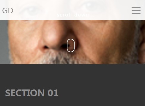
A jQuery & CSS based sliding navigation bar that is sticky at the top of the page as you scroll down. The navigation bar will auto hide itself in the case when you scroll up and reach the top of the browser window. It is fully responsive and mobile optimized for any web layouts. On small screen devices like mobile and tablet, you will see a dropdown toggle menu instead. Also comes with a smooth scroll functionality which allows you to scroll to any position of the web page. Great for single page websites.
Basic Usage:
1. Create a sticky top navigation bar as follows.
<header class="main_header">
  <div class="row">
    <div class="content">
      <div class="mobile-toggle"> <span></span> <span></span> <span></span> </div>
      <nav>
        <ul>
          <li><a href=".sec01">Section 01</a></li>
          <li><a href=".sec02">Section 02</a></li>
          <li><a href=".sec03">Section 03</a></li>
          <li><a href=".sec04">Section 04</a></li>
        </ul>
      </nav>
    </div>
  </div>
</header>
2. The required CSS/CSS3 rules for the responsive sticky navigation bar.
.main_header {
  position: fixed;
  top: 0px;
  max-height: 70px;
  z-index: 999;
  width: 100%;
  padding-top: 17px;
  background: none;
  overflow: hidden;
  -webkit-transition: all 0.3s;
  transition: all 0.3s;
  opacity: 0;
  top: -100px;
  padding-bottom: 6px;
  font-family: "Oswald", sans-serif;
}
@media only screen and (max-width: 766px) {
  .main_header {
    padding-top: 25px;
  }
}

.open-nav {
  max-height: 400px !important;
}
.open-nav .mobile-toggle {
  transform: rotate(-90deg);
  -webkit-transform: rotate(-90deg);
}

.sticky {
  background-color: rgba(255, 255, 255, 0.93);
  opacity: 1;
  top: 0px;
  border-bottom: 1px solid silver;
}

@media only screen and (max-width: 766px) {
  .logo {
    float: none;
  }
}

nav {
  float: right;
  width: 60%;
}
@media only screen and (max-width: 766px) {
  nav {
    width: 100%;
  }
}
nav ul {
  list-style: none;
  overflow: hidden;
  text-align: right;
  float: right;
}
@media only screen and (max-width: 766px) {
  nav ul {
    padding-top: 10px;
    margin-bottom: 22px;
    float: left;
    text-align: center;
    width: 100%;
  }
}
nav ul li {
  display: inline-block;
  margin-left: 35px;
  line-height: 1.5;
}
@media only screen and (max-width: 766px) {
  nav ul li {
    width: 100%;
    padding: 7px 0;
    margin: 0;
  }
}
nav ul a {
  color: #888888;
  text-transform: uppercase;
  font-size: 12px;
}

.mobile-toggle {
  display: none;
  cursor: pointer;
  font-size: 20px;
  position: absolute;
  right: 22px;
  top: 0;
  width: 30px;
  -webkit-transition: all 200ms ease-in;
  -moz-transition: all 200ms ease-in;
  transition: all 200ms ease-in;
}
@media only screen and (max-width: 766px) {
  .mobile-toggle {
    display: block;
  }
}
.mobile-toggle span {
  width: 30px;
  height: 4px;
  margin-bottom: 6px;
  border-radius: 1000px;
  background: #8f8f8f;
  display: block;
}
3. Create target sections you wish to scroll to manually. Please note that the CSS classes must correspond to the href links created in the first step.
<section class="sec01">Section 01</section>
<section class="sec02">Section 02</section>
<section class="sec03">Section 03</section>
<section class="sec04">Section 04</section>
4. The Javascript to enable the responsive and mobile friendly navigation bar.
$('nav a').click(function(event) {
  var id = $(this).attr("href");
  var offset = 70;
  var target = $(id).offset().top - offset;
  $('html, body').animate({
    scrollTop: target
  }, 500);
  event.preventDefault();
});
This awesome jQuery plugin is developed by cgruber. For more Advanced Usages, please check the demo page or visit the official website.