Responsive Mobile Toggle Navigation With jQuery And CSS3
| File Size: | 254 KB |
|---|---|
| Views Total: | 10998 |
| Last Update: | |
| Publish Date: | |
| Official Website: | Go to website |
| License: | MIT |
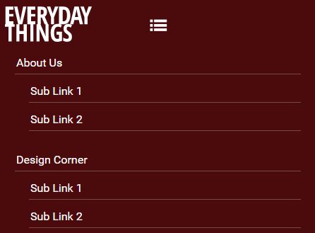
A fully responsive, multi-level site navigation system that uses JQuery and CSS3 media queries to switch between dropdown navigation and mobile-friendly toggle menu depending on the current screen size.
How to use it:
1. Create a normal multi-level drop down menu using nested nav lists as follow:
<nav>
  <a class="mobile_menu" title="Menu" href="#"></a>
  <ul>
    <li><a href="#" aria-haspopup="true">About Us </a>
      <ul>
        <li><a href="#">Sub Link 1</a></li>
        <li><a href="#">Sub Link 2</a></li>
      </ul>
    </li>
    <li><a href="#" aria-haspopup="true">Design Corner</a>
      <ul>
        <li><a href="#">Sub Link 1</a></li>
        <li><a href="#">Sub Link 2</a></li>
        <li><a href="#" aria-haspopup="true">Sub Link 3</a>
          <ul>
            <li><a href="#">Sub Sub Link 4</a></li>
            <li><a href="#">Sub Sub Link 5</a></li>
          </ul>
        </li>
      </ul>
    </li>
    <li><a href="#" >Products</a>
      <ul>
        <li><a href="#">Sub Link 1</a></li>
        <li><a href="#">Sub Link 2</a></li>
      </ul>
    </li>
    <li><a href="#">Contact Us</a></li>
  </ul>
</nav>
2. The primary CSS styles for the navigation menu.
nav {
  background-color: rgba(0, 0, 0, .65);
  position: relative;
  padding: 50px 0px 0px 0px;
}

nav a.mobile_menu {
  width: 32px;
  height: 32px;
  background: url(../images/icon_menu.svg) no-repeat 0 0;
  background-size: contain;
  position: absolute;
  top: 22px;
  left: 50%;
  margin-left: -16px;
  display: none;
}

nav a:visited { color: #fff; }

nav ul {
  list-style: none;
  margin: 0px;
  padding: 0px;
}

nav ul::after {
  content: "";
  display: block;
  clear: both;
}

nav ul li:hover { background-color: #2b0306; }

nav ul li:hover > ul { display: block; }

nav ul li a {
  display: inline-block;
  color: #fff;
  padding: 10px 20px;
  text-decoration: none;
  width: 125px;
  position: relative;
}

nav ul li a:hover { background-color: #79131a; }

nav ul ul {
  display: none;
  position: absolute;
  top: 100%;
  background-color: #2b0306;
}

nav ul ul li { position: relative; }

nav ul ul ul {
  left: 100%;
  top: 0;
}

/* top level */

nav > ul { padding-left: 200px; }

nav > ul > li { float: left; }

nav > ul > li > a {
  padding: 10px 20px 15px 20px;
  width: auto;
}

nav a[aria-haspopup="true"]::after {
  content: '';
  display: block;
  width: 0;
  height: 0;
  position: absolute;
  border-top: 4px solid transparent;
  border-bottom: 4px solid transparent;
  border-left: 4px solid #fff;
  right: 9px;
  top: 16px;
}

nav > ul > li > a[aria-haspopup="true"]::after {
  border-left: 4px solid transparent;
  border-right: 4px solid transparent;
  border-top: 4px solid #fff;
  left: 20px;
  bottom: 6px;
  right: auto;
  top: auto;
}
3. Set the mobile styles to the navigation menu in the CSS3 media queries:
@media screen and (max-width:760px) {

nav { padding-top: 80px; }

nav > ul { padding-left: 10px; }

}

@media screen and (max-width:625px) {

nav {
  padding: 50px 15px 20px 15px;
  background-color: #4b0a0c;
  height: 0px;
  overflow: hidden;
}

nav a.mobile_menu { display: block; }

nav ul, nav ul ul, nav ul ul ul {
  display: block;
  position: static;
}

nav > ul { padding: 0px; }

nav > ul > li {
  float: none;
  margin-top: 25px;
}

nav ul li:hover { background: none; }

nav ul li a {
  display: block;
  margin: 8px 10px 8px 10px;
  padding: 6px 15px 6px 2px;
  border-bottom: 1px solid rgba(255, 255, 255, .25);
  width: auto;
}

nav ul li a:hover { background-color: rgba(255, 255, 255, .2); }

nav ul ul { background: none; }

nav ul ul li a { margin-left: 30px; }

nav ul ul ul li a { margin-left: 60px; }

nav a[aria-haspopup="true"]::after { display: none; }

}
4. Place the latest version of jQuery library right before the closing body tag.
<script src="//code.jquery.com/jquery-3.1.1.js"></script>
5. The core JavaScript to active & animate the navigation menu.
$ (document).ready(function(){

  $('nav a.mobile_menu').on('click', function() {

    var currentNAvHeight = $('nav').height();

    if( currentNAvHeight < 5){

      var newNavHeight = $('nav > ul').height() + 15;
      $('nav').animate({'height': newNavHeight + 'px'}, 750);
    }else {
      $('nav').animate({'height':'0px'}, 750, function () {
        $(this).removeAttr('style');
      });
    }

  });

  $(window).resize(function(){

    if ( $(this).width() > 625) {
       $('nav').removeAttr('style');
    }

  });

});
This awesome jQuery plugin is developed by Charlyinthenet. For more Advanced Usages, please check the demo page or visit the official website.


