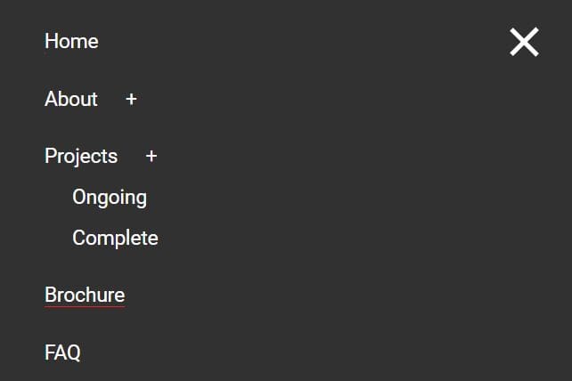
Responsive Off-canvas Navigation with Gooey Transition Effect
| File Size: | 4.92 KB |
|---|---|
| Views Total: | 6657 |
| Last Update: | |
| Publish Date: | |
| Official Website: | Go to website |
| License: | MIT |
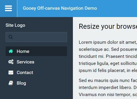
A jQuery & CSS / CSS3 based responsive off-canvas push navigation that comes with a cool gooey transition effect as you resize the browser window.
How to use it:
1. Include the Font Awesome 4 for navigation icons.
<link rel="stylesheet" href="/path/to/font-awesome.min.css">
2. Create an off-canvas sidebar navigation for your website.
<aside>
  <h2>Sidebar Navigation</h2>
  <nav class="site-nav">
    <a class="active" href="#"><i class="fa fa-home"></i> Home</a>
    <a href="#"><i class="fa fa-gears"></i> Services</a>
    <a href="#"><i class="fa fa-envelope"></i> Contact</a>
    <a href="#"><i class="fa fa-book"></i> Blog</a>
  </nav>
  <footer>
    <a href=""><i class="fa fa-sign-out fa-rotate-180"></i> Logout</a>
  </footer>
</aside>
3. Create a toggle button which allows you to open / close the sidebar navigation.
<button id="menu" title="Menu"><i class="fa fa-bars fa-2x"></i></button>
4. The core CSS styles for the sidebar navigation.
aside {
  position: fixed;
  height: 100%;
  width: 100%;
  color: #fff;
  left: -100%;
  background-color: #2A3744;
  padding: 20px;
  -moz-transition: left 0.4s ease, width 0.5s cubic-bezier(0.525, -0.35, 0.115, 1.335);
  -o-transition: left 0.4s ease, width 0.5s cubic-bezier(0.525, -0.35, 0.115, 1.335);
  -webkit-transition: left 0.4s ease, width 0.5s cubic-bezier(0.525, -0.35, 0.115, 1.335);
  transition: left 0.4s ease, width 0.5s cubic-bezier(0.525, -0.35, 0.115, 1.335);
}

aside a {
  padding: 8px;
  color: rgba(255, 255, 255, 0.7);
  font-weight: 300;
  -moz-transition: background-color 0.3s, color 0.3s;
  -o-transition: background-color 0.3s, color 0.3s;
  -webkit-transition: background-color 0.3s, color 0.3s;
  transition: background-color 0.3s, color 0.3s;
}

aside a:hover { color: #fff; }

aside a i, aside a img {
  width: 20px;
  text-align: center;
  margin-right: 6px;
}

aside .site-nav a { margin-bottom: 3px; }

aside .site-nav a.active, aside .site-nav a:hover { background-color: rgba(0, 0, 0, 0.3); }

aside .site-nav a.active i { color: #24FFCE; }

aside footer {
  margin-top: 10px;
  padding-top: 10px;
  border-top: 1px solid rgba(0, 0, 0, 0.3);
  width: 100%;
  position: absolute;
  bottom: 40px;
  left: 0;
  padding-left: 10px;
}

aside footer a { padding: 8px; }
5. The required CSS styles for your main content.
<section>
  Main content here
</section>
section {
  -moz-transition: margin-left 0.4s ease;
  -o-transition: margin-left 0.4s ease;
  -webkit-transition: margin-left 0.4s ease;
  transition: margin-left 0.4s ease;
}
6. Make them responsive.
@media (min-width: 639px) {

body.nav-open section { margin-left: 250px; }

aside {
  position: fixed;
  top: 0;
  padding-top: 80px;
  width: 250px;
}

}
7. The jQuery script to toggle CSS classes as you open / close the sidebar navigation. Make sure to include the JavaScript snippet as displayed below after jQuery library but before the closing body tag.
<script src="//code.jquery.com/jquery-2.1.4.min.js"></script>
$(function(){
  $("#menu").on("click" , function(){
    $(this).toggleClass("active");
    $("body").toggleClass("nav-open");
  });
});
This awesome jQuery plugin is developed by soulrider911. For more Advanced Usages, please check the demo page or visit the official website.