Responsive & Retina-Ready Menu with Size-Dependent Layouts
| File Size: | 41.3 KB |
|---|---|
| Views Total: | 7447 |
| Last Update: | |
| Publish Date: | |
| Official Website: | Go to website |
| License: | MIT |
A Responsive & Retina-Ready Menu built with CSS3 and a little bit javascript. It uses an icon font to make the menu fully retina-ready.
The menu automatically changes to one of three different layouts depending on the browser window size: a “desktop” inline version, a two columns tablet-optimized version and a mobile version with a menu link to display and hide the navigation for smaller screens.
Preview:
Desktop inline version:

Two columns tablet-optimized version:

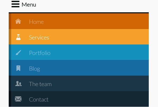
Mobile version:

How to use it:
1. Include component.css to style the menu
<link rel="stylesheet" type="text/css" href="css/component.css" />
2. Markup html structure
<nav id="menu" class="nav">
<ul>
<li> <a href="#"> <span class="icon"> <i aria-hidden="true" class="icon-home"></i> </span> <span>Home</span> </a> </li>
<li> <a href="#"> <span class="icon"> <i aria-hidden="true" class="icon-services"></i> </span> <span>Services</span> </a> </li>
<li> <a href="#"> <span class="icon"> <i aria-hidden="true" class="icon-portfolio"></i> </span> <span>Portfolio</span> </a> </li>
<li> <a href="#"> <span class="icon"> <i aria-hidden="true" class="icon-blog"></i> </span> <span>Blog</span> </a> </li>
<li> <a href="#"> <span class="icon"> <i aria-hidden="true" class="icon-team"></i> </span> <span>The team</span> </a> </li>
<li> <a href="#"> <span class="icon"> <i aria-hidden="true" class="icon-contact"></i> </span> <span>Contact</span> </a> </li>
...
</ul>
</nav>
3. The javascript
<script>
//  The function to change the class
var changeClass = function (r,className1,className2) {
var regex = new RegExp("(?:^|\\s+)" + className1 + "(?:\\s+|$)");
if( regex.test(r.className) ) {
r.className = r.className.replace(regex,' '+className2+' ');
    }
    else{
r.className = r.className.replace(new RegExp("(?:^|\\s+)" + className2 + "(?:\\s+|$)"),' '+className1+' ');
    }
    return r.className;
};

//  Creating our button in JS for smaller screens
var menuElements = document.getElementById('menu');
menuElements.insertAdjacentHTML('afterBegin','<button type="button" id="menutoggle" class="navtoogle" aria-hidden="true"><i aria-hidden="true" class="icon-menu"> </i> Menu</button>');

//  Toggle the class on click to show / hide the menu
document.getElementById('menutoggle').onclick = function() {
changeClass(this, 'navtoogle active', 'navtoogle');
}
</script>
This awesome jQuery plugin is developed by STÉPHANIE WALTER. For more Advanced Usages, please check the demo page or visit the official website.


