Smooth Multi-level Responsive Menu With jQuery And CSS3
| File Size: | 2.48 KB |
|---|---|
| Views Total: | 9773 |
| Last Update: | |
| Publish Date: | |
| Official Website: | Go to website |
| License: | MIT |
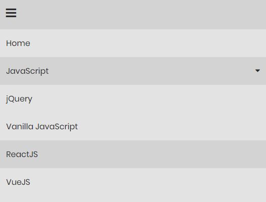
A minimal responsive multi-level menu that will be automatically collapsed into a smoothly-sliding dropdown hamburger navigation on small screen devices.
jQuery is used to toggle the CSS classes and apply the smooth slide animations to the dropdown menus when toggled.
How to use it:
1. Load the Font Awesome for the hamburger button.
<link rel="stylesheet"
      href="https://use.fontawesome.com/releases/v5.1.0/css/all.css"
      integrity="sha384-lKuwvrZot6UHsBSfcMvOkWwlCMgc0TaWr+30HWe3a4ltaBwTZhyTEggF5tJv8tbt"
      crossorigin="anonymous">
2. Create the multi-level dropdown menu.
<nav>
  <div>
    <i class="fa fa-bars"></i>
  </div>

  <ul>
    <li><a href="#">Home</a></li>
    <li><a href="#">JavaScript <i class="fa fa-sort-desc"></i></a>
      <ul>
        <li><a href="#">jQuery</a></li>
        <li><a href="#">Vanilla JavaScript</a></li>
        <li><a href="#">ReactJS</a></li>
        <li><a href="#">VueJS</a></li>
      </ul>
    </li>
    <li><a href="#">Graphic Design <i class="fa fa-sort-desc"></i></a>
      <ul>
        <li><a href="#">Font</a></li>
        <li><a href="#">PSD</a></li>
        <li><a href="#">Illustration</a></li>
        <li><a href="#">Texture</a></li>
      </ul>
    </li>
    <li><a href="#">About</a></li>
    <li><a href="#">Contact</a></li>
  </ul>
</nav>
3. The CSS for the horizontal dropdown menu on the desktop.
nav ul {
  margin: 0;
  padding: 0;
  list-style-type: none;
  background: #e3e3e3;
  position: relative;
}

nav ul li {
  display: inline-block;
}

nav ul li a {
  color: #292929;
  text-decoration: none;
  padding: 15px;
  display: block;
}

nav ul li:hover {
  background: lightgrey;
}

nav ul ul {
  position: absolute;
  min-width: 200px;
  background: lightgrey;
  display: none;
}

nav ul ul li {
  display: block;
  background: #e3e3e3;
}

nav ul li:hover ul {
  display: block;
}

nav ul li i {
  color: #292929;
  float: right;
  padding-left: 20px;
}

nav div {
  background: lightgrey;
  color: #292929;
  font-size: 24px;
  padding: 0.6em;
  cursor: pointer;
  display: none;
}
4. The CSS for the sliding hamburger navigation on the mobile.
@media(max-width: 768px) {
  nav div {
    display: block;
  }

  nav ul {
    display: none;
    position: static;
    background: #e3e3e3;
  }

  nav ul li {
    display: block;
  }

  nav ul ul {
    position: static;
    background: #e3e3e3;
  }
}
5. Insert the latest jQuery library right before the </body> tag.
<script src="https://code.jquery.com/jquery-3.3.1.min.js"
        integrity="sha384-tsQFqpEReu7ZLhBV2VZlAu7zcOV+rXbYlF2cqB8txI/8aZajjp4Bqd+V6D5IgvKT"
        crossorigin="anonymous"></script>
6. The main JavaScript to activate the responsive menu.
$("nav div").click(function() {
  $("ul").slideToggle();
  $("ul ul").css("display", "none");
});

$("ul li").click(function() {
  $("ul ul").slideUp();
  $(this).find('ul').slideToggle();
});

$(window).resize(function() {
  if($(window).width() > 768) {
    $("ul").removeAttr('style');
  }
});
This awesome jQuery plugin is developed by codegridweb. For more Advanced Usages, please check the demo page or visit the official website.


