Space-saving Responsive Menu with jQuery and CSS3
| File Size: | 3.16 KB |
|---|---|
| Views Total: | 6733 |
| Last Update: | |
| Publish Date: | |
| Official Website: | Go to website |
| License: | MIT |
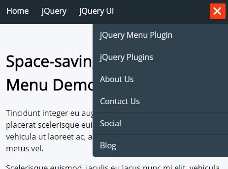
A jQuery based, responsive, mobile-friendly, space-saving navigation menu that automatically collapses overflow items into a toggleable dropdown menu when there's no enough page space.
How to use it:
1. Create a header navigation for your website.
<header>
  <nav id="menu">
    <ul>
      <li><a href="#">Home</a></li>
      <li><a href="#">jQuery</a></li>
      <li><a href="#">jQuery UI</a></li>
      <li><a href="#">jQuery Menu Plugin</a></li>
      <li><a href="#">jQuery Plugins</a></li>
      <li><a href="#">About Us</a></li>
      <li><a href="#">Contact Us</a></li>
      <li><a href="#">Social</a></li>
      <li><a href="#">Blog</a></li>
    </ul>
  </nav>
</header>
2. The basic CSS styles for the site navigation.
header {
  background: #1e2b33;
  padding: 15px 5px;
  position: relative;
  z-index: 1;
}

#menu {
  position: relative;
  z-index: 1;
  width: 100%;
}

#menu ul {
  list-style: none;
  margin: 0;
  padding: 0;
  white-space: nowrap;
  display: inline-block;
}

#menu ul li {
  display: inline-block;
  position: relative;
}

#menu ul li a {
  color: #fff;
  text-decoration: none;
  padding: 0.7em;
}
3. The primary CSS styles for menu dropdown.
#menu ul li.on-hidden { display: none; }

#on-hidden-menu {
  display: block;
  position: absolute;
  z-index: 10;
  right: 0;
  margin-top: 15px;
  min-width: 280px;
}

#on-hidden-menu ul {
  margin: 0;
  padding: 0;
  list-style: none;
  position: relative;
  overflow: hidden;
  height: 0;
}

#on-hidden-menu li {
  background: #30424d;
  border-bottom: 1px solid #273640;
  opacity: 0;
  -moz-transition: all .4s ease-in-out .2s;
  -o-transition: all .4s ease-in-out .2s;
  -webkit-transition: all .4s ease-in-out .2s;
  transition: all .4s ease-in-out .2s;
  position: relative;
}

#on-hidden-menu li a {
  color: rgba(255,255,255,.9);
  text-decoration: none;
  padding: 10px 15px;
  display: block;
}

#on-hidden-menu li a:hover { background: #354C5A; }

#on-hidden-menu.open ul {
  display: block;
  height: 100%;
}

#on-hidden-menu.open ul li { opacity: 1; }

#on-hidden-menu.open ul li:last-child { border-bottom-left-radius: 5px; }
4. Style the menu toggle button.
#on-hidden-menu .toggle {
  width: 32px;
  position: absolute;
  top: -42px;
  right: 10px;
  height: 32px;
  background-color: #f73a14;
  z-index: 1;
  cursor: pointer;
  border-radius: 2px;
}

#on-hidden-menu .toggle:before, #on-hidden-menu .toggle:after, #on-hidden-menu .toggle span:before {
  content: '';
  width: 4px;
  height: 4px;
  background: #fff;
  border-radius: 5px;
  position: absolute;
  top: 17px;
  left: 5px;
  -moz-transition: all .4s ease-in-out;
  -o-transition: all .4s ease-in-out;
  -webkit-transition: all .4s ease-in-out;
  transition: all .4s ease-in-out;
}

#on-hidden-menu .toggle:after {
  left: 13px;
  -moz-transition-delay: .1s;
  -o-transition-delay: .1s;
  -webkit-transition-delay: .1s;
  transition-delay: .1s;
}

#on-hidden-menu .toggle span:before {
  left: 21px;
  -moz-transition-delay: .2s;
  -o-transition-delay: .2s;
  -webkit-transition-delay: .2s;
  transition-delay: .2s;
}

#on-hidden-menu.open .toggle:before, #on-hidden-menu.open .toggle:after {
  width: 20px;
  -moz-transform: rotate(225deg);
  -ms-transform: rotate(225deg);
  -o-transform: rotate(225deg);
  -webkit-transform: rotate(225deg);
  transform: rotate(225deg);
  top: 14px;
  height: 3px;
}

#on-hidden-menu.open .toggle:after {
  -moz-transform: rotate(-225deg);
  -ms-transform: rotate(-225deg);
  -o-transform: rotate(-225deg);
  -webkit-transform: rotate(-225deg);
  transform: rotate(-225deg);
  left: 5px;
  -moz-transition-delay: .0s;
  -o-transition-delay: .0s;
  -webkit-transition-delay: .0s;
  transition-delay: .0s;
}

#on-hidden-menu.open .toggle span:before {
  top: 14px;
  left: 13px;
  width: 2px;
  height: 2px;
  -moz-transition-delay: .0s;
  -o-transition-delay: .0s;
  -webkit-transition-delay: .0s;
  transition-delay: .0s;
}
5. Include the needed jQuery library at the end of the document.
<script src="//code.jquery.com/jquery-2.1.4.min.js"></script>
6. The core JavaScript to active the smart navigation menu.
hiddenNavBar = {
  $menu: $('#menu'),
  init: function () {
    this.resize();
    $('<div id="on-hidden-menu"><div class="toggle "><span></span></div><ul></ul></div>').hide().insertAfter(this.$menu);
    // toggle
    $('#on-hidden-menu .toggle').click(function () {
      $('#on-hidden-menu').toggleClass('open');
    });

    // win load & resize
    $(window).on('load resize', function () {
      hiddenNavBar.resize();
    });
  },
  resize: function () {
    setTimeout(function () {
      var menuWidth = $('ul', this.$menu).width() + 60;
      var winW = $(window).width();

      console.log(menuWidth, winW);

      if (menuWidth > winW) {
        console.log('init');

        $('#on-hidden-menu').show();
        $clone = $('li:not(".on-hidden"):last', this.$menu).addClass('on-hidden').clone();

        if ($clone.parent().size() == 0) {
          $clone.prependTo($('#on-hidden-menu ul'));
        }

        hiddenNavBar.resize();

      } else if (menuWidth + $('li.on-hidden:first').width() < winW) {
        $('li.on-hidden:first').removeClass('on-hidden');
        $('#on-hidden-menu ul li:first').remove();
      }

      if ($('.on-hidden').size() == 0) {
        $('#on-hidden-menu').removeClass('open').hide();
      }
    }, 10);
  }
};

$(function () {
  hiddenNavBar.init();
})
This awesome jQuery plugin is developed by supah. For more Advanced Usages, please check the demo page or visit the official website.


