Sticky Mobile-friendly Navigation Menu With jQuery
| File Size: | 22 KB |
|---|---|
| Views Total: | 3623 |
| Last Update: | |
| Publish Date: | |
| Official Website: | Go to website |
| License: | MIT |
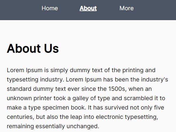
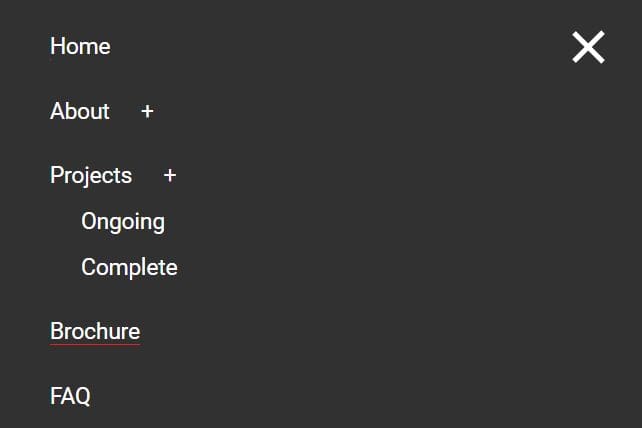
This is a sticky responsive nav menu built using jQuery and CSS3 that automatically converts the regular dropdown nav into a mobile-friendly off-canvas menu. The mobile menu will slide from the right hand side of the screen while blurring the main content.
How to use it:
1. Create a normal html list based dropdown nav for your website. In this case, we're going to create a multi-level dropdown nav from nested HTML unordered lists as these:
<div id="navigation" class="navigation">
  <nav id="nav">
    <ul>
      <li><a href="#">LINK 1</a></li>
      <li><a href="#">LINK 2</a></li>
      <li><a href="#">LINK 3.1</a>
        <ul>
          <li><a href="#">LINK 3.2</a>
            <ul>
              <li><a href="#">LINK 3.2.1</a></li>
              <li><a href="#">LINK 3.2.2</a></li>
              <li><a href="#">LINK 3.2.3</a></li>
            </ul>
          </li>
          <li><a href="#">LINK 3.3</a></li>
          <li><a href="#">LINK 3.4</a></li>
        </ul>
      </li>
      <li><a href="#">LINK 4</a></li>
      <li><a href="#">LINK 5</a></li>
      ...
    </ul>
  </nav>
</div>
2. Create a button to toggle the off-canvas menu on mobile view.
<div id="button-box" class="button-box"> <button type="button" id="toggle-nav" class="toggle-nav">MENU<span>☰</span></button> </div>
3. The main CSS/CSS3 styles.
#button-box {
  display: flex;
  flex-direction: row;
  height: 64px;
  position: absolute;
  right: 0;
  top: 0;
  width: 96px;
}

#toggle-nav {
  border: 0;
  height: 64px;
  line-height: 64px;
  padding: 0;
  position: relative;
  text-indent: -99999px;
  width: 48px;
}

#toggle-nav span {
  display: block;
  font-size: 1.7rem;
  left: 25%;
  position: absolute;
  text-indent: 0;
  top: 0;
}

#toggle-nav span { transform: scale(1, 0.8); }

#navigation {
  box-shadow: 0 3px 6px rgba(0, 0, 0, 0.16), 0 3px 6px rgba(0, 0, 0, 0.23);
  background: #F8F8F0;
  position: fixed;
  right: 0;
  top: 64px;
  z-index: 9600;
}

#navigation {
  height: 100%;
  overflow: hidden;
  transition: all linear 0.2s;
  width: 0;
}

#navigation.visible {
  transition: all linear 0.2s;
  width: 300px;
}

#nav {
  font-size: 0.875rem;
  height: calc(100% - 64px);
  overflow-x: hidden;
  overflow-y: auto;
  width: calc(100% + 24px);
}

#nav ul {
  list-style: none;
  margin: 0;
  padding: 0;
}

#nav ul li {
  border-top: 1px solid #a1a1a1;
  cursor: pointer;
  position: relative;
}

#nav ul li ul { display: none; }

#nav ul li ul li { background: rgba(0, 0, 0, 0.1); }

#nav ul li a {
  border: 0;
  display: block;
  height: 48px;
  line-height: 48px;
  padding: 0 8px;
  position: relative;
  white-space: nowrap;
  width: calc(100% - 24px);
}

#nav .hasChildren { width: calc(100% - 56px); }

#nav .hasChildren:after {
  background: rgba(0, 0, 0, 0.1);
  border-left: 1px solid #a1a1a1;
  content: '\22EE';
  font-size: 1.3rem;
  height: 48px;
  position: absolute;
  right: -33px;
  text-align: center;
  top: 0;
  width: 32px;
}

#nav .li-has-Children .ul-visible { border-top: 1px solid #a1a1a1; }

#overlay {
  background: rgba(0, 0, 0, 0.5);
  bottom: 0;
  height: 100%;
  left: 0;
  opacity: 0;
  position: fixed;
  right: 0;
  top: 0;
  transition: all linear 0.2s;
  visibility: hidden;
  width: 100%;
  z-index: +1;
}

#overlay.visible {
  opacity: 1;
  visibility: visible;
}

@media only screen and (min-width: 1200px) {

#button-box {
  position: relative;
  width: 48px;
}

#toggle-nav { display: none; }

#navigation {
  box-shadow: none;
  float: left;
  height: 64px;
  position: relative;
  top: 0;
  width: calc(100% - 200px - 48px);
}

#nav {
  height: 64px;
  overflow: hidden;
  position: relative;
  width: 100%;
}

#nav ul {
  height: 64px;
  position: relative;
}

#nav ul li {
  border-bottom: 0;
  cursor: pointer;
  display: inline-block;
  margin-right: 8px;
  position: relative;
}

#nav ul li a {
  border-bottom: 0;
  color: #232d36;
  height: 64px;
  line-height: 64px;
  padding-right: 8px;
  position: relative;
  width: auto;
  z-index: +1;
}

#nav ul li .hasChildren {
  margin-right: 4px;
  padding-right: 8px;
  width: auto;
}

#nav ul li .hasChildren:after {
  background: transparent;
  border: 0;
  height: 64px;
  padding-right: 4px;
  right: 0;
  width: 8px;
}

#nav ul li ul {
  background: #FFED4E;
  box-shadow: 0 3px 6px rgba(0, 0, 0, 0.16), 0 3px 6px rgba(0, 0, 0, 0.23);
  height: auto;
  margin-top: -1px;
  min-width: 100px;
  position: fixed;
  top: 64px;
  width: auto;
  z-index: +1;
}

#nav ul li ul li {
  display: block;
  width: 100%;
  margin-right: 0;
}

#nav ul li ul li a {
  color: #282828;
  height: 40px;
  line-height: 40px;
  padding-right: 4px;
}

#nav ul li ul li a:hover { background: rgba(0, 0, 0, 0.1); }

#nav ul li ul li .hasChildren {
  margin-right: 0;
  padding-right: 16px;
}

#nav ul li ul li .hasChildren:after {
  height: 40px;
  margin-right: 4px;
}

#nav ul li ul li ul {
  background: #FFD569;
  position: absolute;
  top: 0;
  left: 100%;
}

#nav ul li:last-child { margin-right: 0; }

#nav ul li:hover ul { display: block; }

#nav ul li:hover ul li ul { display: none; }

#nav ul li:hover ul li:hover ul { display: block; }

#nav ul li:hover ul li:hover ul li ul { display: none; }

#nav ul li:hover ul li:hover ul li:hover ul { display: block; }

}
4. The main JavaScript to enable the navigation. Just add the following JavaScript snippets after jQuery library and done.
<div id="button-box" class="button-box"> <button type="button" id="toggle-nav" class="toggle-nav">MENU<span>☰</span></button> </div>
<div id="button-box" class="button-box"> <button type="button" id="toggle-nav" class="toggle-nav">MENU<span>☰</span></button> </div>
This awesome jQuery plugin is developed by labsforge. For more Advanced Usages, please check the demo page or visit the official website.