Stylish Responsive Slide Menu with jQuery and CSS3
| File Size: | 2.11 KB |
|---|---|
| Views Total: | 3977 |
| Last Update: | |
| Publish Date: | |
| Official Website: | Go to website |
| License: | MIT |
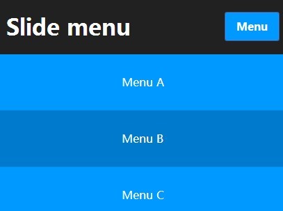
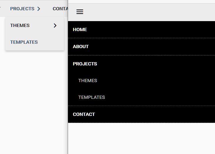
A stylish responsive navigation menu that will be converted into a toggle menu with CSS3 animations in small screens.
How to use it:
1. Create the Html for a responsive menu.
<div id="header" class="l-header">
  <div class="wrap">
    <button class="btn menu-btn">Menu</button>
    <nav class="menu">
      <ul class="menu__list">
        <li class="menu__item"> <a href="#" class="menu__link">Item A</a> </li>
        <li class="menu__item"> <a href="#" class="menu__link">Item B</a> </li>
        <li class="menu__item"> <a href="#" class="menu__link">Item C</a> </li>
      </ul>
    </nav>
  </div>
</div>
2. The basic styles for the responsive menu.
button {
  -webkit-font-smoothing: antialiased;
  background-color: #09f;
  border: none;
  border-radius: 0.1875em;
  color: white;
  display: inline-block;
  font-size: 1em;
  font-weight: bold;
  line-height: 1;
  padding: .75em 1em;
  text-decoration: none;
}

button:hover {
  background-color: #007acc;
  color: white;
}

.l-header {
  height: 80px;
  position: relative;
  background: #212121;
}

.menu-btn {
  display: none;
  position: absolute;
  right: 10px;
  top: 20px;
}

@media (max-width: 768px) {
.menu-btn { display: block; }
}

.wrap {
  margin-left: auto;
  margin-right: auto;
  max-width: 1000px;
}
3. The core styles for the responsive menu.
.menu { float: right; }

.menu__list {
  overflow: hidden;
  padding-left: 0;
  margin: 0;
  list-style: none;
}

.menu__item {
  float: left;
  text-align: center;
  text-align: center;
}

.menu__link {
  display: block;
  color: #fff;
  text-decoration: none;
  line-height: 5em;
  height: 5em;
  padding: 0 1.5em;
  word-wrap: no-wrap;
  transition: all .3s ease;
}

.menu__link:hover,
.menu__link:focus {
  background: #09f;
  color: #fff;
}

@media (max-width: 768px) {

.menu { float: none; }

.menu__item {
  display: block;
  float: none;
  -webkit-transform: translateX(-100%);
  -moz-transform: translateX(-100%);
  -ms-transform: translateX(-100%);
  -o-transform: translateX(-100%);
  transform: translateX(-100%);
  transition: all .3s ease-out;
}

.menu__item--play {
  display: block;
  -webkit-transform: translateX(0);
  -moz-transform: translateX(0);
  -ms-transform: translateX(0);
  -o-transform: translateX(0);
  transform: translateX(0);
}

.menu__item + .menu__item { border-top: 1px solid #008ae6; }

.menu__link { background: #09f; }

.menu__link:hover { background: #007acc; }

}
4. Include the necessary jQuery library at the bottom of the document.
<script src="//ajax.googleapis.com/ajax/libs/jquery/1.11.1/jquery.min.js"></script>
5. A little jQuery script to enable the responsive menu.
$('.menu-btn').on('click', function() {

  var elem = $(this),
    item = $('.menu__item'),
    active = 'is-active',
    play = 'menu__item--play';

  if (  elem.hasClass(active) ) {
    elem.removeClass(active);
    $(item.get().reverse()).each(function(i) {
    var row = $(this);
      setTimeout(function() {
    row.removeClass(play);
    }, 50*i);
    });
  }

  else {
    elem.addClass(active);
    item.each(function(i) {
    var row = $(this);
      setTimeout(function() {
    row.addClass(play);
    }, 50*i);
    });
  }

});
This awesome jQuery plugin is developed by sutterlity. For more Advanced Usages, please check the demo page or visit the official website.