Stylish & Responsive Slide Out Menu with CSS3 and Javascript
| File Size: | 58 KB |
|---|---|
| Views Total: | 5427 |
| Last Update: | |
| Publish Date: | |
| Official Website: | Go to website |
| License: | MIT |
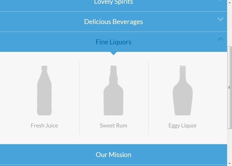
A stylish & responsive navigation menu built with CSS3 and javascript that slides out a grid-like thumbnail layout for the submenu. The menu slides out from the top when a main menu item is clicked and the sub-items fade in. When clicking on another item, the height of the submenu will adjust and the content will fade in and out while switching.
How to use it:
1. Markup html structure
<nav class="cbp-hsmenu-wrapper" id="cbp-hsmenu-wrapper">
<div class="cbp-hsinner">
<ul class="cbp-hsmenu">
<li> <a href="#">Menu 1</a>
<ul class="cbp-hssubmenu">
<li><a href="#"><img src="images/1.png" alt="img01"/><span>Submenu 1</span></a></li>
<li><a href="#"><img src="images/2.png" alt="img02"/><span>Submenu 2</span></a></li>
<li><a href="#"><img src="images/3.png" alt="img03"/><span>Submenu 3</span></a></li>
...
</ul>
</li>
<li> <a href="#">Menu 2</a>
<ul class="cbp-hssubmenu cbp-hssub-rows">
<li><a href="#"><img src="images/1.png" alt="img01"/><span>Submenu 1</span></a></li>
<li><a href="#"><img src="images/2.png" alt="img02"/><span>Submenu 2</span></a></li>
<li><a href="#"><img src="images/3.png" alt="img03"/><span>Submenu 3</span></a></li>
...
</ul>
</li>
<li> <a href="#">Menu 3</a>
<ul class="cbp-hssubmenu">
<li><a href="#"><img src="images/1.png" alt="img01"/><span>Submenu 1</span></a></li>
<li><a href="#"><img src="images/2.png" alt="img02"/><span>Submenu 2</span></a></li>
<li><a href="#"><img src="images/3.png" alt="img03"/><span>Submenu 3</span></a></li>
...
</ul>
</li>
<li><a href="#">Menu 4</a></li>
<li><a href="#">Menu 5</a></li>
</ul>
</div>
</nav>
2. The CSS
@font-face {
font-family: 'bpmenu';
src: url('../fonts/bpmenu/bpmenu.eot');
src: url('../fonts/bpmenu/bpmenu.eot?#iefix') format('embedded-opentype'),  url('../fonts/bpmenu/bpmenu.woff') format('woff'),  url('../fonts/bpmenu/bpmenu.ttf') format('truetype'),  url('../fonts/bpmenu/bpmenu.svg#bpmenu') format('svg');
font-weight: normal;
font-style: normal;
}
/* Main menu wrapper */
.cbp-hsmenu-wrapper {
position: relative;
}
/* Common style for all lists */
.cbp-hsmenu-wrapper ul {
list-style: none;
padding: 0;
margin: 0 auto;
}
/* 100% width bar for menu */
.cbp-hsinner {
background: #47a3da;
position: relative;
z-index: 100;
}
/* Main menu style */
.cbp-hsmenu-wrapper .cbp-hsmenu {
width: 90%;
max-width: 69em;
margin: 0 auto;
padding: 0 1.875em;
}
.cbp-hsmenu > li {
margin-left: 4em;
display: inline-block;
}
.cbp-hsmenu > li:first-child {
margin-left: 0;
}
/* Main menu link style */
.cbp-hsmenu > li > a {
color: #fff;
font-size: 1.2em;
line-height: 3em;
display: inline-block;
position: relative;
z-index: 10000;
outline: none;
}
.no-touch .cbp-hsmenu > li > a:hover, .no-touch .cbp-hsmenu > li > a:focus, .cbp-hsmenu > li.cbp-hsitem-open > a {
color: #02639d;
}
/* Add an arrow to the main menu link if it has a submenu (not the only child) */
.cbp-hsmenu > li > a:not(:only-child):before {
display: inline-block;
font-family: 'bpmenu';
speak: none;
font-style: normal;
font-weight: normal;
font-variant: normal;
text-transform: none;
line-height: 1;
-webkit-font-smoothing: antialiased;
content: "\f107";
font-size: 80%;
margin-right: 0.3em;
opacity: 0.4;
vertical-align: middle;
}
.cbp-hsmenu > li.cbp-hsitem-open > a:not(:only-child):before {
content: "\f106";
}
/* Add a triangle to currently open menu item link */
.cbp-hsmenu > li.cbp-hsitem-open > a:after {
top: 100%;
border: solid transparent;
content: " ";
height: 0;
width: 0;
position: absolute;
pointer-events: none;
border-color: transparent;
border-top-color: #47a3da;
border-width: 10px;
left: 50%;
margin-left: -10px;
}
/* Submenu style */
.cbp-hssubmenu {
position: absolute;
left: 0;
top: 100%;
width: 100%;
z-index: 0;
text-align: center; /* for aligning the sub items */
visibility: hidden;
}
.cbp-hssubmenu:before, .cbp-hssubmenu:after {
content: " ";
display: table;
}
.cbp-hssubmenu:after {
clear: both;
}
/* Let's allow 6 item in a row */
.cbp-hssubmenu > li {
width: 16.2%;
display: inline-block;
vertical-align: top;
box-shadow: -28px 0 0 -27px #ddd, 0 -28px 0 -27px #ddd;
opacity: 0;
-webkit-transition: opacity 0.1s 0s;
-moz-transition: opacity 0.1s 0s;
transition: opacity 0.1s 0s;
}
/* First 6 items don't have upper box shadow */
.cbp-hssubmenu > li:nth-child(-n+6) {
box-shadow: -28px 0 0 -27px #ddd;
}
/* Every 7th item does not have a left box shadow */
.cbp-hssubmenu > li:nth-child(6n+1) {
box-shadow: 0 -28px 0 -27px #ddd;
}
/* The first one does not have any box shadow */
.cbp-hssubmenu > li:first-child {
box-shadow: none;
}
.cbp-hssubmenu > li a {
display: block;
text-align: center;
color: #a2a2a2;
outline: none;
padding: 2em 1em 1em 1em;
}
.no-touch .cbp-hssubmenu > li a:hover, .no-touch .cbp-hssubmenu > li a:focus {
color: #888;
}
.cbp-hssubmenu > li a img {
border: none;
outline: none;
display: inline-block;
margin: 0;
max-width: 100%;
-webkit-transition: opacity 0.2s;
-moz-transition: opacity 0.2s;
transition: opacity 0.2s;
}
.no-touch .cbp-hssubmenu > li a:hover img {
opacity: 0.5;
}
.cbp-hssubmenu > li a span {
display: block;
min-height: 3em;
margin-top: 0.4em;
}
.cbp-hsmenu > li.cbp-hsitem-open .cbp-hssubmenu {
z-index: 1000;
visibility: visible;
}
.cbp-hsmenu > li.cbp-hsitem-open .cbp-hssubmenu > li {
opacity: 1;
-webkit-transition: opacity 0.5s 0.1s;
-moz-transition: opacity 0.5s 0.1s;
transition: opacity 0.5s 0.1s;
}
/* Helper div for animating the background */
.cbp-hsmenubg {
background: #f7f7f7;
position: absolute;
width: 100%;
top: 100%;
left: 0;
z-index: 0;
height: 0px;
}
.no-touch .cbp-hsmenubg {
-webkit-transition: height 0.3s;
-moz-transition: height 0.3s;
transition: height 0.3s;
}
 @media screen and (max-width: 65em) {
.cbp-hsmenu-wrapper {
font-size: 80%;
}
}
 @media screen and (max-width: 51.4375em) {
.cbp-hsmenu-wrapper {
font-size: 100%;
}
.cbp-hsmenu-wrapper .cbp-hsmenu {
padding: 0;
max-width: none;
width: 100%;
}
.cbp-hsmenu > li {
border-top: 1px solid rgba(255,255,255,0.5);
text-align: center;
margin: 0 auto;
display: block;
}
.cbp-hsmenu > li:first-child {
border-top: none;
}
.cbp-hsmenu > li > a {
display: block;
}
.cbp-hsmenu > li > a:not(:only-child):before {
line-height: 1.8;
right: 0;
position: absolute;
font-size: 200%;
}
.cbp-hsmenubg {
display: none;
}
.cbp-hssubmenu {
background: #f7f7f7;
position: relative;
overflow: hidden;
height: 0;
}
.cbp-hsmenu > li.cbp-hsitem-open .cbp-hssubmenu {
height: auto;
}
/* Let's only allow 3 item in a row now */
.cbp-hssubmenu > li {
width: 30%;
}
/* Reset box shadows for the 6 items in row case */
.cbp-hssubmenu > li:nth-child(-n+6),  .cbp-hssubmenu > li:nth-child(6n+1) {
box-shadow: -28px 0 0 -27px #ddd, 0 -28px 0 -27px #ddd;
}
/* First 4 items don't have upper box shadow */
.cbp-hssubmenu > li:nth-child(-n+3) {
box-shadow: -28px 0 0 -27px #ddd;
}
/* Every 5th item does not have a left box shadow */
.cbp-hssubmenu > li:nth-child(3n+1) {
box-shadow: 0 -28px 0 -27px #ddd;
}
}
 @media screen and (max-width: 25em) {
/* Let's only allow 1 item in a row now */
.cbp-hssubmenu > li {
width: 100%;
display: block;
}
.cbp-hsmenu-wrapper .cbp-hssubmenu > li {
box-shadow: 0 1px #cecece;
text-align: left;
}
.cbp-hssubmenu > li a {
text-align: left;
line-height: 50px;
padding: 0.4em 1em;
}
.cbp-hssubmenu > li a img {
float: left;
max-height: 50px;
}
.cbp-hssubmenu > li a span {
min-height: 0;
margin: 0;
}
}
3. The javascript
<script src="js/cbpHorizontalSlideOutMenu.min.js"></script>
<script>
var menu = new cbpHorizontalSlideOutMenu( document.getElementById( 'cbp-hsmenu-wrapper' ) );
</script>
This awesome jQuery plugin is developed by codrops. For more Advanced Usages, please check the demo page or visit the official website.


