Super Small Responsive Mobile Menu Plugin For jQuery
| File Size: | 8.15 KB |
|---|---|
| Views Total: | 2699 |
| Last Update: | |
| Publish Date: | |
| Official Website: | Go to website |
| License: | MIT |
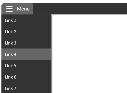
A simple and fast jQuery/Zepto plugin for creating a responsive & mobile-friendly dropdown toggle navigation based on automatic or custom breakpoints.
How to use it:
1. Load the nav.css into your page's head section to style the navigation.
<link rel="stylesheet" href="css/nav.css">
2. Create a normal horizontal navigation bar using Html unordered list.
<ul class="navbar">
  <li><a href="#">Link 1</a></li>
  <li><a href="#">Link 2</a></li>
  <li><a href="#">Link 3</a></li>
  <li><a href="#">Link 4</a></li>
  <li><a href="#">Link 5</a></li>
  <li><a href="#">Link 6</a></li>
  ...
</ul>
3. Load the necessary jQuery or Zepto library at the bottom of your page.
<script src="//ajax.googleapis.com/ajax/libs/jquery/1.11.1/jquery.min.js"></script>
4. Make sure to load the jQuery Responsive Simple Nav plugin after jQuery/Zepto.
<script src="js/navbar.min.js"></script>
5. Call the script with your configurations. The plugin will turn the horizontal navigation bar into a dropdown toggle menu when the screen size reaches the breakpoint defined in the javascript.
dropDownLabel: '<span class="icon"></span>',
breakPoint: 0, // define manual breakpoint - set it to 0 means no manual breakpoint
toggleSpeed: 320 // call your togglespeed here -- set it to 0 to turn it off
});
This awesome jQuery plugin is developed by snyoz. For more Advanced Usages, please check the demo page or visit the official website.


