Semantic Responsive Mobile Navigation - jQuery rsmm
| File Size: | 5.24 KB |
|---|---|
| Views Total: | 3251 |
| Last Update: | |
| Publish Date: | |
| Official Website: | Go to website |
| License: | MIT |
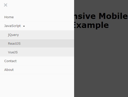
A responsive, adaptive, SEO-friendly, drop-down navigation plugin that collapses the horizontal menu items to an off-canvas side menu when a specified breakpoint is reached.
How to use it:
1. Create a normal dropdown menu from a nested nav list.
<nav class="myNav">
  <ul>
    <li>
      <a href="#">Home</a>
    </li>
    <li>
      <a href="#">JavaScript</a>
      <ul>
        <li>
          <a href="#">jQuery</a>
        </li>
        <li>
          <a href="#">ReactJS</a>
        </li>
        <li>
          <a href="#">VueJS</a>
        </li>
      </ul>
    </li>
    <li>
      <a href="#">Contact</a>
    </li>
    <li>
      <a href="#">About</a>
    </li>
  </ul>
</nav>
2. Load the Font Awesome for the hamburger button.
<link rel="stylesheet" href="https://use.fontawesome.com/releases/v5.3.1/css/all.css" integrity="sha384-mzrmE5qonljUremFsqc01SB46JvROS7bZs3IO2EmfFsd15uHvIt+Y8vEf7N7fWAU" crossorigin="anonymous">
3. Load jQuery JavaScript library and the jQuery rsmm plugin's files in the document.
<script src="https://code.jquery.com/jquery-3.3.1.slim.min.js" integrity="sha384-q8i/X+965DzO0rT7abK41JStQIAqVgRVzpbzo5smXKp4YfRvH+8abtTE1Pi6jizo" crossorigin="anonymous"></script>
<script src="script.js"></script>
4. Call the function rsmm on the nav list and define the breakpoint at which screen size the responsive nav should switch to the mobile view.
$(document).ready(function() {
  $('.myNav').rsmm({
    'mobile' : 768
  });
});
5. Make the responsive nav fixed on the top.
$(document).ready(function() {
  $('.myNav').rsmm({
    'position' : 'fixedOnScroll'
  });
});
This awesome jQuery plugin is developed by Chealeak. For more Advanced Usages, please check the demo page or visit the official website.


