9 Best Github Style Calendar Heatmap Plugins In JavaScript (2026 Update)
If you are looking for something to visualize the time series data and make it more readable, this article might give you some inspiration.
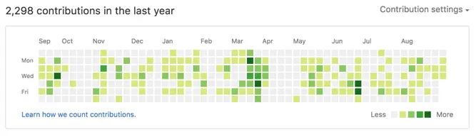
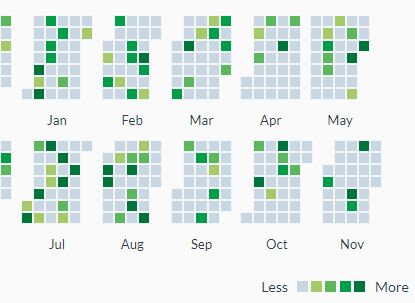
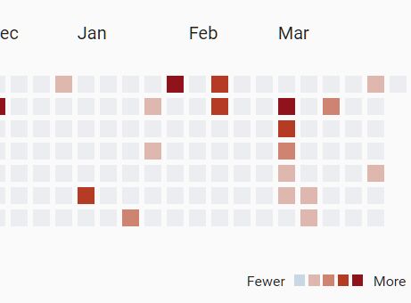
GitHub, the website that powers software development, uses a contributions calendar to display activity across the month. It's a great way of showing the volume of contribution activity in a given month. This type of calendar also shows users how people contribute to each project, especially how many contributors contribute how many times in a certain period of time. It's quite easy to fall in love with the tool when you start working with it due to its simplicity and fantastic features.
If you want to create a Github contributions calendar-style heatmap graph from your own time series data, one option is to write a jQuery or JavaScript plugin yourself. The other is to find an existing solution. This post compares seven of the best available, so you can sort through them to find the one that works best for your needs. Let's get started.
Originally Published Sep 06 2022, updated Mar 10 2026
Table of contents
Best jQuery Calendar Heatmap Plugins
Github-like Interactive Data Heatmaps using jQuery - Heatmap.js
The jQuery Heatmap plugin enables you to create data visualizations similar to GitHub's contribution calendar. It transforms your data into an interactive heatmap where color intensities represent data values, perfect for tracking activities, contributions, or any time-series data.
This plugin takes your time-series data and creates a calendar-style visualization. Each cell in the calendar represents a day, with color intensities mapping to your data values. The darker the color, the higher the value - giving users an immediate visual understanding of patterns and trends.
The Heatmap supports both static data arrays and dynamic data loading through AJAX requests. It automatically handles dates, adapts to different locales, and provides interactive tooltips. For organizations tracking user engagement, developer contributions, or any temporal data, this visualization presents complex information in a digestible format.

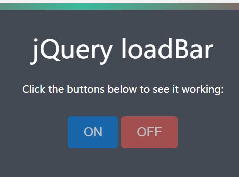
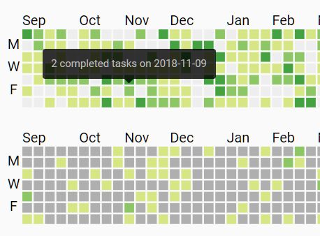
Calendar Heatmap Plugin With jQuery And Moment.js - CalendarHeatmap
A jQuery plugin used to generate a dynamic, interactive, configurable calendar heatmap for representing time series data.
Hover over the time slots to show details for each of the days on demand. Inspired by Github’s commit calendar graph.
jQuery Plugin For Github Style Heatmap Calendar - Contribution Graph
A jQuery plugin that renders a Github style, SVG based calendar heatmap for user profiles to represent time series data. Inspired by Github's contribution calendar graph.
Github Style Calendar Heatmap In jQuery
Just another jQuery plugin that dynamically renders a calendar heatmap (year view) to visualize time series data (like activities, contribution) similar to Github contribution graph.
Github Style Heatmap Graph Plugin With jQuery - Calmosaic
Calmosaic (Calendar Mosaic) is a jQuery plugin that dynamically renders a customizable calendar heatmap for representing time series data. Inspired by Github's contribution chart.
Best Vanilla JS Calendar Heatmap Libraries
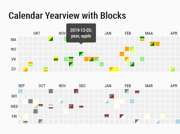
Customizable And Extensible Calendar Heatmap Library – cal-heatmap
A versatile javascript charting library that allows you to create customizable, extensible, and interactive time-series calendar heatmaps similar to Github’s contribution graph.
Features:
- Supports various data types such as JSON, CSV, TSV, and plain text (TXT).
- Dark Mode and Light Mode.
- Allows to customize the calendar language, timezone, and locale-specific settings.
- Allows to set min/max/start dates.
- Useful legend and tooltip plugins.
- Lots of API methods and events.
- Written in Typescript and ES6, and fully tested on real browsers
- And much more.

Github Style Contribution Graph In JavaScript – Heatmap.js
A JavaScript library to generate a Github contribution graph like heatmap for displaying user activity.

Easy Calendar Heatmap Web Component – contributions-calendar.js
A JavaScript library that helps you create a Github-style calendar heatmap (aka contributions calendar) to visualize time series data.

Generate Customizable Heat Maps For Date-based Activities – Heat.js
A lightweight JavaScript library that generates customizable heat maps to visualize date-based activity and trends.
Features:
- Six Visualization Modes: Switch between Map, Line, Chart, Days, Months, and Color Ranges views to analyze data from different perspectives.
- Multi-Language: 60 built-in language translations for international applications.
- Theme System: 31 ready-made CSS themes with full support for custom theming through CSS variables.
- Export Flexibility: Export data in nine formats including “csv”, “xml”, “txt”, “md”, “html”, “tsv”, “yaml”, and “toml”.
- Import Capability: Import existing data from seven different file formats.
- Trend Segregation: Split data into distinct trend types for separate analysis and visualization.
- Responsive Design: Fully responsive layout styled with CSS/SASS and compatible with Bootstrap.
- Custom Year Ranges: Configure fiscal year displays or any custom month range beyond the standard January to December.

Conclusion:
The seven plugins in this post offer a broad diversity in their method of presenting your data for analysis, as well as the capabilities of the calendar heatmaps. In particular, we were wowed by how dynamic and interactive most of them are, and how easy they are to customize through available options or custom CSS styling. All of these plugins will lend a hand if you’re looking to create the next Github-inspired calendar heatmap graph. Enjoy.
See Also:
- 10 Best JavaScript Calendar Plugins For Scheduled Events
- 10 Best Timeline Components In jQuery And Pure JS/CSS
- 10 Best Gantt Chart Plugins In JavaScript