iOS Style Float Label Pattern In jQuery - Slidinput
| File Size: | 137 KB |
|---|---|
| Views Total: | 1491 |
| Last Update: | |
| Publish Date: | |
| Official Website: | Go to website |
| License: | MIT |
Yet another jQuery implementation of the iOS Style Float Lable Pattern that floats the placeholder value above the input when your user starts typing or moves the focus to the text field.
How to use it:
1. Add the stylesheet slidinput.css and the JavaScript slidinput.js to the webpage.
<link rel="stylesheet" href="/path/to/dist/jquery.slidinput.min.css" />
<script src="/path/to/cdn/jquer.slim.min.js"></script>
<script src="/path/to/dist/jquery.slidinput.min.js"></script>
2. Attach the plugin to the input field within the document. Note that each input field must have a placeholder attribute for the floating label.
<h3>Username</h3>
<input type="text" placeholder="Username" class="myInput" />

<h3>Password</h3>
<input type="password" placeholder="Password" class="myInput" />

<h3>Website</h3>
<input type="url" placeholder="Website" class="myInput" />
$(function(){
  $('.myInput').slidinput();
});
3. Set the scale factor. Default: 0.5.
$('.myInput').slidinput({
  scaling: 0.7
});
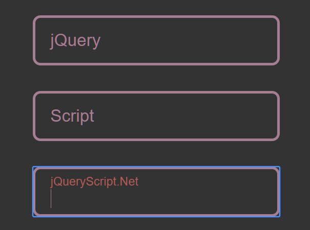
4. Make the label floating above the input field.
$('.myInput').slidinput({
  mode: 'above'
});
5. Enable the regular mode.
$('.myInput').slidinput({
  mode: 'regular'
});
6. Enable the middle mode.
$('.myInput').slidinput({
  mode: 'middle'
});
7. Apply x/y offsets to the floating label.
$('.myInput').slidinput({
  offsetY: -10,
  offsetX: -25
});
8. Disable the focus animation.
$('.myInput').slidinput({
  focusAnimation: false
});
9. Auto re-init the plugin on window resize. Default: true.
$('.myInput').slidinput({
  resizeUpdate: true
});
10. Callback functions.
$('.myInput').slidinput({
  onInit: function(controller, options){
    // do something
  },
  onDestroy: function(controller, options){
    // do something
  }
});
11. Override the default styles of the floating label.
.myInput {
  font-family: sans-serif;
  border: 2px solid #a57e94;
  border-radius: 6px;
  margin: 10px 20px;
  background-color: transparent;
  color: #a57e94;
  padding: 10px 12px;
}

.myInput-wrapper.focused .slidinput-placeholder {
  color: #ad5e57 !important;
}
.myInput-wrapper.filled .slidinput-placeholder {
  color: #7ea58b !important;
}
12. Destroy the plugin.
$('.myInput').slidinput('destroy');
13. You are also allowed to initialize the plugin and pass the options via data attributes as follows:
<input
  type="text"
  placeholder="Data Attribute Init"
  data-slidinput
  data-mode="above"
  data-scaling="0.8"
  data-offsetX="25"
  class="myInput"
/>
Changelog:
2020-11-25
- Webpack settings update, fixed compilation errors
2020-04-09
- Updated dependencies, fixed security alert
2020-04-07
- Moved defaults to public object
- Added callbacks onInit and onDestroy
- Added auto re-init on window resize event
- Fixed Not working inside Bootstrap 4.4.1 Modals
2020-03-08
- Added new option to prevent focus animation
- Improved regular mode
- Fixed bug with data-slidinput init
2020-03-06
- Added data attribute initing and adding options
- Some additional cosmetic changes
2020-03-05
- Added 'destroy' method
2020-03-05
- Added 'destroy' method
- Added on init filling check
2020-03-05
- Added mode 'middle'
- Added 'offset' options
- Fixed width bug
2020-02-14
- Added new mode: regular
- Added text-align: center support
- Adding classes to wrapper according to input mode
2020-02-12
- Fixed height 100% issue, improved focus/filled class tracking.
This awesome jQuery plugin is developed by goodleby. For more Advanced Usages, please check the demo page or visit the official website.