Single & Multi-state Toggle Buttons In jQuery - Toggle.js
| File Size: | 13.2 KB |
|---|---|
| Views Total: | 3300 |
| Last Update: | |
| Publish Date: | |
| Official Website: | Go to website |
| License: | MIT |
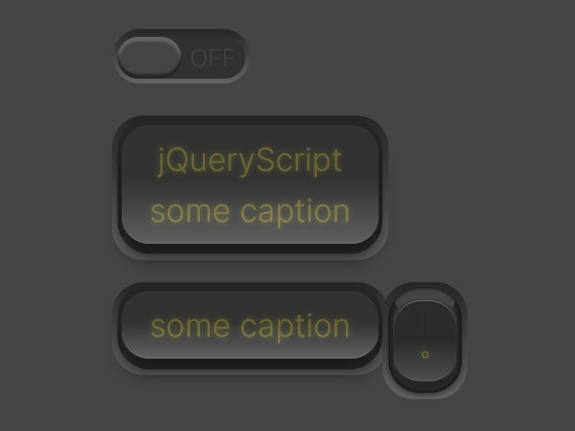
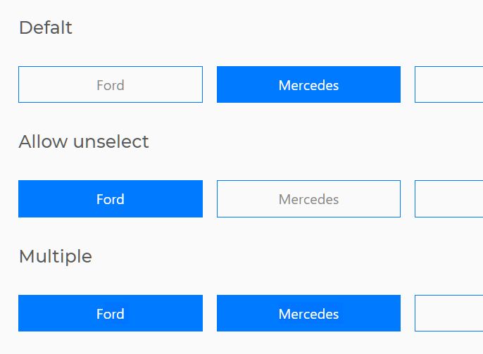
A jQuery based toggle button builder that converts buttons, checkboxes, radio buttons, or select boxes into user-friendly single- or multi-state toggle buttons with custom on/off icons.
How to use it:
1. To get started, download the plugin and load the jquery-toggle.js script after jQuery.
<script src="/path/to/cdn/jquery.min.js"></script>
<script src="/path/to/jquery-toggle.js"></script>
2. Create a basic toggle button (state = 2) from a normal button element.
<button class="toggle">Toggle Button</button>
$('button.toggle').makeToggleButton({
  // options here
});
3. Create a multi-state toggle button from a normal button element.
<button class="toggle">Change State</button>
$('button.toggle').makeMultiStateButton({
  num_of_states: 3
});
4. Create a single- or multi-state toggle button from checkboxes.
<ul id="example" autocomplete="off">
  <li>
    <label>
      <input name="options1-1" type="checkbox" value="0"> Option 0
    </label>
  </li>
   <li>
    <label>
      <input name="options1-2" type="checkbox" value="1"> Option 1
    </label>
  </li>
   <li>
    <label>
      <input name="options1-3" type="checkbox" value="2"> Option 2
    </label>
  </li>
  ...
</ul>
$('#example').replaceCheckboxesWithButtons({
  // options here
});
5. Create a multi-state toggle button from checkboxes, radio buttons, or select elements.
<ul id="example" autocomplete="off">
  <li>
    <label>
      <input name="options2_1" type="checkbox" value="0"> Option 0
    </label>
  </li>
   <li>
    <label>
      <input name="options2_2" type="checkbox" value="1"> Option 1
    </label>
  </li>
   <li>
    <label>
      <input name="options2_3" type="checkbox" value="2"> Option 2
    </label>
  </li>
  <li>
    <label>
      <input name="options3_1" type="radio" value="0" checked> State 0
    </label>
  </li>
  <li>
    <label>
      <input name="options3_2" type="radio" value="0" checked> State 1
    </label>
  </li>
  <li>
    <label>
      <input name="options3_3" type="radio" value="0" checked> State 3
    </label>
  </li>
  <select>
    <option value="">I have two states</option>
    <option value="a">Option A</option>
  </select>
  <select>
    <option value="">I have three states</option>
    <option value="a">Option B</option>
    <option value="b">Option C</option>
  </select>
  <select>
    <option value="">I have three states, too</option>
    <option value="a">Option D</option>
    <option value="b">Option E</option>
  </select>
  ...
</ul>
$('#example').replaceInputsWithMultiStateButtons();
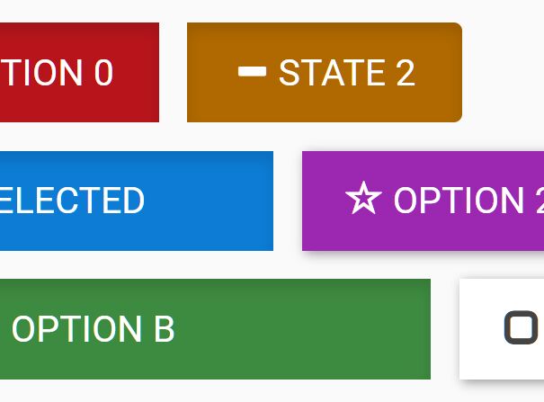
6. Customize the on/off styles, text and icons. The plugin currently supports both Bootstrap Glyphicons and Font Awesome iconic fonts.
$('#example').replaceInputsWithMultiStateButtons({

  // initial state
  state: 0,

  // false = changes color according to the current state
  nocolor: false,

  // uses Font Awesome Icons instead
  font_awesome: false,

  // allows multiple icons
  // default false
  multi_icon: true,

  // custom icons, text, styles (CSS classes)
  icon_on_0: 'question-sign',
  icon_off_0: 'ban-circle',
  icon_off_1: 'ok-circle',
  icon_on_2: 'minus-sign',
  color_2: 'warning',
  text_2: 'Somewhat',
  icon_on_3: 'remove-sign',
  icon_off_3: 'remove-circle',
  color_3: 'danger',

})
7. You can also pass the options via data attributes.
<select data-type="multi-icon"
        data-on-icon="check"
        data-off-icon="remove"
        data-on-color="primary"
        data-off-color="danger"
        data-on-text="Include"
        data-off-text="Not selected"
        data-icon="minus"
        data-color="warning"
        data-text="Nope"
        >
  <option value="">Default</option>
  <option value="d">Option D</option>
  <option value="e">Option E</option>
</select>
Changelog:
2020-08-28
- Fix event triggerings
This awesome jQuery plugin is developed by Aalto-LeTech. For more Advanced Usages, please check the demo page or visit the official website.