3D Flipping Cube Navigation With jQuery And CSS3
| File Size: | 1.76 KB |
|---|---|
| Views Total: | 4452 |
| Last Update: | |
| Publish Date: | |
| Official Website: | Go to website |
| License: | MIT |
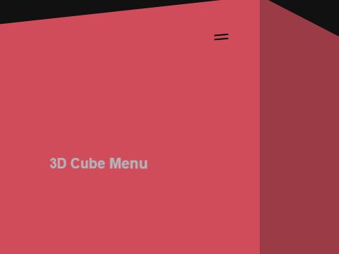
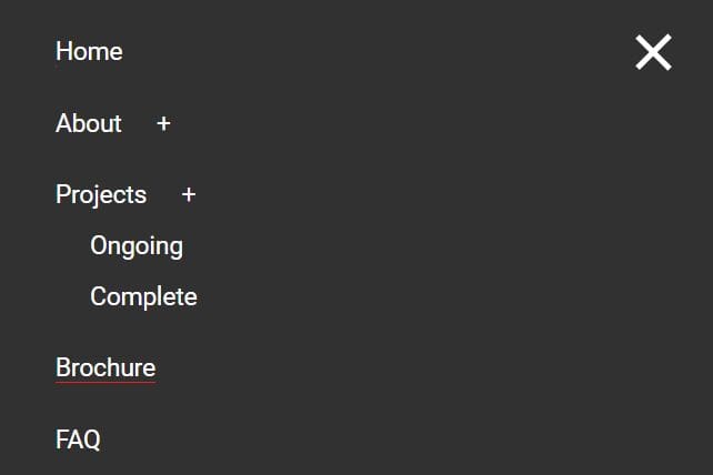
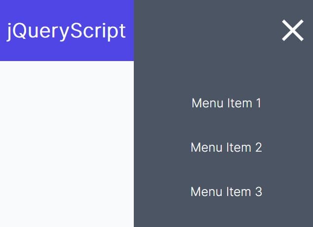
This is a little jQuery script that makes use of CSS3 3D transforms to create a flipping cube navigation menu for your next creative web page.
How to use it:
1. Create the main content that contains a menu toggle button for your webpage.
<div class="full page">
  <div class="menu" id="openNav"></div>
  <div class="cube">3D Cube Menu</div>
</div>
2. Create the html for the cube navigation menu.
<div class="full nav">
  <div class="menu crossed" id="closeNav"></div>
  ... menu items here ...
</div>
3. The primary CSS/CSS3 styles for the 3D cube navigation.
body {
  perspective: 600px;
  background: #111;
  font-family: -apple-system, BlinkMacSystemFont, "myriad-pro", sans-serif;
  overflow: hidden;
}

@media screen and (max-width: 768px) {

body { perspective: 300px; }

}

.full {
  position: fixed;
  top: 0;
  left: 0;
  display: block;
  width: 100%;
  height: 100%;
  transition: all 0.6s linear;
  background: white;
}

.menu {
  position: absolute;
  right: 30px;
  top: 30px;
  width: 48px;
  height: 48px;
  border-radius: 50%;
  transition: all 0.2s linear;
  cursor: pointer;
}

.menu:active { background: #eee; }

.menu::before, .menu::after {
  content: "";
  position: absolute;
  top: 23px;
  left: 14px;
  height: 2px;
  width: 20px;
  background: black;
  pointer-events: none;
  transition: all 0.2s linear;
}

.menu::before { transform: translateY(-3px); }

.menu::after { transform: translateY(3px); }

.menu.crossed::before { transform: rotate(45deg); }

.menu.crossed::after { transform: rotate(135deg); }

.page {
  transform-origin: right center;
  transform: translateX(0) rotateY(0);
  z-index: 1;
  opacity: 1;
}

.page.swipe-lft {
  opacity: 0.5;
  z-index: 0;
  transform: translateX(-100%) rotateY(-35deg);
}

.nav {
  transform-origin: left center;
  transform: translateX(100%) rotateY(35deg);
  z-index: 0;
  opacity: 0.5;
}

.nav.open {
  opacity: 1;
  z-index: 1;
  transform: translateX(0) rotateY(0deg);
}

.cube {
  position: absolute;
  top: 50%;
  left: 50%;
  transform: translate(-50%, -50%);
  font-size: 5vw;
  font-weight: 600;
  color: #C8CCD4;
  pointer-events: none;
}

@media screen and (max-width: 768px) {

.cube {
  font-size: 24px;
  white-space: nowrap;
}

}
4. Include the needed jQuery JavaScript library at the bottom of the web page.
<script src="//code.jquery.com/jquery-3.2.1.slim.min.js"></script>
5. The jQuery script to add/remove CSS classes as you open/close the cube navigation.
$("#openNav").click(function() {
  $(".page").addClass("swipe-lft");
  $(".nav").addClass("open");
});

$("#closeNav").click(function() {
  $(".page").removeClass("swipe-lft");
  $(".nav").removeClass("open");
});
This awesome jQuery plugin is developed by andreasstorm. For more Advanced Usages, please check the demo page or visit the official website.