Responsive Multi-level Dropdown & Toggle Menu Plugin With jQuery
| File Size: | 3.52 KB |
|---|---|
| Views Total: | 16889 |
| Last Update: | |
| Publish Date: | |
| Official Website: | Go to website |
| License: | MIT |
Yet another jQuery plugin used to create a responsive dropdown navigation menu that automatically switches to a mobile-friendly toggle menu when the window width reaches a specified breakpoint.
How to use it:
1. Load the required stylesheet toggle-nav.css in the header to style the responsive navigation menu.
<link href="toggle-nav.css" rel="stylesheet">
2. Create a normal responisve multi-level dropdown menu following the markup structure as this:
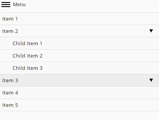
<header class="main" id="siteheader"> <a href="#menu" class="menu-link active"><span></span> Menu</a> <nav id="menu" class="menu"> <ul class="level-1"> <li><a href="">Item 1</a></li> <li><a href="">Item 2</a><span class="has-subnav">▼</span> <ul class="wide level-2"> <li><a href="">Child Item 1</a></li> <li><a href="">Child Item 2</a></li> <li><a href="">Child Item 3</a></li> </ul> </li> <li><a href="">Item 3</a><span class="has-subnav">▼</span> <ul class="level-2"> <li><a href="">Child Item 1</a></li> <li><a href="">Child Item 2</a></li> </ul> </li> <li><a href="">Item 4</a></li> <li><a href="">Item 5</a></li> </ul> </nav> </header>
3. Load jQuery library and the Responsive Toggle Nav plugin's JavaScript at the end of the document.
<script src="//code.jquery.com/jquery-3.1.0.slim.min.js"></script>
<script src="toggle-nav.js"></script>
4. That's it. Modify and override the CSS rules in the toggle-nav.css to create your own menu styles.
.menu {
  ...
}
This awesome jQuery plugin is developed by chriscather. For more Advanced Usages, please check the demo page or visit the official website.


