Responsive Off-canvas Sidebar Navigation With jQuery And CSS3
| File Size: | 2.37 KB |
|---|---|
| Views Total: | 8699 |
| Last Update: | |
| Publish Date: | |
| Official Website: | Go to website |
| License: | MIT |
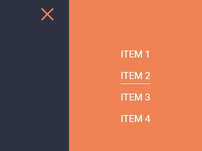
A jQuery/CSS3 based responsive, off-canvas navigation where the sidebar menu is displayed by sliding the entire page to the left (or right) side when toggled.
How to use it:
1. Create the sidebar navigation that is hidden on page load.
<div class="sidebar">
  <ul class="sidebar-list">
    <li class="sidebar-item">
      <a href="#" class="sidebar-anchor">Item 1</a>
    </li>
    <li class="sidebar-item">
      <a href="#" class="sidebar-anchor">Item 2</a>
    </li>
    <li class="sidebar-item">
      <a href="#" class="sidebar-anchor">Item 3</a>
    </li>
  </ul>
</div>
2. Create a button to toggle the sidebar navigation.
<div class="nav-right visible-xs">
  <div class="button" id="btn">
    <div class="bar top"></div>
    <div class="bar middle"></div>
    <div class="bar bottom"></div>
  </div>
</div>
3. Insert another hidden toggle button into the main content.
<main>
  <nav>
    <div class="nav-right hidden-xs">
      <div class="button" id="btn">
        <div class="bar top"></div>
        <div class="bar middle"></div>
        <div class="bar bottom"></div>
      </div>
    </div>
  </nav>
</main>
4. Insert another hidden toggle button into the main content.
main {
  z-index: 2;
  position: relative;
  height: 100%;
  background-color: #2D3142;
  -webkit-transition: transform .7s ease-in-out;
  -moz-transition: transform .7s ease-in-out;
  -ms-transition: transform .7s ease-in-out;
  -o-transition: transform .7s ease-in-out;
  transition: transform .7s ease-in-out;
}

.sidebar {
  height: 100%;
  width: 400px;
  position: fixed;
  top: 0;
  z-index: 1;
  right: 0;
  background-color: #EF8354;
}

.move-to-left {
  -webkit-transform: translateX(-400px);
  -moz-transform: translateX(-400px);
  -ms-transform: translateX(-400px);
  -o-transform: translateX(-400px);
  transform: translateX(-400px);
}

nav { padding-top: 30px; }

.sidebar-list {
  padding: 0;
  margin: 0;
  list-style: none;
  position: relative;
  margin-top: 150px;
  text-align: center;
}

.sidebar-item {
  margin: 30px 0;
  opacity: 0;
  -webkit-transform: translateY(-20px);
  -moz-transform: translateY(-20px);
  -ms-transform: translateY(-20px);
  -o-transform: translateY(-20px);
  transform: translateY(-20px);
}

.sidebar-item:first-child {
  -webkit-transition: all .7s .2s ease-in-out;
  -moz-transition: all .7s .2s ease-in-out;
  -ms-transition: all .7s .2s ease-in-out;
  -o-transition: all .7s .2s ease-in-out;
  transition: all .7s .2s ease-in-out;
}

.sidebar-item:nth-child(2) {
  -webkit-transition: all .7s .4s ease-in-out;
  -moz-transition: all .7s .4s ease-in-out;
  -ms-transition: all .7s .4s ease-in-out;
  -o-transition: all .7s .4s ease-in-out;
  transition: all .7s .4s ease-in-out;
}

.sidebar-item:nth-child(3) {
  -webkit-transition: all .7s .6s ease-in-out;
  -moz-transition: all .7s .6s ease-in-out;
  -ms-transition: all .7s .6s ease-in-out;
  -o-transition: all .7s .6s ease-in-out;
  transition: all .7s .6s ease-in-out;
}

.sidebar-item:last-child {
  -webkit-transition: all .7s .8s ease-in-out;
  -moz-transition: all .7s .8s ease-in-out;
  -ms-transition: all .7s .8s ease-in-out;
  -o-transition: all .7s .8s ease-in-out;
  transition: all .7s .6s ease-in-out;
}

.sidebar-item.active {
  opacity: 1;
  -webkit-transform: translateY(0px);
  -moz-transform: translateY(0px);
  -ms-transform: translateY(0px);
  -o-transform: translateY(0px);
  transform: translateY(0px);
}

.sidebar-anchor {
  color: #FFF;
  text-decoration: none;
  font-size: 1.8em;
  text-transform: uppercase;
  position: relative;
  padding-bottom: 7px;
}

.sidebar-anchor:before {
  content: "";
  width: 0;
  height: 2px;
  position: absolute;
  bottom: 0;
  left: 0;
  background-color: #FFF;
  -webkit-transition: all .7s ease-in-out;
  -moz-transition: all .7s ease-in-out;
  -ms-transition: all .7s ease-in-out;
  -o-transition: all .7s ease-in-out;
  transition: all .7s ease-in-out;
}

.sidebar-anchor:hover:before { width: 100%; }
5. Style and position the toggle buttons.
.bar {
  display: block;
  height: 5px;
  width: 50px;
  background-color: #EF8354;
  margin: 10px auto;
}

.button {
  cursor: pointer;
  display: inline-block;
  width: auto;
  margin: 0 auto;
  -webkit-transition: all .7s ease;
  -moz-transition: all .7s ease;
  -ms-transition: all .7s ease;
  -o-transition: all .7s ease;
  transition: all .7s ease;
}

.nav-right {
  position: fixed;
  right: 40px;
  top: 20px;
}

.nav-right.visible-xs { z-index: 3; }

.hidden-xs { display: none; }

.middle { margin: 0 auto; }

.bar {
  -webkit-transition: all .7s ease;
  -moz-transition: all .7s ease;
  -ms-transition: all .7s ease;
  -o-transition: all .7s ease;
  transition: all .7s ease;
}

.nav-right.visible-xs .active .bar {
  background-color: #FFF;
  -webkit-transition: all .7s ease;
  -moz-transition: all .7s ease;
  -ms-transition: all .7s ease;
  -o-transition: all .7s ease;
  transition: all .7s ease;
}

.button.active .top {
  -webkit-transform: translateY(15px) rotateZ(45deg);
  -moz-transform: translateY(15px) rotateZ(45deg);
  -ms-transform: translateY(15px) rotateZ(45deg);
  -o-transform: translateY(15px) rotateZ(45deg);
  transform: translateY(15px) rotateZ(45deg);
}

.button.active .bottom {
  -webkit-transform: translateY(-15px) rotateZ(-45deg);
  -moz-transform: translateY(-15px) rotateZ(-45deg);
  -ms-transform: translateY(-15px) rotateZ(-45deg);
  -o-transform: translateY(-15px) rotateZ(-45deg);
  transform: translateY(-15px) rotateZ(-45deg);
}

.button.active .middle { width: 0; }
6. Make the sidebar navigation responsive.
@media (min-width: 480px) {

  .nav-list { display: block; }

}

@media (min-width: 768px) {

  .nav-right { position: absolute; }

  .hidden-xs { display: block; }

  .visible-xs { display: none; }

}
7. Load the needed jQuery JavaScript library.
<script src="//code.jquery.com/jquery.min.js"></script>
8. The JavaScript to active the sidebar navigation.
function toggleSidebar() {
  $(".button").toggleClass("active");
  $("main").toggleClass("move-to-left");
  $(".sidebar-item").toggleClass("active");
}

$(".button").on("click tap", function() {
  toggleSidebar();
});
9. The JavaScript to allow ESC key to close the sidebar navigation.
$(document).keyup(function(e) {
  if (e.keyCode === 27) {
    toggleSidebar();
  }
});
This awesome jQuery plugin is developed by tonkec. For more Advanced Usages, please check the demo page or visit the official website.


