Responsive Scrolling Navigation Menu With jQuery and jQuery UI
| File Size: | 5.06 KB |
|---|---|
| Views Total: | 6752 |
| Last Update: | |
| Publish Date: | |
| Official Website: | Go to website |
| License: | MIT |
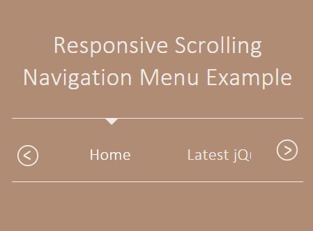
A jQuery & jQuery UI based responsive, mobile-friendly navigation which allows the visitor to scroll vertically through menu items on hover or touch swipe.
How to use it:
1. Create a menu list with next / prev navigation buttons on the webpage.
<div id="navMenu">
  <div id="navMenu-wrapper">
    <ul id="navMenu-items" style="">
      <div id="menuSelector"></div>
      <li class="navMenu-item active"> <a href="#">Home</a> </li>
      <li class="navMenu-item"> <a href="#">Latest jQuery Plugins</a> </li>
      <li class="navMenu-item"> <a href="#">Most Popular Plugins</a> </li>
      <li class="navMenu-item"> <a href="#">Recommended Plugins</a> </li>
      <li class="navMenu-item"> <a href="#">Blog</a> </li>
      <li class="navMenu-item"> <a href="#">Submit Plugins & News</a> </li>
      <li class="navMenu-item"> <a href="#">Contact</a> </li>
      <li class="navMenu-item"> <a href="#">About</a> </li>
      <li class="navMenu-item"> <a href="#">RSS</a> </li>
      <li class="navMenu-item"> <a href="#">Social Media</a> </li>
      <li class="navMenu-item active"> <a href="#">Navmenu </a> </li>
    </ul>
    <div class="navMenu-paddles">
      <button class="navMenu-paddle-left icon-chevronleft" aria-hidden="true"> </button>
      <button class="navMenu-paddle-right icon-chevronright" aria-hidden="true"> </button>
    </div>
  </div>
</div>
2. The main CSS styles for the navigation menu.
#navMenu {
  border-bottom: 1px solid #EFEBE8;
  border-top: 1px solid #EFEBE8;
  position: relative;
}

#navMenu #navMenu-wrapper {
  overflow: hidden;
  height: 60px;
  padding: 0 30px;
}

#navMenu-items {
  margin: 0 20px;
  padding: 1px 0;
  list-style: none;
  white-space: nowrap;
  overflow-x: auto;
  -webkit-overflow-scrolling: touch;
}

#menuSelector {
  position: relative;
  margin-left: -5px;
  top: -1px;
  width: 0;
  height: 0;
  border-left: 6px solid transparent;
  border-right: 6px solid transparent;
  border-top: 6px solid #EFEBE8;
}

.active p, .active a { color: #fff !important; }

#navMenu ul li {
  display: inline-block;
  margin: 16px 24px;
}

#navMenu a {
  color: #EFEBE8;
  -webkit-transition: 0.2s ease-in-out;
  -moz-transition: 0.2s ease-in-out;
  -o-transition: 0.2s ease-in-out;
  transition: 0.2s ease-in-out;
}
3. The required CSS styles for the next / prev navigation buttons.
.slick-prev, .icon-chevronleft { transform: rotate(180deg); }

.icon-chevronleft, .icon-chevronright {
  background-image: url('arrow.png');
  background-repeat: no-repeat;
  background-size: 20px;
}

.navMenu-paddle-left, .navMenu-paddle-right {
  cursor: pointer;
  border: none;
  position: absolute;
  top: 20px;
  background-color: transparent;
  width: 25px;
  height: 25px;
  margin-left: auto;
  margin-right: auto;
}

.slick-prev, .navMenu-paddle-left { left: 0; }

.arrow {
  width: 25px;
  margin-left: auto;
  margin-right: auto;
}

.slick-next, .navMenu-paddle-right { right: 0; }
4. Include the needed jQuery and jQuery UI on the webpage.
<script src="jquery.min.js"></script>
<script src="jquery-ui.min.js"></script>
5. The core JavaScript to active the responsive menu.
$(function() {
  var items = $('#navMenu-items').width();
  var itemSelected = document.getElementsByClassName('navMenu-item');
  navPointerScroll($(itemSelected));
  $("#navMenu-items").scrollLeft(200).delay(200).animate({
    scrollLeft: "-=200"
  }, 2000, "easeOutQuad");

  $('.navMenu-paddle-right').click(function () {
    $("#navMenu-items").animate({
      scrollLeft: '+='+items
    });
  });
  $('.navMenu-paddle-left').click(function () {
    $( "#navMenu-items" ).animate({
      scrollLeft: "-="+items
    });
  });

  if(!/Android|webOS|iPhone|iPad|iPod|BlackBerry|IEMobile|Opera Mini/i.test(navigator.userAgent) ) {
    var scrolling = false;

    $(".navMenu-paddle-right").bind("mouseover", function(event) {
        scrolling = true;
        scrollContent("right");
    }).bind("mouseout", function(event) {
        scrolling = false;
    });

    $(".navMenu-paddle-left").bind("mouseover", function(event) {
        scrolling = true;
        scrollContent("left");
    }).bind("mouseout", function(event) {
        scrolling = false;
    });

    function scrollContent(direction) {
        var amount = (direction === "left" ? "-=3px" : "+=3px");
        $("#navMenu-items").animate({
            scrollLeft: amount
        }, 1, function() {
            if (scrolling) {
                scrollContent(direction);
            }
        });
    }
  }

  $('.navMenu-item').click(function () {
    $('#navMenu').find('.active').removeClass('active');
    $(this).addClass("active");
    navPointerScroll($(this));
  });

});

function navPointerScroll(ele) {

  var parentScroll = $("#navMenu-items").scrollLeft();
  var offset = ($(ele).offset().left - $('#navMenu-items').offset().left);
  var totalelement = offset + $(ele).outerWidth()/2;

  var rt = (($(ele).offset().left) - ($('#navMenu-wrapper').offset().left) + ($(ele).outerWidth())/2);
  $('#menuSelector').animate({
    left: totalelement + parentScroll
  })
}
This awesome jQuery plugin is developed by ac_coding. For more Advanced Usages, please check the demo page or visit the official website.


