Basic Responsive Toggle Menu Plugin For jQuery
| File Size: | 3.98 KB |
|---|---|
| Views Total: | 8421 |
| Last Update: | |
| Publish Date: | |
| Official Website: | Go to website |
| License: | MIT |
The simplest jQuery responsive menu plugin which transforms the normal site navigation into a toggleable dropdown menu for better user experience on mobile/tablet devices.
How to use it:
1. Include the main CSS file 'menu.css' in the header of the html page.
<link href="css/menu.css" rel="stylesheet">
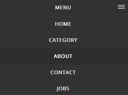
2. Create normal site navigation from an unordered html list:
<div id="cssmenu">
  <ul>
    <li> <a href="#">Home</a> </li>
    <li> <a href="#">Category</a> </li>
    <li> <a href="#">About</a> </li>
    <li> <a href="#">Contact</a> </li>
    <li> <a href="#">Jobs</a> </li>
  </ul>
</div>
3. Include jQuery library and the main JavaScript file 'menu.js' at the bottom of the page.
<script src="//code.jquery.com/jquery.min.js"></script>
<script src="menu.js"></script>
4. That's it. You can modify & override the default styles of the responsive menu in the CSS as follows:
#cssmenu {
  width: auto;
  font-family: 'Open Sans', Helvetica, sans-serif;
  background: #848484;
}

#cssmenu>ul { box-shadow: inset 0 -3px 0 rgba(0, 0, 0, 0.05); }

#cssmenu>ul>li>a {
  padding: 18px 25px 21px 25px;
  text-decoration: none;
  font-size: 1.5em;
  font-weight: 700;
  color: #dddddd;
  text-transform: uppercase;
  letter-spacing: 1px;
}

...
This awesome jQuery plugin is developed by carry0987. For more Advanced Usages, please check the demo page or visit the official website.


