Pretty Simple Responsive Dropdown Navigation With jQuery And CSS3
| File Size: | 4.13 KB |
|---|---|
| Views Total: | 16742 |
| Last Update: | |
| Publish Date: | |
| Official Website: | Go to website |
| License: | MIT |
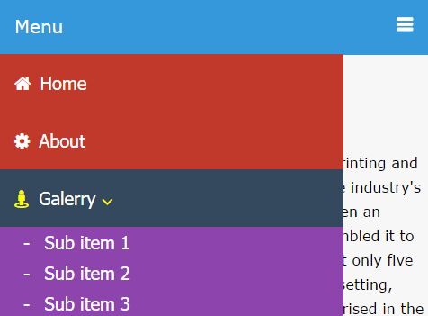
A jQuery & CSS3 based multi-level dropdown menu that automatically transforms the regular header navigation into an off-canvas hamburger menu on small screen devices e.g. tablet and mobile.
View more:
How to use it:
1. Create the multi-level header navigation with a responsive nav bar as this:
<header>
  <!-- responsive nav bar -->
  <div class="nav-bar">
    <a href=""><i class="fa fa-bars"></i><span>Menu</span></a>
  </div>
  <!-- navigation -->
  <nav>
    <ul>
      <li><a href="#"><i class="fa fa-home"></i>Home</a></li>
      <li><a href="#"><i class="fa fa-cog"></i>About</a></li>
      <li class="sub-menu">
        <a href="#"><i class="fa fa-street-view"></i>Galerry <i class="fa fa-angle-down"></i></a>
        <!-- children nav -->
        <ul class="children">
            <li><a href=""><span>-</span> Sub item 1</a></li>
            <li><a href=""><span>-</span> Sub item 2</a></li>
            <li><a href=""><span>-</span> Sub item 3</a></li>
        </ul>
      </li>
      <li class="sub-menu"><a href="#"><i class="fa fa-eye-slash"></i>Blog <i class="fa fa-angle-down"></i></a>

        <ul class="children">
            <li><a href=""><span>-</span> Sub item 1</a></li>
            <li><a href=""><span>-</span> Sub item 2</a></li>
            <li><a href=""><span>-</span> Sub item 3</a></li>
        </ul>

      </li>
      <li><a href="#"><i class="fa fa-envelope"></i>Contact</a></li>
    </ul>
  </nav> <!-- navigation end -->

</header>
2. The CSS to style the header navigation on desktop.
header { width: 100%; }

.nav-bar { display: none; }

header nav {
  background: #c0392b;
  z-index: 1000;
  width: 100%;
  margin: auto;
}

header nav ul { list-style: none; }

header nav ul li {
  float: left;
  position: relative;
}

header nav:after {
  content: "";
  display: block;
  clear: both;
}

header nav ul li a {
  color: #fff;
  display: block;
  padding: 20px;
  text-decoration: none;
  font-size: 20px;
  font-family: tahoma;
}

header nav ul li:hover { background: #34495e; }

header nav ul li:hover i { color: yellow; }

header nav ul li i { margin-right: 10px; }

header nav ul li:hover .children { display: block; }

header nav ul li .children {
  display: none;
  background: #8e44ad;
  position: absolute;
  width: 150%;
  z-index: 1000;
}

header nav ul li .children span { display: none; }

header nav ul li .children li {
  display: block;
  width: 100%;
  border-bottom: 1px solid #ffffff99;
}

header nav ul li .children li a { margin-left: 30px; }

header nav ul li .fa-angle-down {
  position: relative;
  top: 3px;
}
3. The essential CSS rules to style the Responsive Dropdown Navigation on small screens (Screen size is less than 800px;)
@media all and (max-width: 800px) {

body { padding-top: 80px; }

.nav-bar {
  display: block;
  width: 100%;
  position: fixed;
  top: 0;
  background: #3498db;
}

.nav-bar span {
  float: left;
  font-size: 20px;
  padding: 20px;
  color: #fff;
}

.nav-bar .fa-bars {
  display: block;
  padding: 20px;
  color: #fff;
  overflow: hidden;
  font-size: 20px;
  font-weight: bold;
  text-decoration: none;
  float: right;
}

header nav {
  width: 80%;
  height: auto;
  position: fixed;
  right: 100%;
  top : 63px;
  overflow: hidden;
  height: 100%;
}

header nav ul li {
  display: block;
  border-bottom: 1px solid rgba(255, 255, .5);
  width: 100%;
}

header ul li a { display: block; }

header nav ul li .children {
  width: 100%;
  position: relative;
  overflow: hidden;
  display: none;
}

header nav ul li:hover .children { display: none; }

header nav ul li ul li:first-child { border-top: 1px solid #ffffff99; }

header nav ul li .children span {
  display: inline-block;
  margin-right: 10px;
}

header nav ul li .children a {
  margin-left: 10px;
  padding: 5px 0;
}

header nav ul li .fa-angle-down {
  position: relative;
  top: 3px;
}
}
4. The Responsive Dropdown Navigation needs the latest version of jQuery library to work.
<script src="https://code.jquery.com/jquery-3.2.0.min.js"></script>
5. The main JavaScript to active the Responsive Dropdown Navigation
$(document).ready(function(){

  var val = 1;

  $(".nav-bar").click(function(){

    if (val == 1) {

      $("header nav").animate({
        'left' : '0'
      });
      val = 0;
    } else{
      val = 1;
      $("header nav").animate({
        'left' : '-100%'
      });
    }

    return false;
  });

  // submenu
  $('.sub-menu').click(function(){
    $(this).children('.children').slideToggle();
  })

});
This awesome jQuery plugin is developed by mahfuzkhu. For more Advanced Usages, please check the demo page or visit the official website.


