Wordpress-style Accessible Dropdown Menu With jQuery
| File Size: | 3.39 KB |
|---|---|
| Views Total: | 5753 |
| Last Update: | |
| Publish Date: | |
| Official Website: | Go to website |
| License: | MIT |
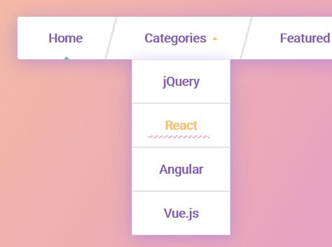
A small script to create a wordpress-style, WAI-ARIA compliant, fully responsive, cross-platform drop down menu using jQuery and CSS3 animations.
How to use it:
1. Create the dropdown menu from a nested nav list as follows:
<nav class="site-navigation" role="navigation" aria-label="Main Navigation">
  <ul class="nav">
    <li class="menu-item active"><a href="#">Home</a></li>
    <li class="menu-item-has-children"><a href="#">Categories</a>
      <ul class="sub-menu">
        <li><a href="#">jQuery</a></li>
        <li><a href="#">React</a></li>
        <li><a href="#">Angular</a></li>
        <li><a href="#">Vue.js</a></li>
      </ul>
    </li>
    <li class="menu-item menu-item-has-children"><a href="#fallback-page">Featured</a>
      <ul class="sub-menu">
        <li><a href="#">Plugins</a></li>
        <li><a href="#">Components</a></li>
        <li><a href="#">Directives</a></li>
      </ul>
    </li>
    <li class="menu-item"><a href="#">About</a></li>
    <li class="menu-item"><a href="#">Contact</a></li>
  </ul>
</nav>
2. The primary CSS/CSS3 styles for the dropdown naivgation and sub menus.
.site-navigation {
  background: #fff;
  border-radius: 3px;
  box-shadow: 0 0.25em 2em rgba(128, 103, 253, 0.4);
  color: #8b5ab7;
  font: 700 1.375rem / 1 'Roboto', sans-serif;
  max-width: 996px;
  margin: 2em auto;
  text-align: center;
}

.site-navigation ul, .site-navigation li {
  list-style: none;
  margin: 0;
  padding: 0;
}

.nav > li {
  border-bottom: 2px solid #e4e3ed;
  position: relative;
}

.nav a {
  color: inherit;
  text-decoration: none;
  -webkit-transition: 0.2s;
  transition: 0.2s;
  display: block;
  overflow: hidden;
  padding: 1.25em;
  position: relative;
}

.nav a::before {
  background-color: #fc9bb6;
  background-image: -webkit-linear-gradient(315deg, #fff 0.13333em, transparent 0.13333em), -webkit-linear-gradient(225deg, #fff 0.13333em, transparent 0.13333em), -webkit-linear-gradient(135deg, #fff 0.13333em, transparent 0.13333em), -webkit-linear-gradient(45deg, #fff 0.13333em, transparent 0.13333em);
  background-image: linear-gradient(135deg, #fff 0.13333em, transparent 0.13333em), linear-gradient(225deg, #fff 0.13333em, transparent 0.13333em), linear-gradient(315deg, #fff 0.13333em, transparent 0.13333em), linear-gradient(45deg, #fff 0.13333em, transparent 0.13333em);
  background-position: -0.2em 0, -0.2em 0, 0 0, 0 0;
  background-size: 0.4em 0.4em;
  content: '';
  display: block;
  position: absolute;
  top: 50%;
  right: 1.25em;
  left: 1.25em;
  margin-right: 8px;
  margin-top: 0.75em;
  height: 0.4em;
  -webkit-transform: translateY(3em);
  transform: translateY(3em);
  -webkit-transition: 0.3s ease-out;
  transition: 0.3s ease-out;
}

.nav a:hover, .nav a:focus { color: #ffbb61; }

.nav a:hover::before, .nav a:focus::before {
  -webkit-transform: none;
  transform: none;
}

.nav a:focus { outline: 2px dotted #ffbb61; }

.nav a:active { color: #50cba1; }

.menu-item-has-children > a::after {
  border: 0.25em solid transparent;
  border-top-color: #ffbb61;
  border-bottom-width: 0;
  content: '';
  display: inline-block;
  -webkit-transition: 0.2s;
  transition: 0.2s;
  margin-top: -0.125em;
  margin-left: 0.5em;
  position: relative;
  vertical-align: middle;
}

.menu-item-has-children > a[aria-expanded=true]::after {
  -webkit-transform: rotate(180deg);
  transform: rotate(180deg);
}

li.active a::after {
  border: 0.25em solid transparent;
  border-bottom-color: #50cba1;
  border-top-width: 0;
  content: '';
  position: absolute;
  bottom: 0;
  left: 50%;
  margin-left: -0.125em;
}

.sub-menu {
  opacity: 0;
  -webkit-transform: translate3d(0, -2rem, 0) scale(0.8);
  transform: translate3d(0, -2rem, 0) scale(0.8);
  visibility: hidden;
}

[aria-expanded=true] + .sub-menu {
 opacity: 1;
 -webkit-transform: none;
 transform: none;
 visibility: visible;
}

.sub-menu {
  background: #fff;
  box-shadow: 0 0.25em 2em rgba(128, 103, 253, 0.4);
  position: absolute;
  top: 100%;
  left: 50%;
  -webkit-transform-origin: top center;
  transform-origin: top center;
  -webkit-transition: 0.3s ease-out;
  transition: 0.3s ease-out;
  width: 11rem;
  z-index: 2;
}

.sub-menu.sub-menu { margin-left: -5.5rem; }

.sub-menu li { border: 1px solid #e4e3ed; }

.sub-menu a {
  -webkit-transform: translate3d(0, 1em, 0);
  transform: translate3d(0, 1em, 0);
}

.sub-menu li:nth-child(1) a {
  -webkit-transition-delay: 0.1s;
  transition-delay: 0.1s;
}

.sub-menu li:nth-child(2) a {
  -webkit-transition-delay: 0.2s;
  transition-delay: 0.2s;
}

.sub-menu li:nth-child(3) a {
  -webkit-transition-delay: 0.3s;
  transition-delay: 0.3s;
}

.sub-menu li:nth-child(4) a {
  -webkit-transition-delay: 0.4s;
  transition-delay: 0.4s;
}

.sub-menu li:nth-child(5) a {
  -webkit-transition-delay: 0.5s;
  transition-delay: 0.5s;
}

[aria-expanded=true] + .sub-menu a {
 -webkit-transform: none;
 transform: none;
}
3. Convert the dropdown menu into a vertical toggle menu on mobile devices.
@media (min-width: 768px) {

.nav {
  display: -webkit-box;
  display: -ms-flexbox;
  display: flex;
  -ms-flex-pack: distribute;
  justify-content: space-around;
}

.nav > li {
  border: 0;
  -webkit-box-flex: 1;
  -ms-flex: 1 1 auto;
  flex: 1 1 auto;
}

.nav > li:not(:last-child)::before {
  background: #e4e3ed;
  content: '';
  display: block;
  -webkit-transform: skew(-15deg);
  transform: skew(-15deg);
  width: 4px;
  position: absolute;
  top: 0;
  bottom: 0;
  right: 2px;
  z-index: 10;
}
}
4. Include the necessary jQuery JavaScript library at the bottom of the webpage.
<script src="//code.jquery.com/jquery-3.2.1.min.js"></script>
5. The JavaScript to enable the accessible dropdown menu.
(function() {
  var $allMenus = $(".menu-item-has-children");
  var $allToggles = $allMenus.find('> a');
  var $allTopLinks = $(".nav > li > a");

  var hoverTimer, blurTimer,
      delay = 500;

  // Reusable functions
  function openMenu($current) {
    $allToggles.attr("aria-expanded", "false");
    $current.attr("aria-expanded", "true");
  }

  function closeMenu($current) {
    $current.attr("aria-expanded", "false");
  }

  function focusSubmenu($current) {
    $current.on("transitionend", function() {
      if ($current.css("visibility") === "visible") {
        $current.find("li:first-child a").focus();
        $current.off("transitionend");
      }
    });
  }

  // Add aria roles
  $(".menu-item.active > a").attr("aria-current", "page");
  $allToggles.attr({
    "aria-haspopup": "true",
    "aria-expanded": "false",
    "role": "button"
  });

  // Open menu on hover
  $allMenus.on("mouseenter", function(e) {
    openMenu($(this).find("[aria-expanded]"));

    clearTimeout(hoverTimer);
  });

  // Close menu after a short delay
  $allMenus.on("mouseleave", function() {
    $element = $(this).find("[aria-expanded]");

    hoverTimer = setTimeout(function() {
      closeMenu($element);
    }, delay);
  });

  // Toggle menu on click, tap, or focus + enter/space
  $allToggles
    .on("click touchstart", function(e) {
      $this = $(this);
      $submenu = $this.next(".sub-menu");

      if ($this.attr("aria-expanded") === "true") closeMenu($this);
      else openMenu($this);

      focusSubmenu($submenu);

      e.preventDefault();
    })
    .on("keyup", function(e) {
      if (e.keyCode === 32) {
        openMenu($(this));
        focusSubmenu($(this).next(".sub-menu"));
      }
    });

  // Close menu when refocusing on top-level links
  $allTopLinks.on("focus", function() {
    closeMenu($allToggles);
  });

  // Close menu on esc and focus loss
  $(".site-navigation").on("keyup", function(e) {
    if (e.keyCode === 27) closeMenu($allToggles);
  });

  // Close menu if focus isn't inside site navigation
  $('.sub-menu').on('focusout', function(){
    // There's a delay between focusout and re-focus
    setTimeout( function() {
      $focused = $(document.activeElement);
      if($focused.closest('.site-navigation').length === 0 ) {
        closeMenu($allToggles);
      }
    }, 1);
  });

})();
This awesome jQuery plugin is developed by giana. For more Advanced Usages, please check the demo page or visit the official website.


