YouTube Like Left Side Drop Down Menu Effect
| File Size: | Unknown |
|---|---|
| Views Total: | 12554 |
| Last Update: | |
| Publish Date: | |
| Official Website: | Go to website |
| License: | MIT |
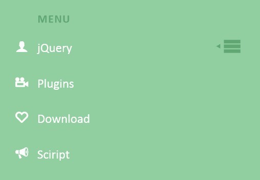
A simple drop down menu based on CSS3 and a few javascript codes, inspired by the left side menu on Youtube when watching a video. When clicking on the menu label and icon, the main menu appears beneath and the menu icon slides to the right side while the label slides up. To close the menu, the menu icon needs to be clicked again.
How to use it:
1. Markup Html Structure
<nav class="dr-menu">
<div class="dr-trigger"><span class="dr-icon dr-icon-menu"></span><a class="dr-label">Menu</a></div>
<ul>
<li><a class="dr-icon dr-icon-user" href="#">jQuery</a></li>
<li><a class="dr-icon dr-icon-camera" href="#">Plugins</a></li>
<li><a class="dr-icon dr-icon-heart" href="#">Download</a></li>
<li><a class="dr-icon dr-icon-bullhorn" href="#">Sciript</a></li>
<li><a class="dr-icon dr-icon-download" href="#">Downloads</a></li>
<li><a class="dr-icon dr-icon-settings" href="#">Demo</a></li>
<li><a class="dr-icon dr-icon-switch" href="#">Logout</a></li>
</ul>
</nav>
2. The CSS
.dr-menu {
width: 100%;
max-width: 400px;
min-width: 300px;
position: relative;
font-size: 1.3em;
line-height: 2.5;
font-weight: 400;
color: #fff;
padding-top: 2em;
}
.dr-menu > div {
cursor: pointer;
position: absolute;
width: 100%;
z-index: 100;
}
.dr-menu > div .dr-icon {
top: 0;
left: 0;
position: absolute;
font-size: 150%;
line-height: 1.6;
padding: 0 10px;
-webkit-transition: all 0.2s ease;
-moz-transition: all 0.2s ease;
transition: all 0.2s ease;
}
.dr-menu.dr-menu-open > div .dr-icon {
color: #60a773;
left: 100%;
-webkit-transform: translateX(-100%);
-moz-transform: translateX(-100%);
-ms-transform: translateX(-100%);
transform: translateX(-100%);
}
.dr-menu > div .dr-icon:after {
content: "\e008";
position: absolute;
font-size: 50%;
line-height: 3.25;
left: -10%;
opacity: 0;
}
.dr-menu.dr-menu-open > div .dr-icon:after {
opacity: 1;
}
.dr-menu > div .dr-label {
padding-left: 3em;
position: relative;
display: block;
color: #60a773;
font-size: 0.9em;
font-weight: 700;
letter-spacing: 1px;
text-transform: uppercase;
line-height: 2.75;
-webkit-transition: all 0.2s ease;
-moz-transition: all 0.2s ease;
transition: all 0.2s ease;
}
.dr-menu.dr-menu-open > div .dr-label {
-webkit-transform: translateY(-90%);
-moz-transform: translateY(-90%);
-ms-transform: translateY(-90%);
transform: translateY(-90%);
}
.dr-menu ul {
padding: 0;
margin: 0 3em 0 0;
list-style: none;
opacity: 0;
position: relative;
z-index: 0;
pointer-events: none;
-webkit-transition: opacity 0s linear 205ms;
-moz-transition: opacity 0s linear 205ms;
transition: opacity 0s linear 205ms;
}
.dr-menu.dr-menu-open ul {
opacity: 1;
z-index: 200;
pointer-events: auto;
-webkit-transition: opacity 0s linear 0s;
-moz-transition: opacity 0s linear 0s;
transition: opacity 0s linear 0s;
}
.dr-menu ul li {
display: block;
margin: 0 0 5px 0;
opacity: 0;
-webkit-transition: opacity 0.3s ease;
-moz-transition: opacity 0.3s ease;
transition: opacity 0.3s ease;
}
.dr-menu.dr-menu-open ul li {
opacity: 1;
}
.dr-menu.dr-menu-open ul li:nth-child(2) {
-webkit-transition-delay: 35ms;
-moz-transition-delay: 35ms;
transition-delay: 35ms;
}
.dr-menu.dr-menu-open ul li:nth-child(3) {
-webkit-transition-delay: 70ms;
-moz-transition-delay: 70ms;
transition-delay: 70ms;
}
.dr-menu.dr-menu-open ul li:nth-child(4) {
-webkit-transition-delay: 105ms;
-moz-transition-delay: 105ms;
transition-delay: 105ms;
}
.dr-menu.dr-menu-open ul li:nth-child(5) {
-webkit-transition-delay: 140ms;
-moz-transition-delay: 140ms;
transition-delay: 140ms;
}
.dr-menu.dr-menu-open ul li:nth-child(6) {
-webkit-transition-delay: 175ms;
-moz-transition-delay: 175ms;
transition-delay: 175ms;
}
.dr-menu.dr-menu-open ul li:nth-child(7) {
-webkit-transition-delay: 205ms;
-moz-transition-delay: 205ms;
transition-delay: 205ms;
}
.dr-menu ul li a {
display: inline-block;
padding: 0 20px;
color: #fff;
}
.dr-menu ul li a:hover {
color: #60a773;
}
.dr-icon:before, .dr-icon:after {
position: relative;
font-family: 'icomoon';
speak: none;
font-style: normal;
font-weight: normal;
font-variant: normal;
text-transform: none;
-webkit-font-smoothing: antialiased;
}
.dr-menu ul .dr-icon:before {
margin-right: 15px;
}
.dr-icon-bullhorn:before {
content: "\e000";
}
.dr-icon-camera:before {
content: "\e002";
}
.dr-icon-heart:before {
content: "\e003";
}
.dr-icon-settings:before {
content: "\e004";
}
.dr-icon-switch:before {
content: "\e005";
}
.dr-icon-download:before {
content: "\e006";
}
.dr-icon-user:before {
content: "\e001";
}
.dr-icon-menu:before {
content: "\e007";
}
3. The javascript
var YTMenu = (function() {

function init() {

[].slice.call( document.querySelectorAll( '.dr-menu' ) ).forEach( function( el, i ) {

var trigger = el.querySelector( 'div.dr-trigger' ),
icon = trigger.querySelector( 'span.dr-icon-menu' ),
open = false;

trigger.addEventListener( 'click', function( event ) {
if( !open ) {
el.className += ' dr-menu-open';
open = true;
}
}, false );

icon.addEventListener( 'click', function( event ) {
if( open ) {
event.stopPropagation();
open = false;
el.className = el.className.replace(/\bdr-menu-open\b/,'');
return false;
}
}, false );

} );

}

init();

})();
This awesome jQuery plugin is developed by Mary Lou. For more Advanced Usages, please check the demo page or visit the official website.