Mobile-first Off-canvas Side Navigation For Bootstrap 5
| File Size: | 8.47 KB |
|---|---|
| Views Total: | 5793 |
| Last Update: | |
| Publish Date: | |
| Official Website: | Go to website |
| License: | MIT |
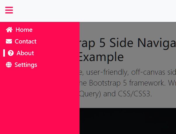
A responsive, user-friendly, off-canvas side navigation system for the Bootstrap 5 framework. Written in JavaScript (jQuery) and CSS/CSS3.
Features:
- Desktop & Tablet: Shows a vertical toolbar on the screen that expands to the full-width when you click the hamburger button.
- Mobile: Hides the vertical toolbar and allows the user to toggle the off-canvas side menu by tapping the hamburger button.
- Shows a background overlay covering the main content when the off-canvas side menu is activated.
How to use it:
1. Add menu items to the off-canvas side navigation. Make sure you first have Bootstrap 5 framework loaded in the document.
<div id="SideNavID" class="sideNavClose">
  <a class="nav-menu-item" href="#">Menu 1</a>
  <a class="nav-menu-item" href="#">Menu 2</a>
  <a class="nav-menu-item" href="#">Menu 3</a>
  <a class="nav-menu-item" href="#">Menu 4</a>
  <a class="nav-menu-item" href="#">Menu 5</a>
  ...
</div>
2. Create a hamburger toggle button on the navbar.
<a id="NavMenuBar" class="navbar-brand nabMenuBar" href="#">
  Hamburger Icon Here
</a>
3. Create an empty container for the background overlay.
<div id="ContentOverlayID" class="ContentOverlayClose">
</div>
4. The necessary CSS styles for the Off-canvas Side Navigation.
.nabMenuBar{
  color: #FE0A52 !important;
  font-size: 24px !important;
}
.nav-menu-item{
  text-decoration: none;
  color: white;
}
.nav-menu-item:hover{
  text-decoration: none;
  color: white;
  border-left: 5px solid white;
  transition: 0.1s;
}
.sideNavOpen{
  height: 100%;
  width: 220px;
  position: fixed;
  top:0;
  left: 0;
  z-index: 10;
  overflow-x: hidden;
  padding-left: 10px;
  padding-top: 20px;
  transition: 0.1s;
  background-color: #FE0A52;
}
.sideNavClose{
  height: 100%;
  width: 60px;
  position: fixed;
  top:0;
  left: 0;
  z-index: 10;
  overflow-x: hidden;
  padding-left: 10px;
  padding-top: 20px;
  transition: 0.1s;
  background-color: #FE0A52;
}
.ContentOverlay{
  display: block;
  position: fixed;
  height: 100%;
  top:0;
  left: 0;
  z-index: 7;
  right: 0;
  bottom: 0;
  cursor: pointer;
  background-color: rgba(0,0,0,0.5);
}
.ContentOverlayClose{
  display: none;
}
.Content{
  margin-left: 60px;
  margin-top: 60px;
  z-index: 5;
}
@media (max-width: 575.98px) {
  .Content { margin-left: 00px; }
  .sideNavClose { visibility: hidden }
}
5. Load the required jQuery library at the end of the document.
<script src="/path/to/cdn/jquery.min.js"></script>
6. The main JavaScript (jQuery script) to activate the off-canvas side navigation.
$('#NavMenuBar').click(function () {
  SideMenuOpenClose();
});

$('#ContentOverlayID').click(function () {
  SideMenuOpenClose();
});

function SideMenuOpenClose() {
  let SideNavID= $('#SideNavID');
  let ContentOverlayID= $('#ContentOverlayID');
  let menuText=$('.menuText');
  if (SideNavID.hasClass('sideNavClose')){
    SideNavID.removeClass('sideNavClose')
    SideNavID.addClass('sideNavOpen')
    menuText.removeClass('d-none');
    ContentOverlayID.removeClass('ContentOverlayClose')
    ContentOverlayID.addClass('ContentOverlay')
  } else {
    SideNavID.removeClass('sideNavOpen')
    SideNavID.addClass('sideNavClose')
    menuText.addClass('d-none');
    ContentOverlayID.removeClass('ContentOverlay')
    ContentOverlayID.addClass('ContentOverlayClose')
  }
}
This awesome jQuery plugin is developed by rupomsoft. For more Advanced Usages, please check the demo page or visit the official website.


