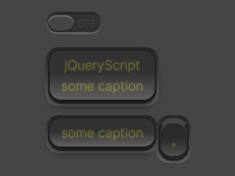
Checkbox Based Toggle Switch with jQuery - Adaptive Switch
| File Size: | 5.11 KB |
|---|---|
| Views Total: | 1954 |
| Last Update: | |
| Publish Date: | |
| Official Website: | Go to website |
| License: | MIT |
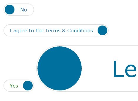
Adaptive Switch is a jQuery plugin which turns a standard Html checkbox into a stylish toggle switch with adaptive text.
How to use it:
1. Place jQuery library and the jQuery adaptive switch plugin at the end of the document.
<script src="//code.jquery.com/jquery-1.11.3.min.js"></script>
<script src="jquery.adaptive-switch.js"></script>
2. Call the function on the checkbox element.
$('input[type="checkbox"]').adaptiveSwitch();
3. Basic styles for the toggle switch.
.adaptive-switch {
  display: inline-block;
  white-space: nowrap;
  line-height: 200%;
}

.adaptive-switch .switch-clear { clear: both; }

.adaptive-switch .switch-inner {
  position: relative;
  overflow: hidden;
  height: 2em;
}

.adaptive-switch label.switch-label {
  display: block;
  ;
  padding: 0 2em;
  color: #00709f;
}

.adaptive-switch label.switch-label span { padding: 0 1em; }

.adaptive-switch label.switch-label-right { padding-left: 0; }

.adaptive-switch label.switch-label-left { padding-right: 0; }

.adaptive-switch .switch-switcher {
  position: absolute;
  top: 0;
  height: 100%;
  width: 200%;
  left: -100%;
  -webkit-transition: left 0.2s linear;
  transition: left 0.2s linear;
}

.adaptive-switch.switch-right .switch-switcher { left: 0; }

.adaptive-switch .switch-switcher label.switch-label {
  width: 50%;
  height: 100%;
  float: left;
  text-align: center;
  cursor: pointer;
}

.adaptive-switch .switch-dot {
  background-color: #FFF;
  position: absolute;
  top: 0;
  left: 0;
  height: 100%;
  width: 100%;
}

.adaptive-switch .switch-dot div {
  width: 2em;
  height: 100%;
  text-align: right;
  -webkit-transition: width 0.2s linear;
  transition: width 0.2s linear;
}

.adaptive-switch.switch-right .switch-dot div { width: 100%; }

.adaptive-switch .switch-dot div span {
  height: 2em;
  width: 2em;
  display: inline-block;
}

.adaptive-switch .switch-dot, .adaptive-switch .switch-switcher label.switch-label {
  -webkit-box-sizing: border-box;
  -moz-box-sizing: border-box;
  box-sizing: border-box;
}

.adaptive-switch, .adaptive-switch .switch-inner, .adaptive-switch .switch-dot {
  -webkit-border-radius: 1000px;
  -moz-border-radius: 1000px;
  border-radius: 1000px;
}

.adaptive-switch .switch-dot div span {
  -webkit-border-radius: 50%;
  -moz-border-radius: 50%;
  border-radius: 50%;
}
 .adaptive-switch ::-moz-selection {
 background: transparent;
}

.adaptive-switch ::selection { background: transparent; }

input.adaptive-switch-input {
  -webkit-appearance: none;
  -moz-appearance: none;
  appearance: none;
  width: 0 !important;
  min-width: 0 !important;
  height: 0 !important;
  min-height: 0 !important;
  border: 0 !important;
  margin: 0 !important;
  padding: 0 !important;
}

input.adaptive-switch-input, input.adaptive-switch-input:before, input.adaptive-switch-input:checked:before, input.adaptive-switch-input:after, input.adaptive-switch-input:checked:after {
  content: none !important;
  visibility: hidden;
  width: 0 !important;
  min-width: 0 !important;
  height: 0 !important;
  min-height: 0 !important;
  border: 0 !important;
  margin: 0 !important;
  padding: 0 !important;
}
4. Customize the toggle switch whatever you like.
.adaptive-switch { font-size: 11px; }

.adaptive-switch {
  border: 1px solid #ddd;
  padding: 2px;
  -moz-box-shadow: inset 0 1px 2px rgba(0,0,0,.07);
  -webkit-box-shadow: inset 0 1px 2px rgba(0,0,0,.07);
  box-shadow: inset 0 1px 2px rgba(0,0,0,.07);
}

.adaptive-switch .switch-dot span { background-color: #00709f; }

.adaptive-switch .switch-switcher label.switch-label { color: #00709f; }
5. You can also customize the toggle text through html5 data-* attributes on checkboxes.
<input type="checkbox"
       data-switch-left="I don't agree"
       data-switch-right="I agree to the Terms & Conditions"
>
This awesome jQuery plugin is developed by 01e9. For more Advanced Usages, please check the demo page or visit the official website.