Flexible Dropdown List Plugin - dropdown.dot
| File Size: | 6.54 KB |
|---|---|
| Views Total: | 1908 |
| Last Update: | |
| Publish Date: | |
| Official Website: | Go to website |
| License: | MIT |
dropdown.dot is a jQuery plugin that helps you create super-flexible dropdown list easily.
Usage:
1. CSS
.dropdown {
    position: relative;
    width: 300px;
    outline: none;
    font-size: 18px;
    margin-bottom: 20px;
    color: #333;
}
.dropdown > .selected {
    font-weight: 700;
    border: 1px solid #BBB;
    border-radius: 4px;
    position: relative;
    background-color: #fdfdfd;
    background-image: -webkit-gradient(linear, left top, left bottom, from(rgb(253, 253, 253)), to(rgb(248, 248, 248)));
    background-image: -webkit-linear-gradient(top, rgb(253, 253, 253), rgb(248, 248, 248));
    background-image: -moz-linear-gradient(top, rgb(253, 253, 253), rgb(248, 248, 248));
    background-image: -o-linear-gradient(top, rgb(253, 253, 253), rgb(248, 248, 248));
    background-image: -ms-linear-gradient(top, rgb(253, 253, 253), rgb(248, 248, 248));
    background-image: linear-gradient(top, rgb(253, 253, 253), rgb(248, 248, 248));
    filter: progid:DXImageTransform.Microsoft.gradient(GradientType=0,StartColorStr='#fdfdfd', EndColorStr='#f8f8f8');
    padding: 10px 12px;
}
.dropdown > .selected .people {
    position: absolute;
    display: inline-block;
    right: 53px;
    text-align: right;
    font-size: 14px;
    line-height: 1;
    color: #666;
}
.dropdown > .selected .people .desc {
    font-size: 12px;
    font-weight: normal;
    color: #BBB;
}
.dropdown.focus > .selected,
.dropdown:focus > .selected {
    outline: none;
    border: 1px solid #333;
}

.dropdown > .selected:hover,
.dropdown > .selected:focus {
    border: 1px solid #333;
    cursor: pointer;
    color: #000;
}
.dropdown > .selected i {
    position: absolute;
    top: 0;
    right: 0;
    bottom: 0;
    width: 40px;
    line-height: 40px;
    border-left: 1px solid #E2E7EA;
    text-align: center;
    color: #999;
}
.dropdown.open > .selected {
    -webkit-border-radius: 4px 4px 0px 0px;
    border-radius: 4px 4px 0px 0px;
}
.dropdown ul {
    display: none;
    position: absolute;
    left: 0;
    top: 100%;
    width: 100%;
    background: #FFF;
    z-index: 10;
    border: 1px solid #333;
    border-top: none;
    -webkit-border-radius: 0px 0px 4px 4px;
    border-radius: 0px 0px 4px 4px;
    box-sizing: border-box;
    -moz-box-sizing: border-box;
    line-height: 1;
    -webkit-box-shadow: 0px 3px 10px 0 rgba(0, 0, 0, 0.2);
    box-shadow: 0px 3px 10px 0 rgba(0, 0, 0, 0.2);
    max-height: 300px;
    overflow: auto;
    margin: 0;
    padding: 0;
}
.dropdown ul li {
    display: block;
    cursor: pointer;
}
.dropdown ul li.selected {
    background: #EEE;
}
.dropdown ul li:last-child.selected {
    -webkit-border-radius: 0px 0px 4px 4px;
    border-radius: 0px 0px 4px 4px;
}
.dropdown ul li {
    position: relative;
    display: block;
    text-decoration: none;
    padding: 10px 10px;
    color: #414141;
}

.dropdown ul li.hover {
    background: #BA6755;
    color: #FFF;
}

.dropdown ul li .people {
    position: absolute;
    right: 10px;
}
2. Markup
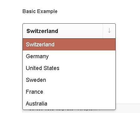
<select data-template="#dropdown">
<option value="1" selected="selected">Switzerland</option>
<option value="2">Germany</option>
<option value="3">United States</option>
<option value="4">Sweden</option>
<option value="5">France</option>
<option value="6">Australia</option>
</select>
3. dot.js Templates
<script id="dropdown-selected" type="text/x-dot-template">
{{=data.label}}<i>↓</i>
</script>
<script id="dropdown" type="text/x-dot-template">
<div class="dropdown" tabindex="1">
<div class="selected">{{=data.selected.label}}<i>↓</i></div>
<ul>
{{~data.items :item:index}}
<li data-index="{{=index}}">{{=item.label}}</li>
{{~}}
</ul>
</div>
</script>
4. Include jQuery Library and dropdown.dot
<script src="http://ajax.googleapis.com/ajax/libs/jquery/1.8.3/jquery.min.js"></script>
<script src="dot.js"></script>
<script src="jquery-dropdown-dot.min.js"></script>
5. Call the plugin
<script type="text/javascript">
    $(document).ready(function() {
      $('select').dropdown();
    });
</script>
This awesome jQuery plugin is developed by unknown. For more Advanced Usages, please check the demo page or visit the official website.