Minimal On/Off Switch Plugin For jQuery - addToggle
| File Size: | 20.4 KB |
|---|---|
| Views Total: | 3734 |
| Last Update: | |
| Publish Date: | |
| Official Website: | Go to website |
| License: | MIT |

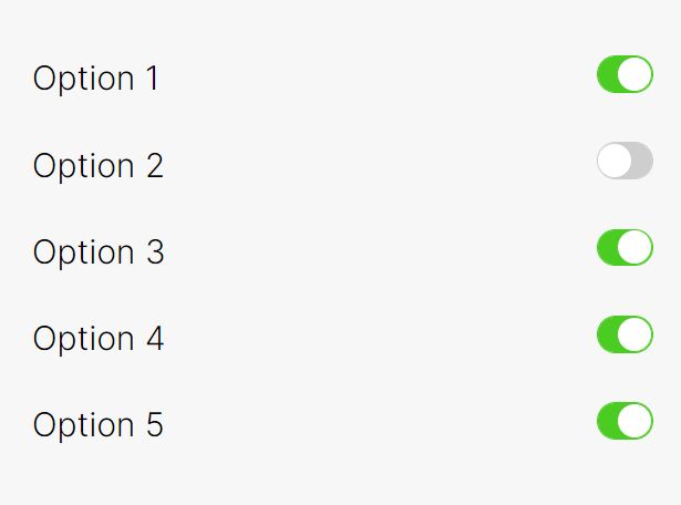
addToggle is a tiny jQuery plugin which converts a regular input field into an easy-to-customize toggle switch for on/off states.
How to use it:
1. Include jQuery library and other required resources into your webpage.
<link href="src/addToggle.css" rel="stylesheet">
<script src="//code.jquery.com/jquery.min.js"></script>
<script src="src/Obj.min.js"></script>
<script src="src/addToggle.js"></script>
2. Create an input field with the 'data-addui' attribute on the webpage. That's it.
<input type='toggle' data-addui="toggle">
3. You can also initialize the plugin by calling the addToggle() function on the input field.
$("input").addToggle()
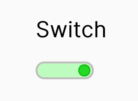
4. Override the default CSS to create your own styles. The CSS snippets as displayed below will help you create a Material Design styled toggle switch.
*[class^=addui-toggle] {
  box-sizing: border-box;
  -moz-box-sizing: border-box;
}

.addui-toggle {
  display: inline-block;
  margin: 16px;
  width: 52px;
  height: 20px;
  border-radius: 52px;
  position: relative;
  background-color: rgba(125,125,125,0.50);
  cursor: pointer;
  -webkit-user-select: none;
  -moz-user-select: none;
  -ms-user-select: none;
  user-select: none;
  transition: background 0.4s;
}

.addui-toggle-truetext, .addui-toggle-falsetext { display: none; }

.addui-toggle-handle {
  display: block;
  width: 30px;
  height: 30px;
  border-radius: 30px;
  position: absolute;
  top: -5px;
  left: 0;
  background-color: #f1f1f1;
  box-shadow: 0 1px 5px 0 rgba(0, 0, 0, 0.4);
  transition: left 0.4s, background 0.4s;
}

.addui-Toggle.addui-Toggle-on { background-color: rgba(15,157,88,0.5); }

.addui-Toggle.addui-Toggle-on .addui-Toggle-handle {
  left: 22px;
  background-color: #0f9d58;
}
Change log:
2016-06-01
- 6.0.1
This awesome jQuery plugin is developed by dustinpoissant. For more Advanced Usages, please check the demo page or visit the official website.