Switch Style Radio Buttons In jQuery - Simple Input Toggle
| File Size: | 15.6 KB |
|---|---|
| Views Total: | 8977 |
| Last Update: | |
| Publish Date: | |
| Official Website: | Go to website |
| License: | MIT |
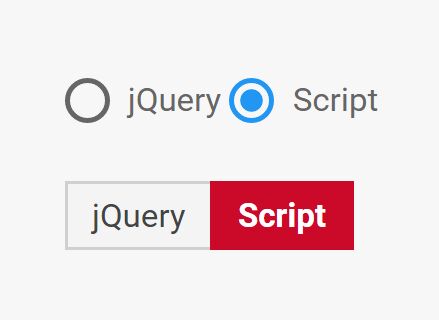
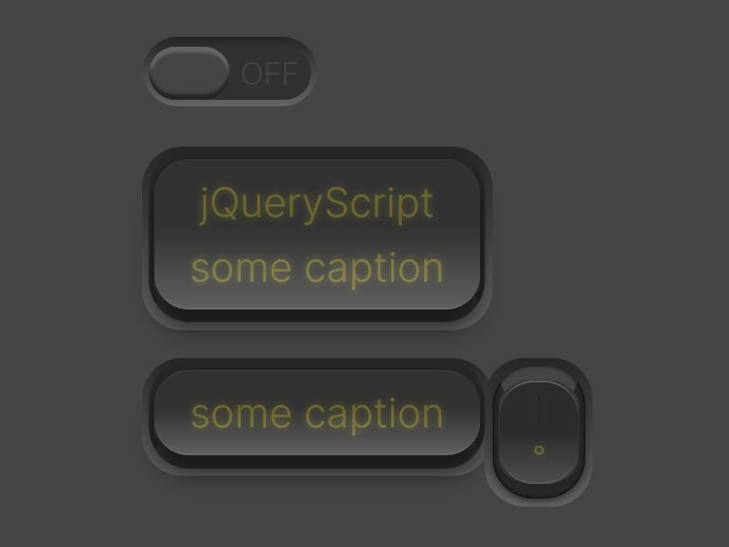
The jQuery Simple Input Toggle plugin transforms the normal radio inputs into switch-style toggle buttons for better user experience.
How to use it:
1. Create two radio buttons as follows:
<div class="form-check">
  <label class="form-check-label">
    <input class="form-check-input" type="radio" name="exampleRadios" id="exampleRadios1" value="option1" checked>
    jQuery
  </label>
  <label class="form-check-label">
    <input class="form-check-input" type="radio" name="exampleRadios" id="exampleRadios2" value="option2">
    Script
  </label>
</div>
2. Load the minified version of jQuery library and the jQuery Simple Input Toggle plugin at the end of the document.
<script src="https://code.jquery.com/jquery-3.2.1.slim.min.js" integrity="sha384-KJ3o2DKtIkvYIK3UENzmM7KCkRr/rE9/Qpg6aAZGJwFDMVNA/GpGFF93hXpG5KkN" crossorigin="anonymous"></script>
<script src="js/jquery.toggleinput.js"></script>
3. Activate the plugin.
jQuery(function($) {
  $('.radio-toggle').toggleInput();
});
4. Add your own CSS styles to the toggle buttons.
.has-toggle-input label, .has-toggle-input.radio label {
  display: block;
  float: left;
  padding: 5px 10px;
  margin: auto auto auto -1px;
  background: #f4f4f4;
  color: #444;
  border: 1px #d0d0d0 solid;
  line-height: normal;
  overflow: hidden;
  cursor: pointer;
}

.has-toggle-input label.active {
  background: #cb0928;
  border-color: #cb0928;
  color: white;
  font-weight: bolder;
}

.has-toggle-input label:first-of-type { margin-left: auto; }

.has-toggle-input label:last-of-type { }
This awesome jQuery plugin is developed by AnrietteC. For more Advanced Usages, please check the demo page or visit the official website.