jQuery Plugin For Custom Bootstrap Checkboxes - bootstrap-checkbox-x
| File Size: | 37.3 KB |
|---|---|
| Views Total: | 6118 |
| Last Update: | |
| Publish Date: | |
| Official Website: | Go to website |
| License: | MIT |
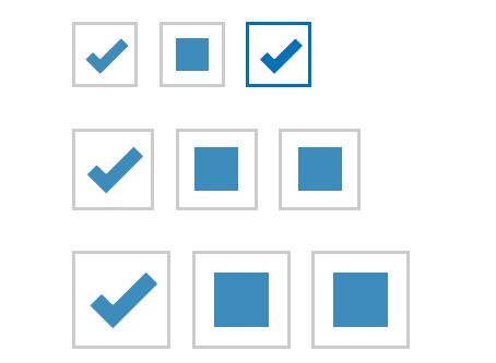
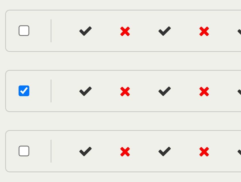
A lightweight jQuery extension for Bootstrap that enhances the default Bootstrap checkbox input with 3 states (checked, unchecked, tri-state), custom CSS styles and contextual colors.
More features:
- Custom checked, unchecked markers.
- Easy to style using your own CSS.
- 5 checkbox sizes: xl, lg, md, sm, or xs
How to use it:
1. Download the plugin and include the jQuery bootstrap-checkbox-x's JavaScript & CSS files into the webpage which has jQuery and Bootstrap installed.
<link href="/path/to/bootstrap.min.css" rel="stylesheet">
<link href="/path/to/checkbox-x.css" rel="stylesheet">
<script src="/path/to/jquery.min.js"></script>
<script src="/path/to/checkbox-x.js"></script>
2. Call the function on your existing checkbox input and done.
<input id="input-id" value="1">
$("#checkbox-id").checkboxX();
3. You're also allowed to initialize the plugin by adding the data-toggle="checkbox-x" to your radio input:
<input id="input-id" value="1" data-toggle="checkbox-x">
4. All possible plugin options. The following options can be set using data-OPTION attributes or passed in an options JavaScript object when calling .checkboxX().
$("#checkbox-id").checkboxX({
  theme: '',
  threeState: true,
  inline: true,
  iconChecked: '<i class="glyphicon glyphicon-ok"></i>',
  iconUnchecked: ' ',
  iconNull: '<div class="cbx-icon-null"></div>',
  valueChecked: '1',
  valueUnchecked: '0',
  valueNull: '',
  size: 'md',
  enclosedLabel: false,
  useNative: false,
  allowThreeValOnInit: false,
  tabindex: "1000"
});
<input id="input-id" value="1"
       data-toggle="checkbox-x"
       data-three-state="true"
       data-size="sm"
       data-OPTION="VALUE">
Changelog:
v1.5.7 (2021-09-19)
- New boolean property useCrossIcon for checked indicator.
- Revamp bootstrap checkbox-x markup for better styling & alignment across Bootstrap versions.
- Enhancements to support all bootstrap versions (5.x, 4.x. and 3.x) enhancement
- Use enhanced SVG icons
- Allow custom icon CSS for checked, unchecked and null states.
v1.5.6 (2021-05-20)
- Update CDN version to use jsdelivr.
v1.5.5 (2018-11-03)
- Add github contribution and issue/PR log templates.
- Rename events to start with checkbox: instead of ending with .checkbox .
- Correct package.json.
- Add support for bootstrap-sass through new sass branch.
- Display initial value correctly when initializing with checkbox
- New property allowThreeValOnInit for showing third state on init for two state checkboxes.
- Use string values instead of integers.
This awesome jQuery plugin is developed by kartik-v. For more Advanced Usages, please check the demo page or visit the official website.