Create Step By Step Progress In Bootstrap 4 - bs-stepper
| File Size: | 119 KB |
|---|---|
| Views Total: | 66957 |
| Last Update: | |
| Publish Date: | |
| Official Website: | Go to website |
| License: | MIT |
bs-stepper is a lightweight stepper JavaScript plugin for Bootstrap 4 that helps you create wizard-style step-by-step progresses for forms, guides, and installations.
How to use it:
1. Install the bs-stepper plugin.
# NPM
$ npm install bs-stepper --save
2. Import the bs-stepper.
import Stepper from 'bs-stepper'
3. Or include the bs-stepper's files from a CDN.
<link rel="stylesheet" href="https://unpkg.com/bs-stepper/dist/css/bs-stepper.min.css">
<script src="https://unpkg.com/bs-stepper/dist/js/bs-stepper.min.js"></script>
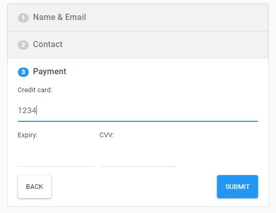
4. The HTML structure to create a basic stepper containing 3 steps and next/prev buttons.
<div id="stepper-example" class="bs-stepper">
  <div class="bs-stepper-header">
    <div class="step" data-target="#test-l-1">
      <a href="#">
        <span class="bs-stepper-circle">1</span>
        <span class="bs-stepper-label">First step</span>
      </a>
    </div>
    <div class="line"></div>
    <div class="step" data-target="#test-l-2">
      <a href="#">
        <span class="bs-stepper-circle">2</span>
        <span class="bs-stepper-label">Second step</span>
      </a>
    </div>
    <div class="line"></div>
    <div class="step" data-target="#test-l-3">
      <a href="#">
        <span class="bs-stepper-circle">3</span>
        <span class="bs-stepper-label">Third step</span>
      </a>
    </div>
  </div>
  <div class="bs-stepper-content">
    <div id="test-l-1" class="content">
      <p class="text-center">test 1</p>
      <button class="btn btn-primary" onclick="myStepper.next()">Next</button>
    </div>
    <div id="test-l-2" class="content">
      <p class="text-center">test 2</p>
      <button class="btn btn-primary" onclick="myStepper.next()">Next</button>
    </div>
    <div id="test-l-3" class="content">
      <p class="text-center">test 3</p>
      <button class="btn btn-primary" onclick="myStepper.next()">Next</button>
      <button class="btn btn-primary" onclick="myStepper.previous()">Previous</button>
    </div>
  </div>
</div>
5. Initialize the stepper by calling the function on the top container.
// Vanilla JavaScript
document.addEventListener('DOMContentLoaded', function () {
  myStepper = new Stepper(document.querySelector('#stepper-example'))
})

// As a jQuery Plugin
$(document).ready(function () {
  var myStepper = new Stepper($('#stepper-example'))
})
6. To create a non-linear stepper where the users are able to back to the previous step:
myStepper = new Stepper(document.querySelector('#stepper-example'),{
  linear: false
})
7. Enable/disable the fade animation:
myStepper = new Stepper(document.querySelector('#stepper-example'),{
  animation: true
})
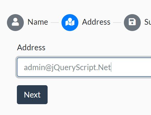
8. To create a vertical stepper, just add the vertical class to the top container.
<div id="example" class="bs-stepper vertical">
  ...
</div>
Changelog:
v1.7.0 (2019-07-24)
- Bugfix
- Add from and to properties in events detail
v1.6.0/v1.6.1 (2019-06-19)
- Allows you to customize stepper internal css classes
- Bugfixes
v1.5.0 (2019-03-22)
- events: dispatch show events (show and shown)
v1.4.1 (2019-03-22)
- selector: remove a selector
- selector: simple tags won't trigger step change, you have to use .step-trigger to allow that
- feat(events): dispatch show events (show and shown)
v1.3.0 (2019-02-25)
- feat(core): rewrite css smartly
v1.3.0 (2019-02-05)
- Bugfixes
v1.2.0 (2018-10-22)
- feat(core): add vertical stepper
2018-10-16
- add fade effect
- add d-none by default for fade steppers
- fix code style
This awesome jQuery plugin is developed by Johann-S. For more Advanced Usages, please check the demo page or visit the official website.